Preview image. Unlock full-res
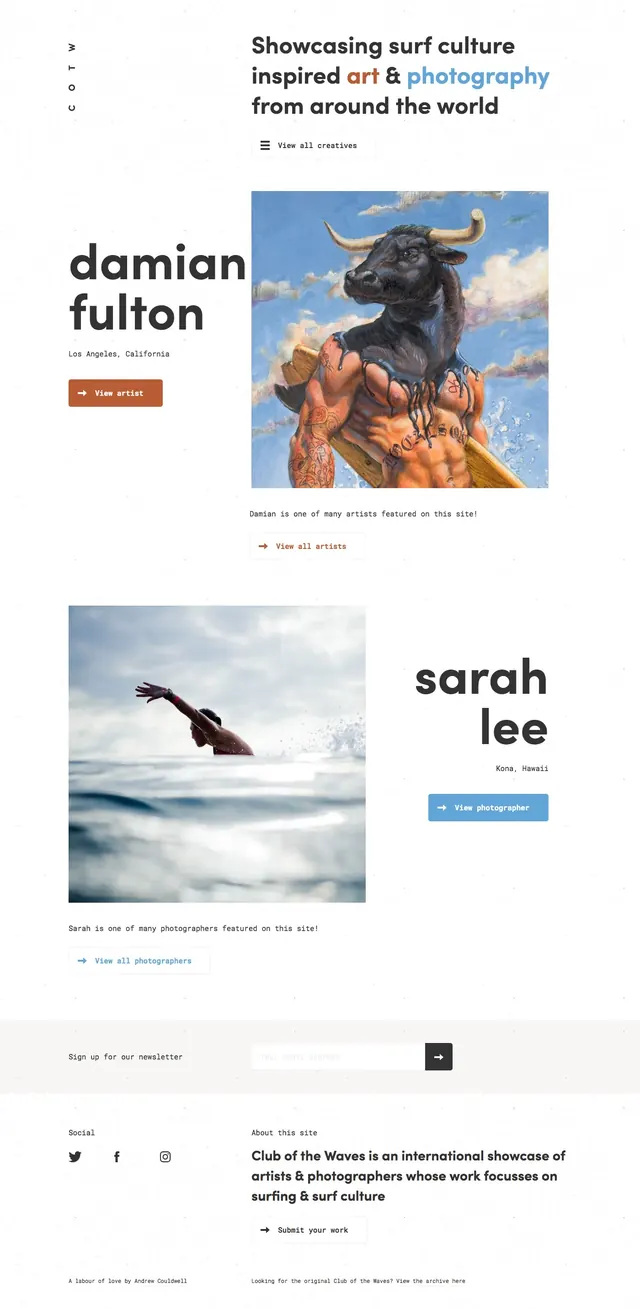
A bright editorial landing page for surf culture artists and photographers with oversized type, asymmetric image blocks, and a clean white canvas.
Summary
A bright editorial landing page for surf culture artists and photographers with oversized type, asymmetric image blocks, and a clean white canvas.
Visual description
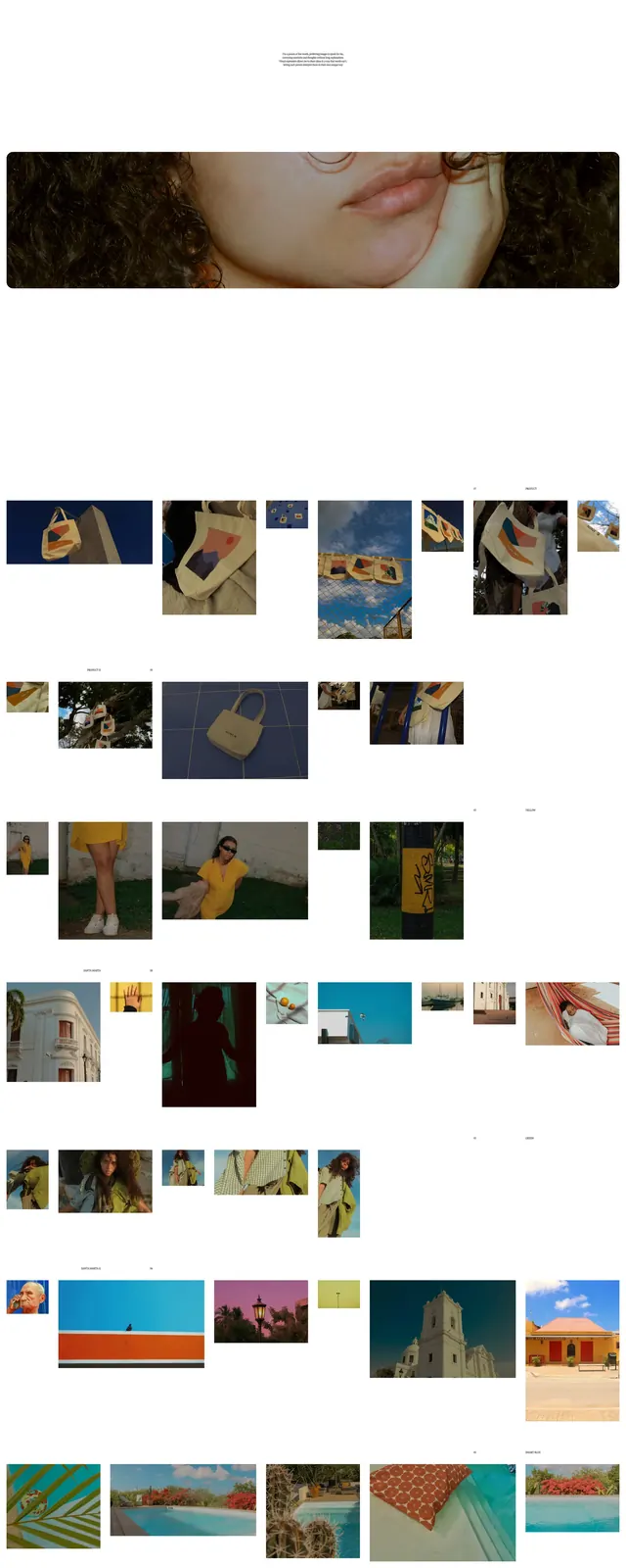
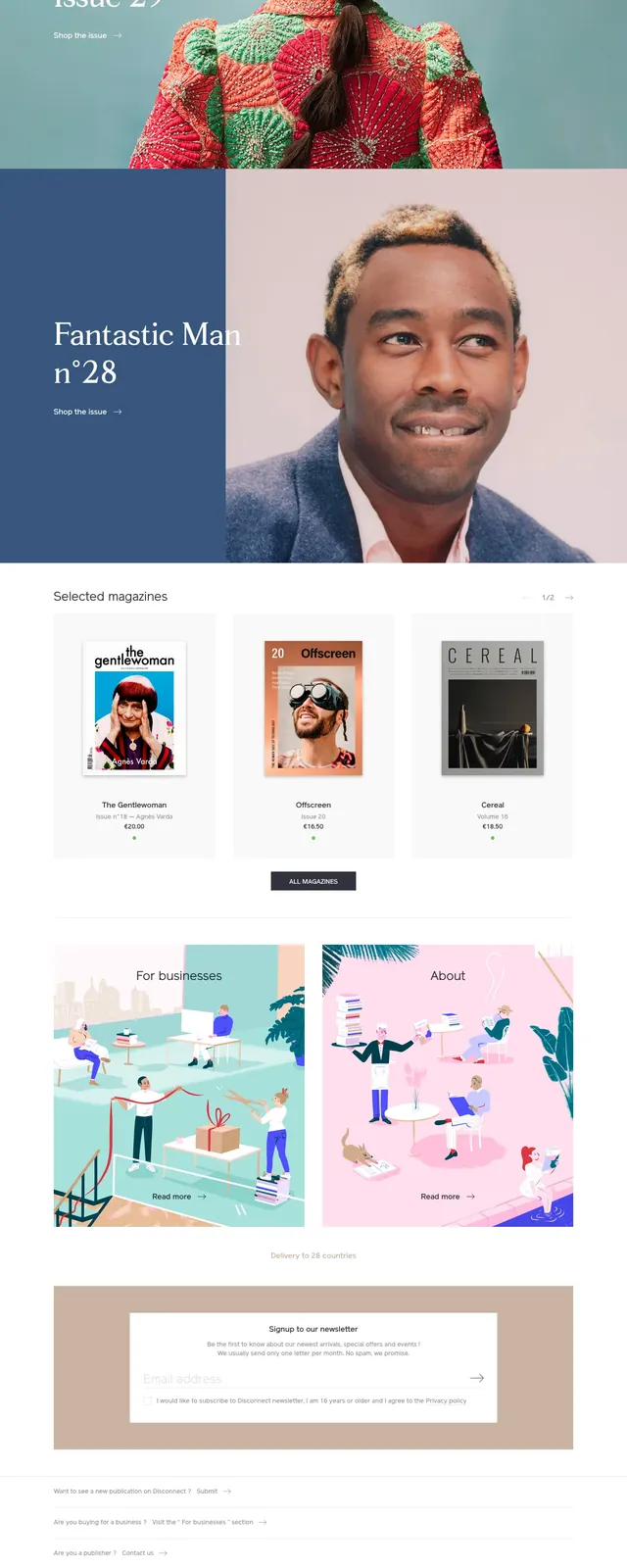
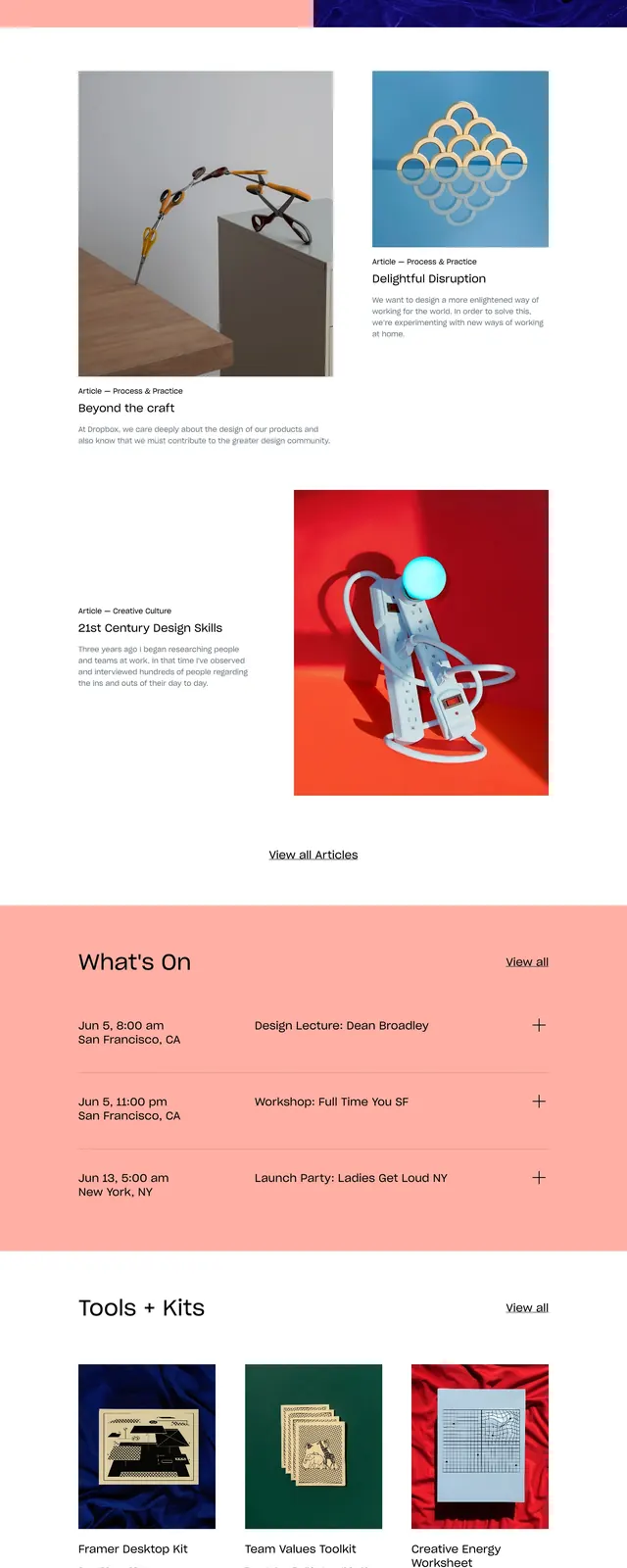
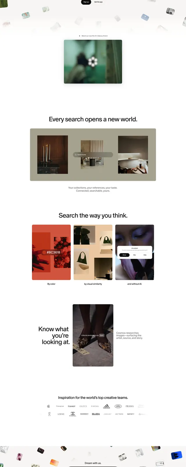
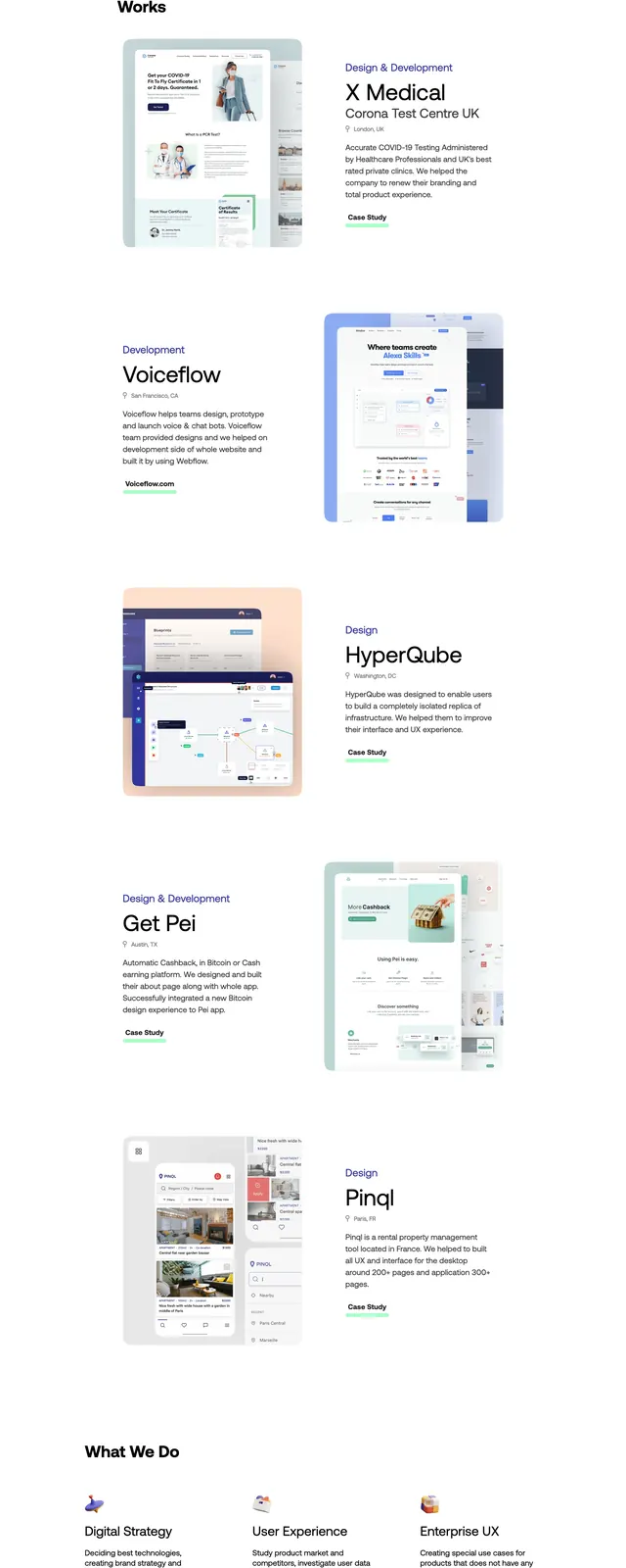
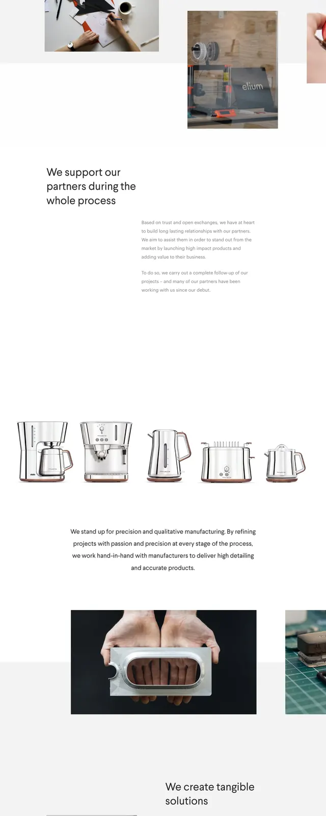
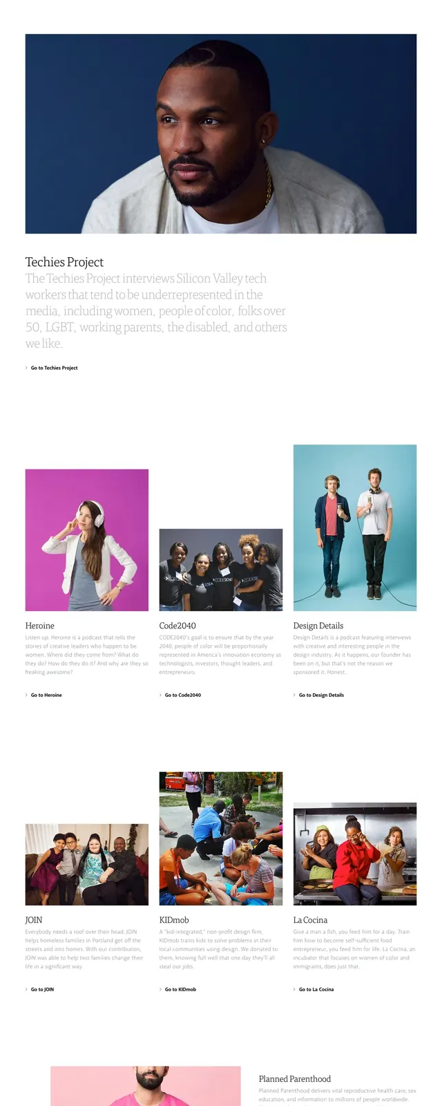
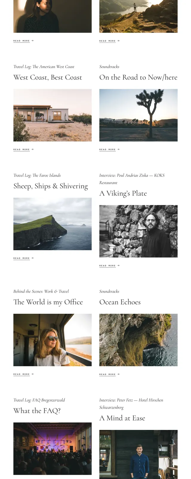
The page uses a mostly white background with large black headline text and occasional accent colors in the wordmark and buttons. Content is arranged in alternating two-column feature blocks, with artist names and locations on one side and large photographic or illustration images on the other. The lower portion includes a newsletter signup strip, social icons, and a compact about/footer area with short supporting copy. Spacing is wide and airy, with repeated artist feature cards stacked vertically down the page.
Key takeaway
The main reusable pattern is the alternating split feature layout paired with oversized editorial type. The design feels curated and art-forward without relying on heavy decoration.
Reuse notes
Useful for portfolios, creative directories, editorial showcases, or community-driven directories where imagery is the main content. It works best when you have strong visuals and short supporting labels rather than dense product copy.