Preview image. Unlock full-res
A high-contrast landing page for Cntrl that combines oversized typography, bright color blocks, and editorial web layouts.
Summary
A high-contrast landing page for Cntrl that combines oversized typography, bright color blocks, and editorial web layouts.
Visual description
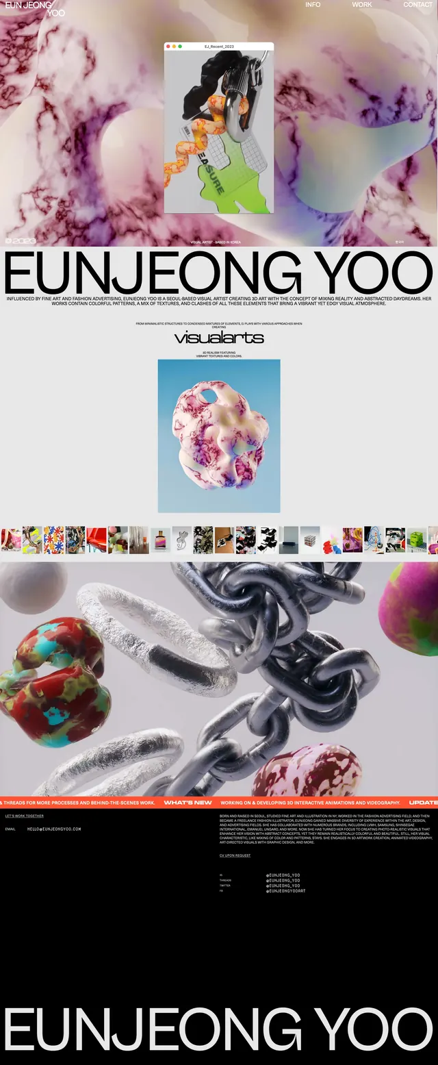
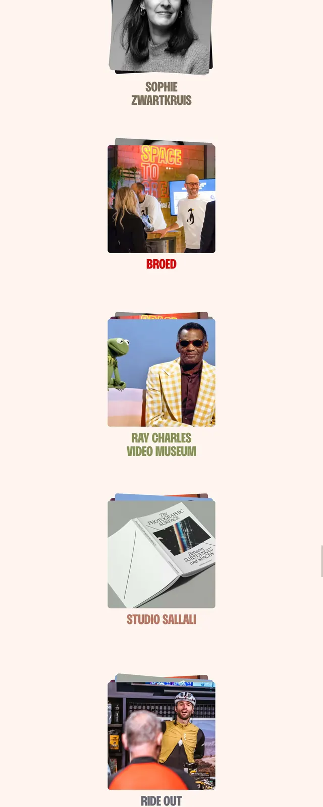
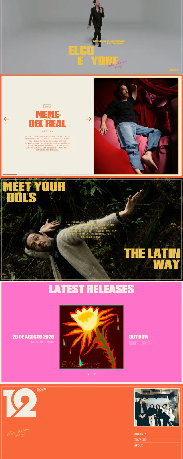
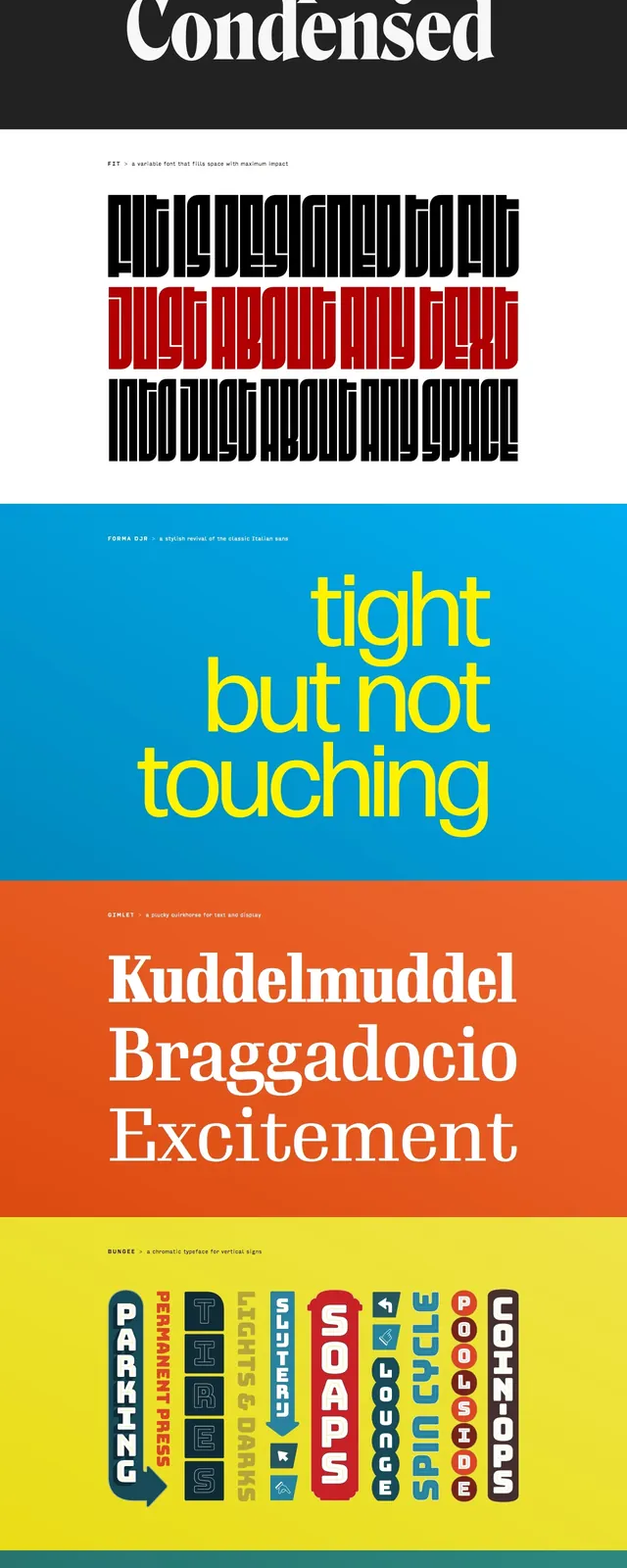
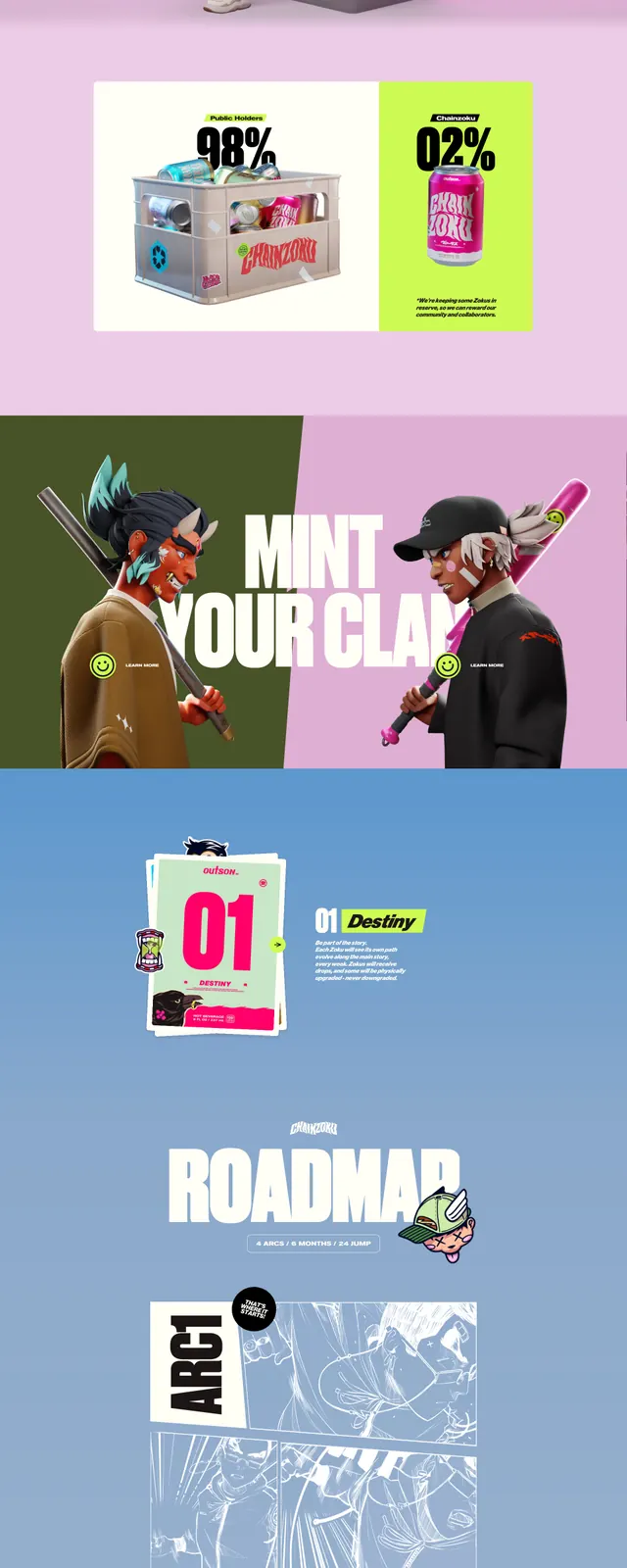
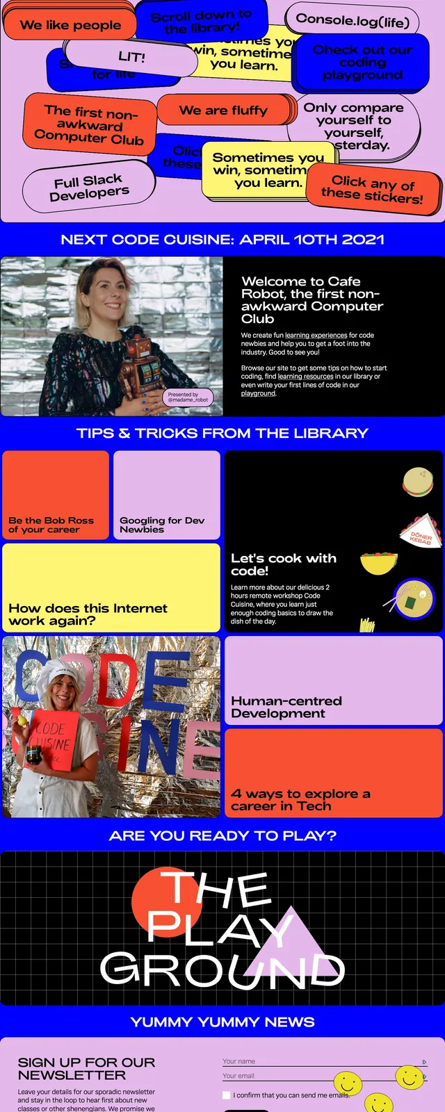
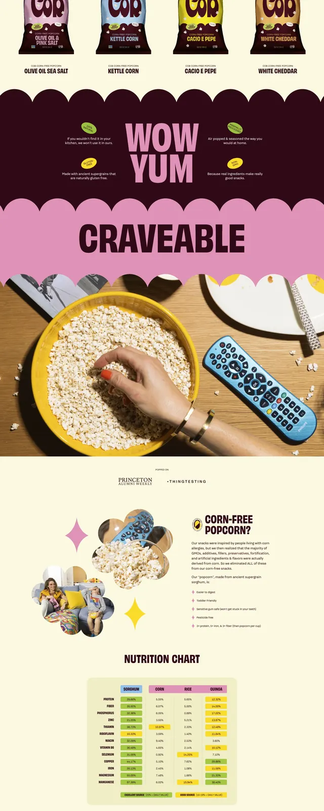
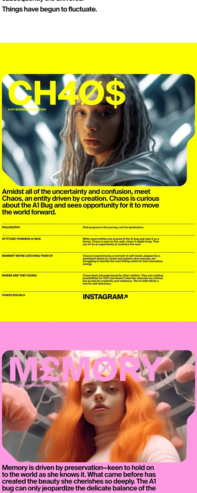
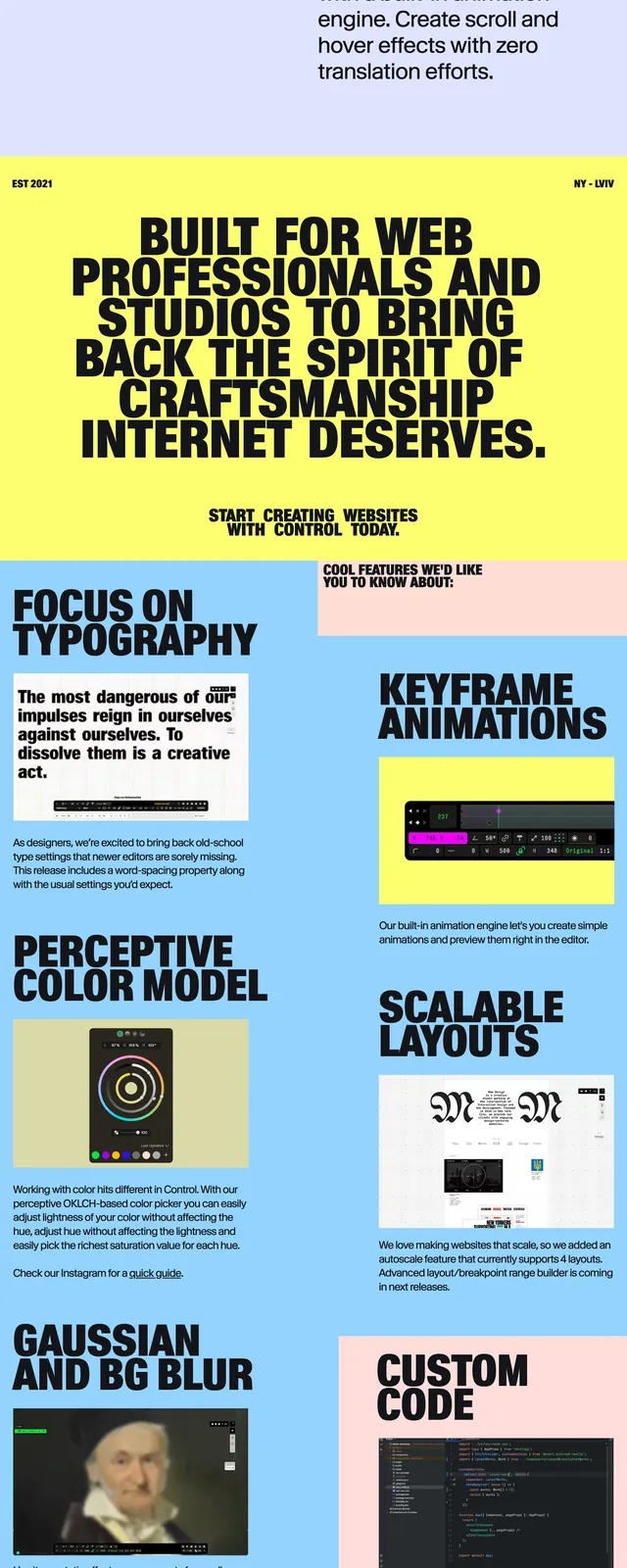
The page uses a vivid yellow background with black, heavy all-caps typography and a centered logo-like wordmark at the top. The hero area is minimal and centered, with a primary call-to-action button and a large embedded preview image below it. Further down, the page shifts into colorful section blocks with large feature headings, supporting copy, and product screenshots arranged in a loose two-column grid. The overall composition feels like a poster translated into a website.
Key takeaway
The main visual idea is bold, graphic, and unapologetically typographic, with bright color fields used to separate content sections. It is designed to feel experimental while still clearly presenting a product and its features.
Reuse notes
Reuse this structure when you want a hero-first marketing page with strong editorial energy and simple CTAs. The palette and type treatment work especially well for creative tools, design software, or other products that benefit from a distinctive visual identity.