Preview image. Unlock full-res
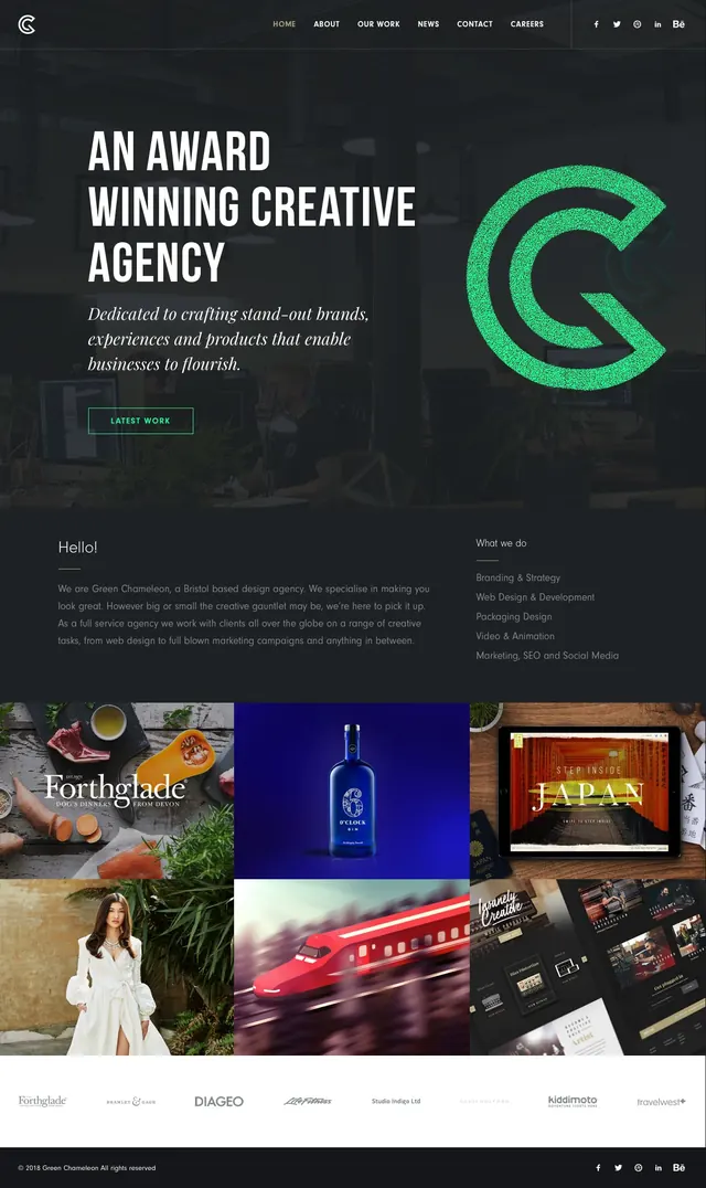
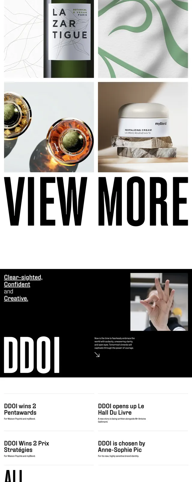
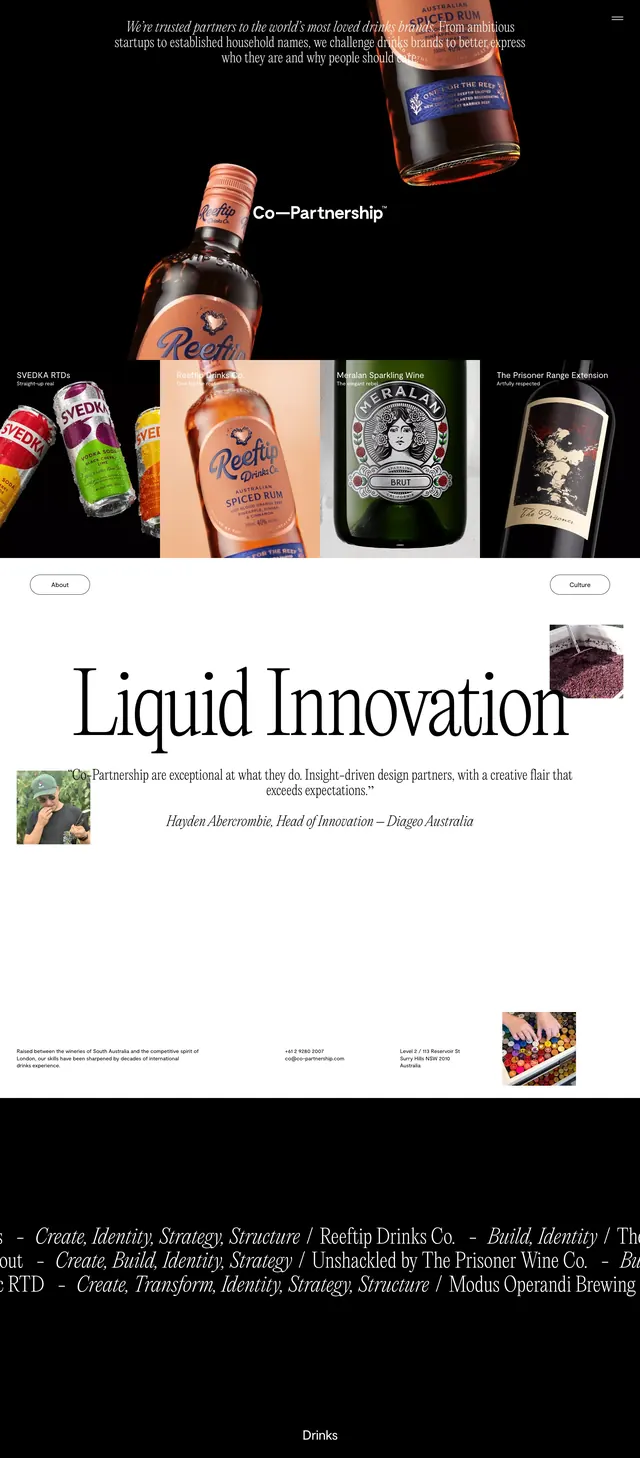
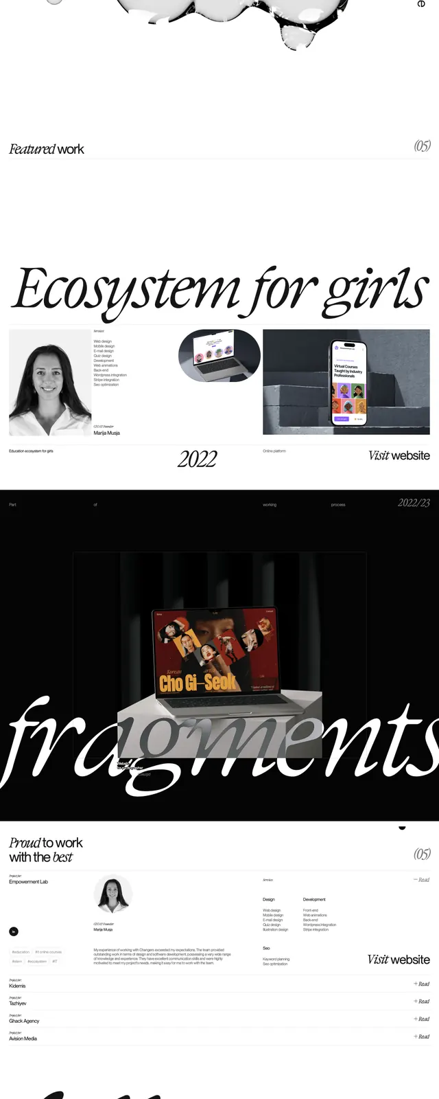
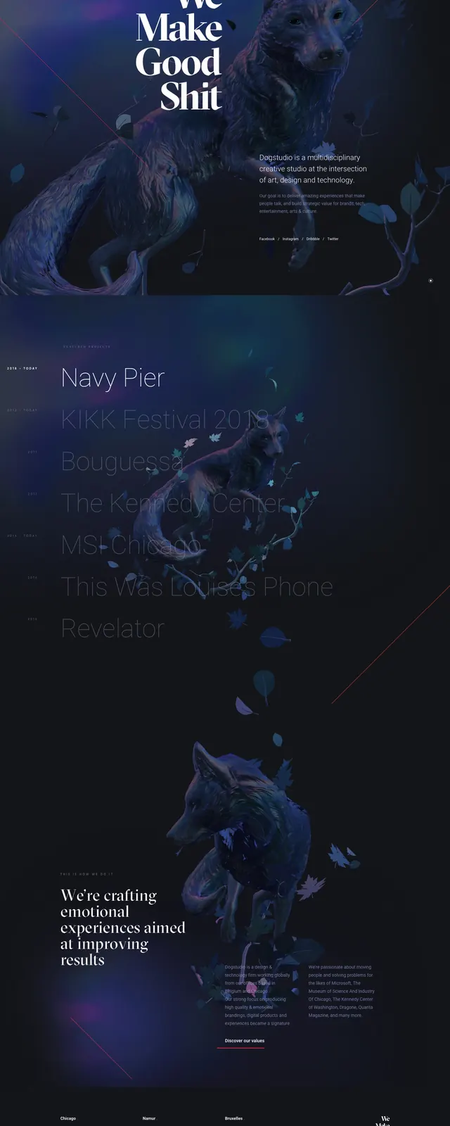
A dark editorial portfolio homepage with oversized typography, layered project imagery, and a minimal contact-led structure.
Summary
A dark editorial portfolio homepage with oversized typography, layered project imagery, and a minimal contact-led structure.
Visual description
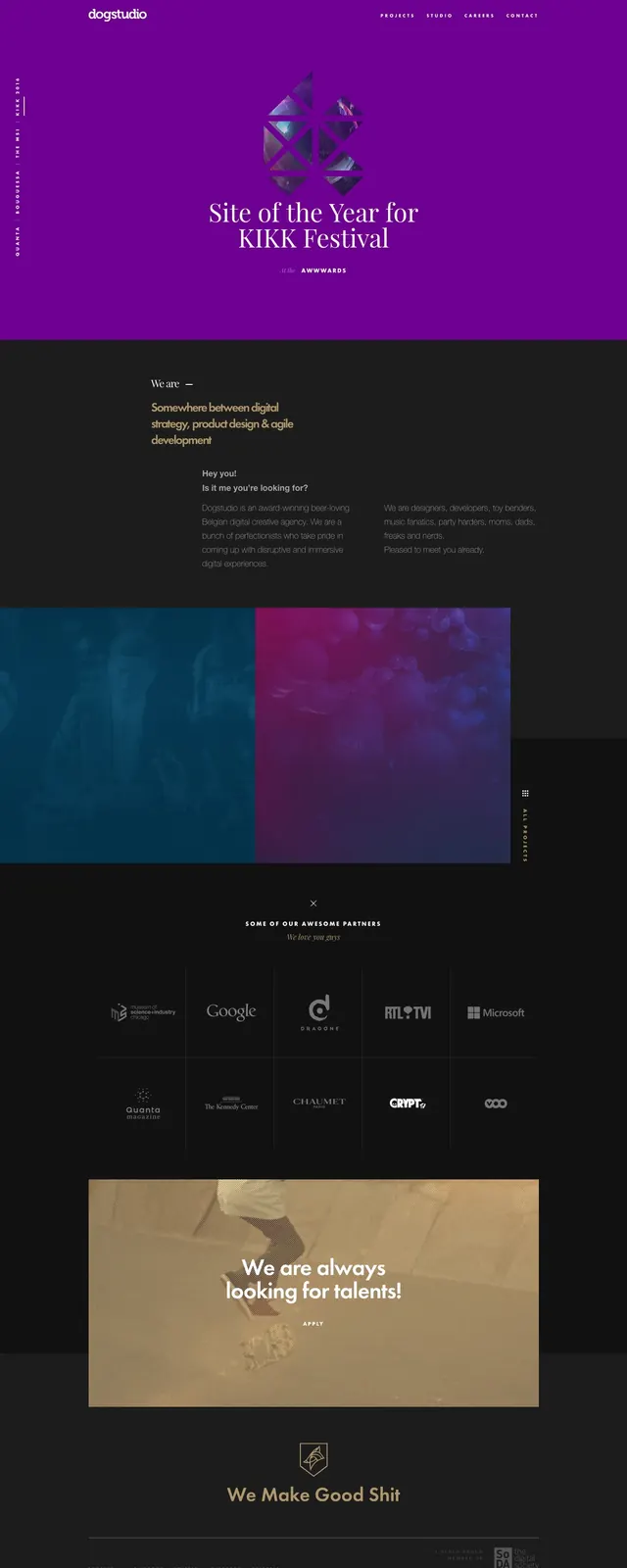
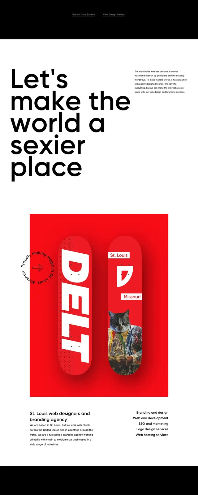
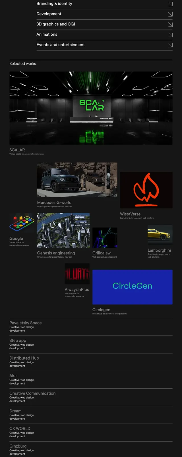
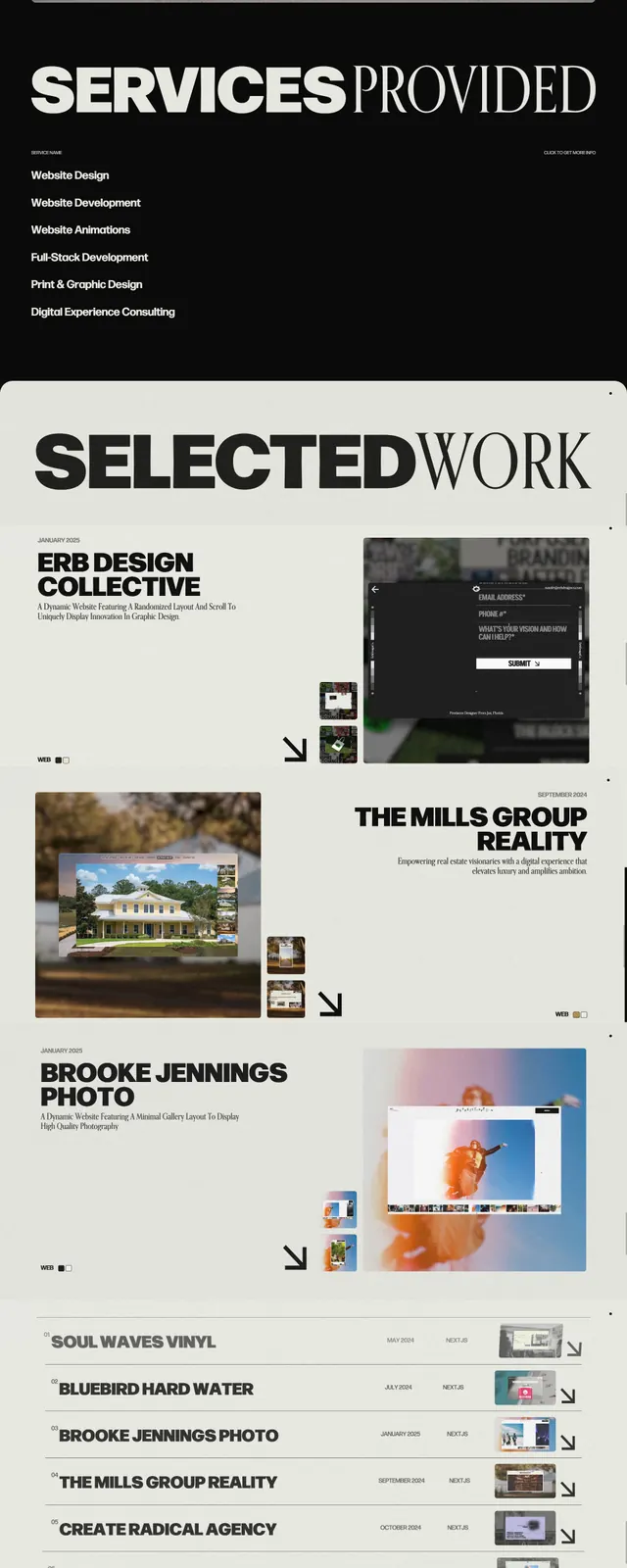
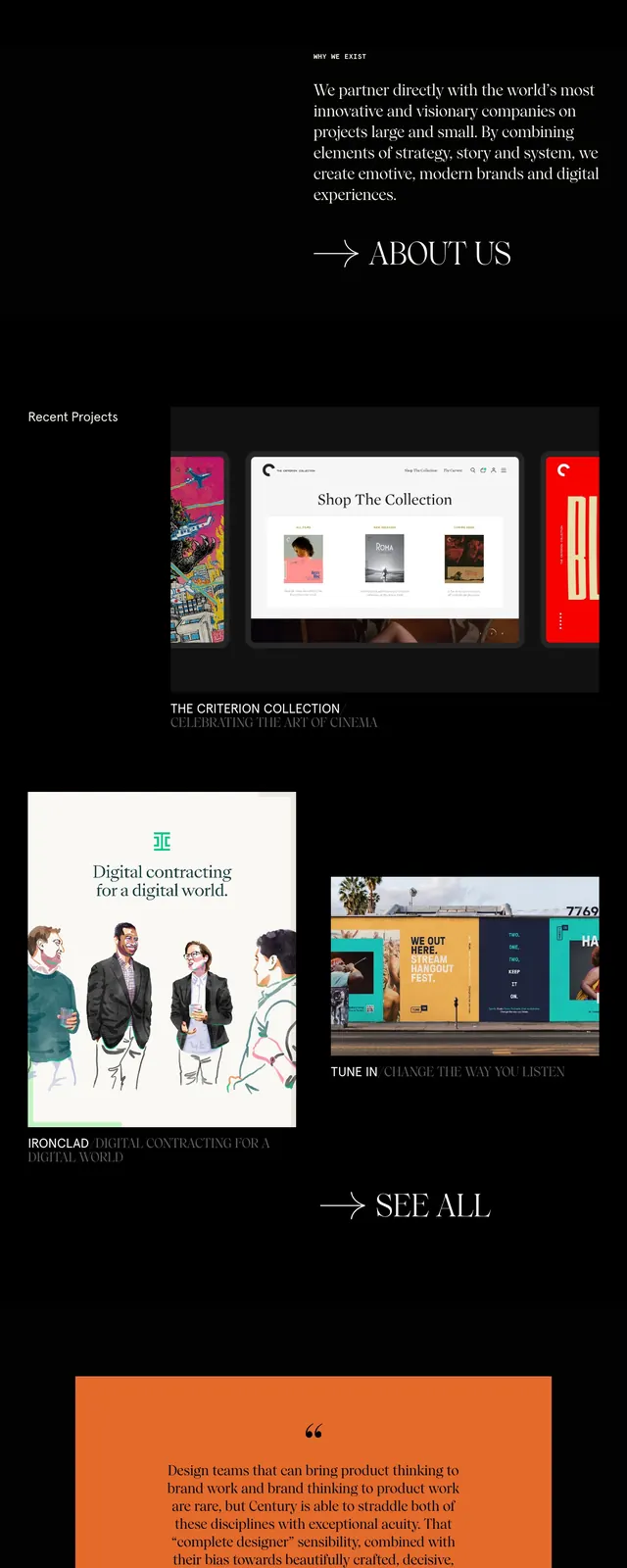
The top of the page uses a warm brown hero area with small navigation links in the corners and a huge centered wordmark reading 'CENTURY' over several overlapping project mockups. Below, the page switches to a black background with large image tiles, a short studio description, and a prominent contact call to action. The composition relies on strong negative space, layered screenshots, and restrained editorial spacing.
Key takeaway
The design feels like a high-end creative studio portfolio: minimal navigation, oversized branding, and curated project imagery do most of the work. It is especially effective for agencies or studios that want an art-directed, magazine-like first impression.
Reuse notes
Reuse the formula of a massive type-led hero over stacked visual previews, then transition into a dark content section with a single clear CTA. The layout works best when the brand has strong imagery and wants to emphasize taste over feature density.