Preview image. Unlock full-res
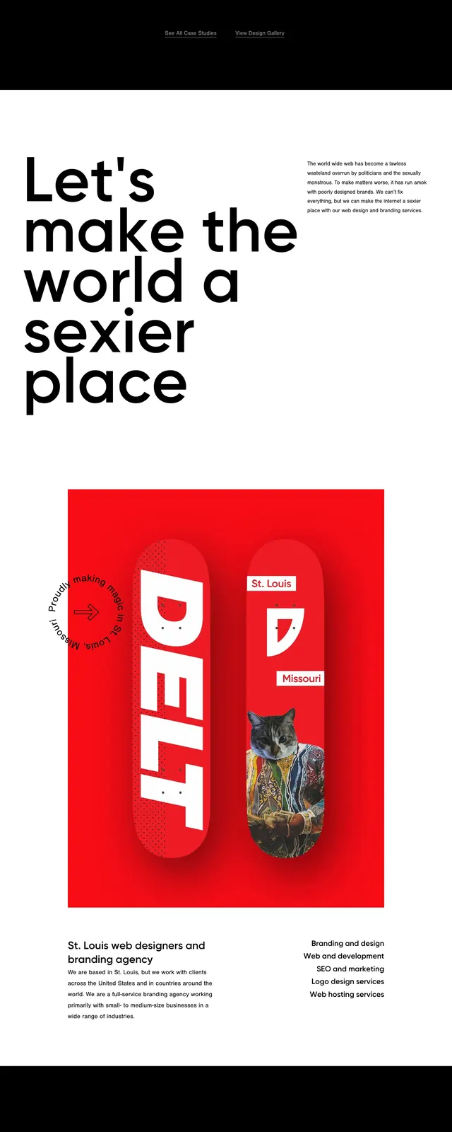
A bold black-and-red agency homepage built around oversized typography, strong imagery, and sparse editorial spacing.
Summary
A bold black-and-red agency homepage built around oversized typography, strong imagery, and sparse editorial spacing.
Visual description
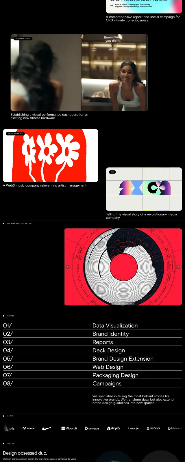
The page opens with a black hero section featuring a large red product-style image centered behind oversized white headline text. Minimal navigation sits at the top, with slim vertical side labels framing the composition. Lower sections switch to a white background with a large cropped wordmark-style heading, a vivid red feature image, a three-card blog list, and a stark footer with contact details and a numbered link list.
Key takeaway
The design relies on extreme contrast, large type, and bold red imagery to make a simple agency site feel editorial and premium. The structure is clean but visually dramatic, with each section using strong negative space and a limited palette.
Reuse notes
Reuse the black-and-red hero treatment for agency or studio landing pages that need immediate visual impact. The blog cards and minimal footer are easy to adapt as reusable content blocks in a similar editorial system.