Preview image. Unlock full-res
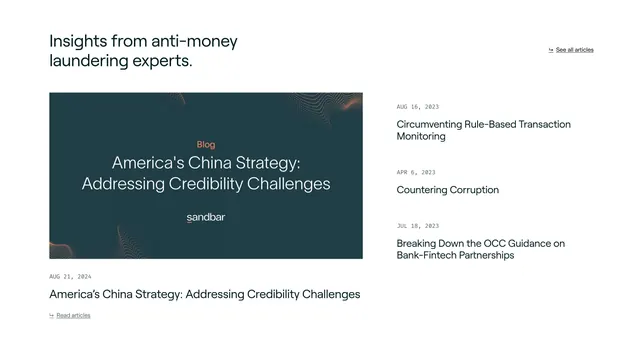
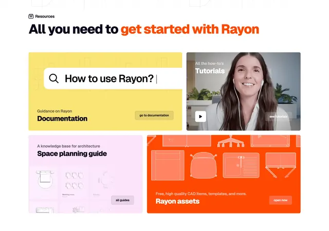
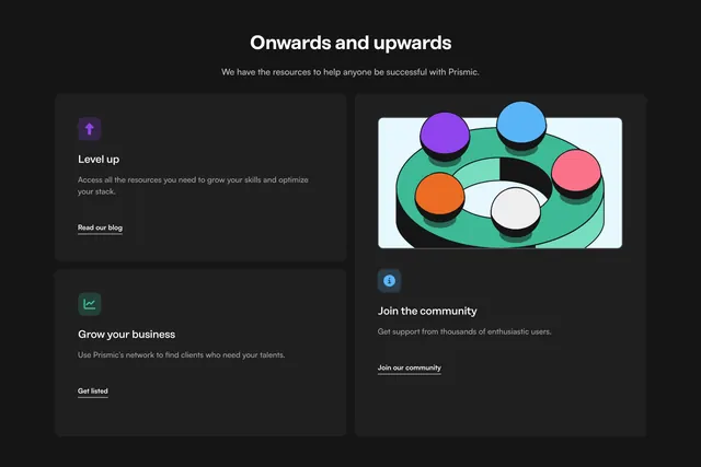
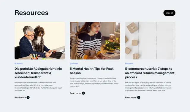
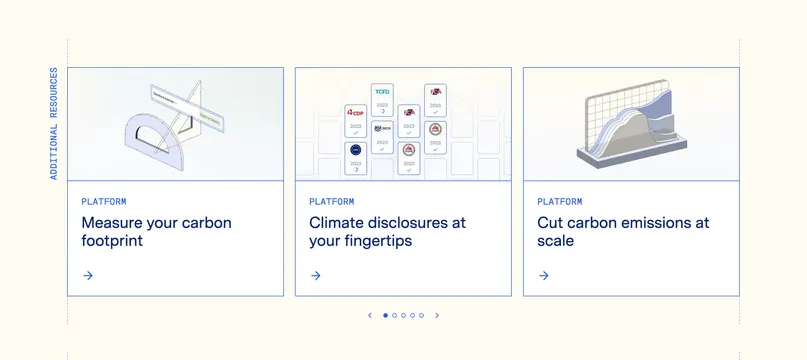
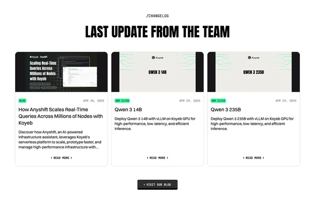
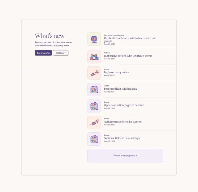
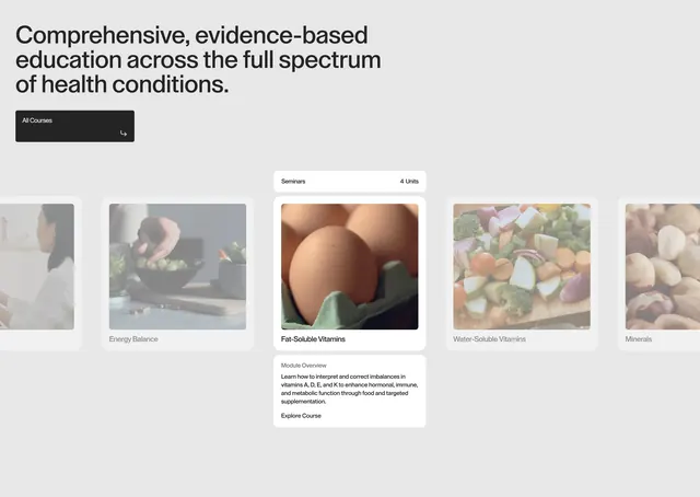
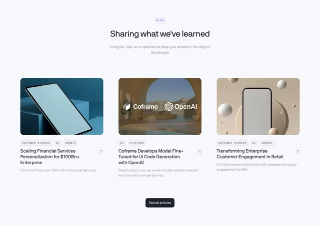
Centered light resources section with a three-column grid of blog cards, each topped by a 3D-rendered image and category badges.
Summary
A centered blog/resources section presenting three article cards in an even grid, each led by a large 3D-rendered thumbnail and a row of small category badges. The defining move is the polished 3D imagery sitting above quiet, restrained card text.
Visual description
On a very light blue-grey background, a small outlined "BLOG" eyebrow badge sits centered above a bold near-black headline "Sharing what we've learned" and a two-line muted subhead. Below, three equal-width cards each open with a rounded-corner 3D render (a blue tablet on cubes, a Coframe x OpenAI desert-room scene, a beige phone among floating spheres). Under each image sit two or three small bordered category badges in all-caps (CUSTOMER STORIES, AI, GROWTH, PLATFORM), then a two-line article title in dark sans-serif and a muted one-line description, with a small diagonal arrow icon at the right of each title. A single dark pill "See all articles" button is centered at the bottom.
Key takeaway
The consistent 3D-render thumbnail language gives an otherwise plain card grid a premium, branded feel without any photography. Small bordered all-caps category badges above each title read as tidy metadata and add scannability. The diagonal arrow per card signals "opens elsewhere" without a full button.
Reuse notes
Strong for a blog index, news, or customer-stories block on a clean SaaS or AI marketing site. Depends entirely on having cohesive, high-quality 3D or illustrated thumbnails; with mismatched stock photos it loses its polish. The single centered "See all" button keeps the section from feeling like a dead end.