Preview image. Unlock full-res
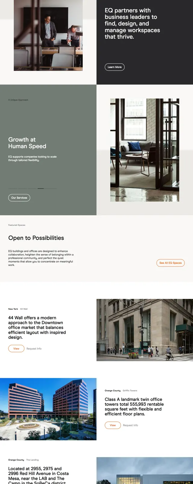
A light, airy co-working site with editorial spacing, large photography, and a calm premium feel.
Summary
A light, airy co-working site with editorial spacing, large photography, and a calm premium feel.
Visual description
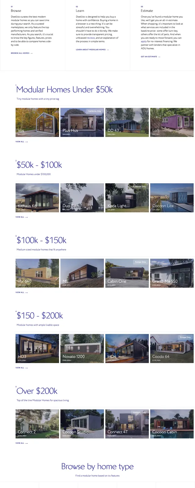
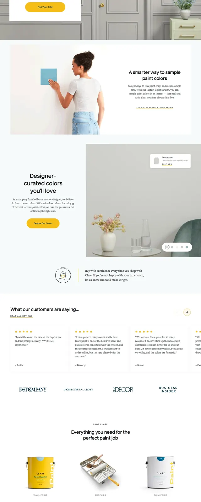
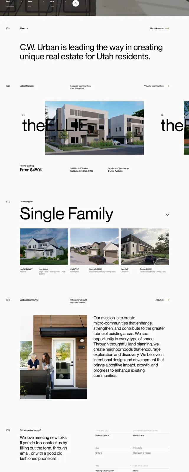
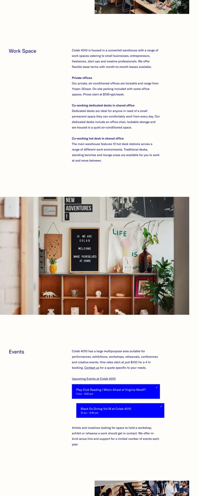
The page uses a pale background with dark navy text and a restrained top navigation. The first screen pairs a large headline on the left with a photographic workspace image on the right, creating a split hero layout. Lower sections continue with generous whitespace, a text-led about block, another large interior photo, and a contact area with phone, email, address, and an embedded map. The footer is minimal and includes social links and copyright text.
Key takeaway
The design relies on strong whitespace, simple typography, and warm interior photography to make the workspace feel inviting and credible. It is a good reference for understated hospitality or coworking landing pages that need to feel premium without visual noise.
Reuse notes
Reuse the split hero, sparse nav, and large image-first sections for brands that depend on location, atmosphere, and trust. The contact block with map works well for spaces, studios, and local membership businesses.