Preview image. Unlock full-res
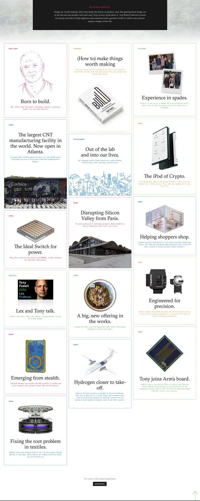
A soft, magazine-like landing page for Buildc with a centered hero and a stacked masonry of story cards below.
Summary
A soft, magazine-like landing page for Buildc with a centered hero and a stacked masonry of story cards below.
Visual description
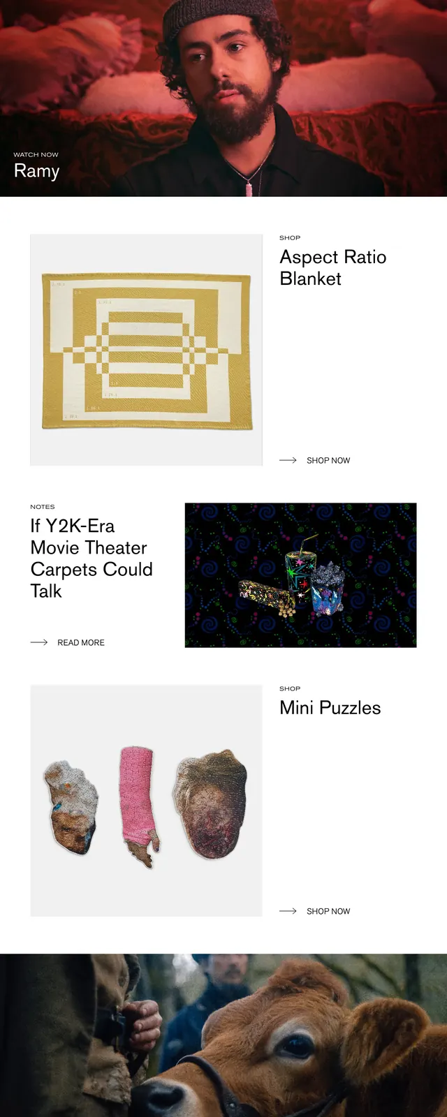
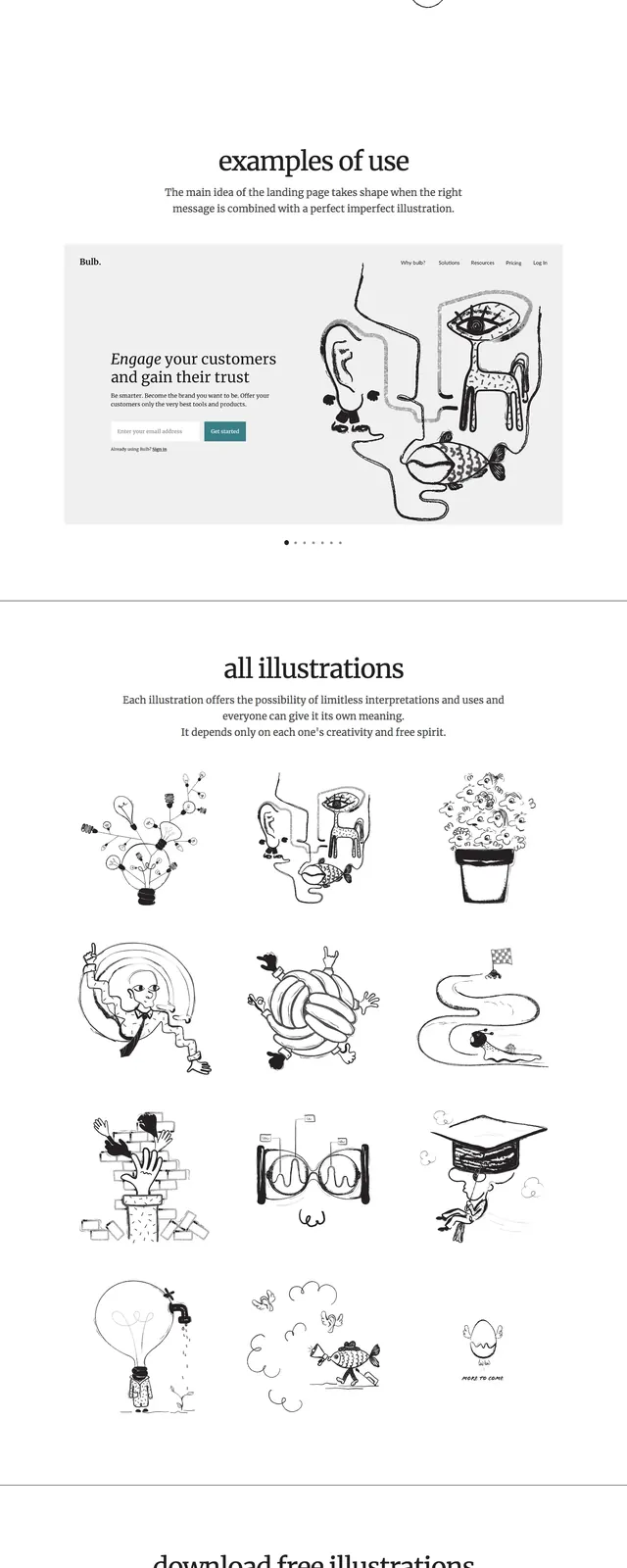
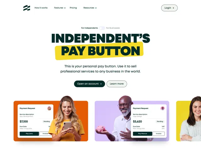
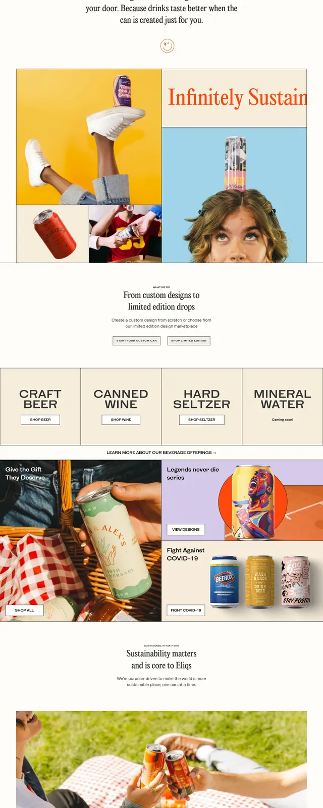
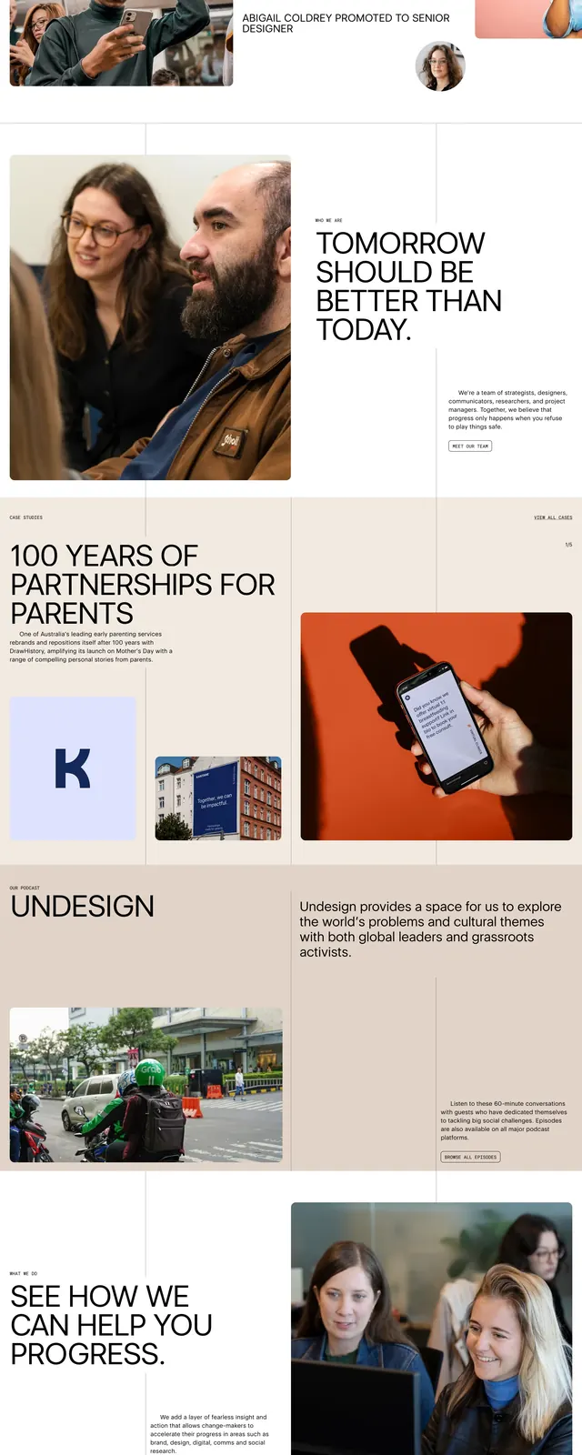
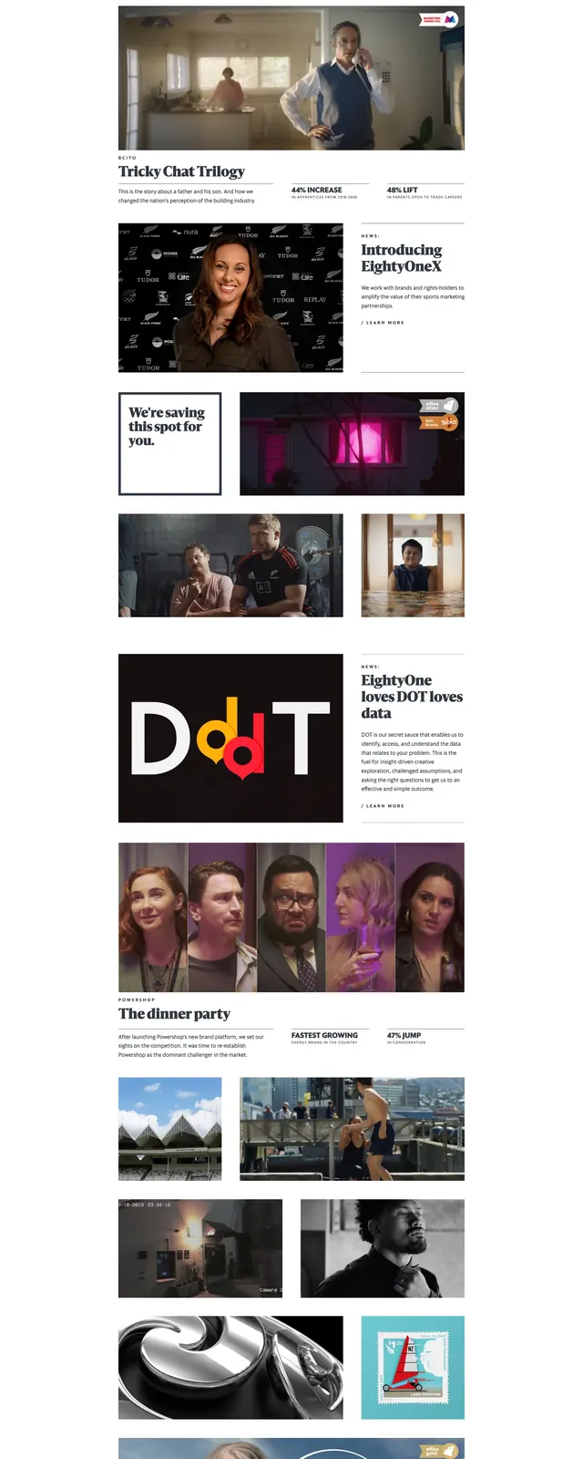
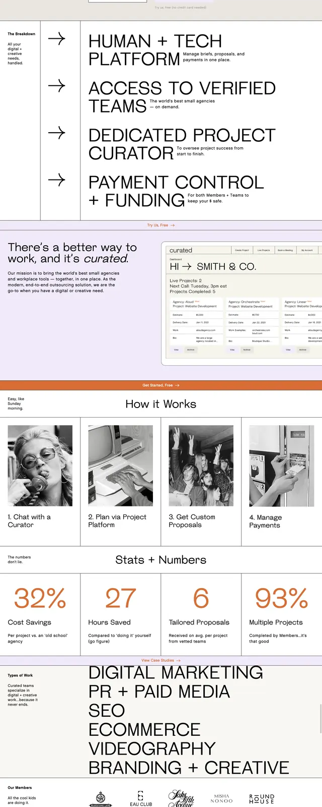
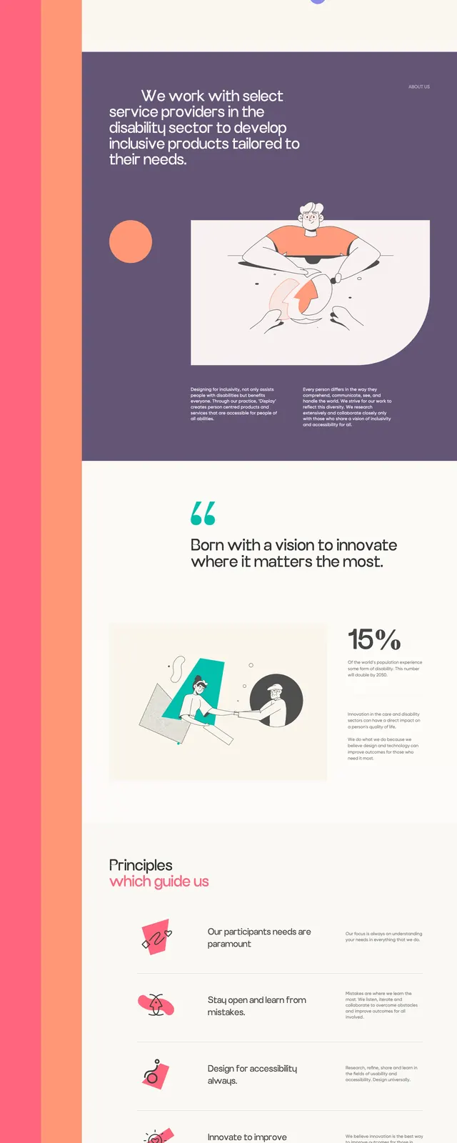
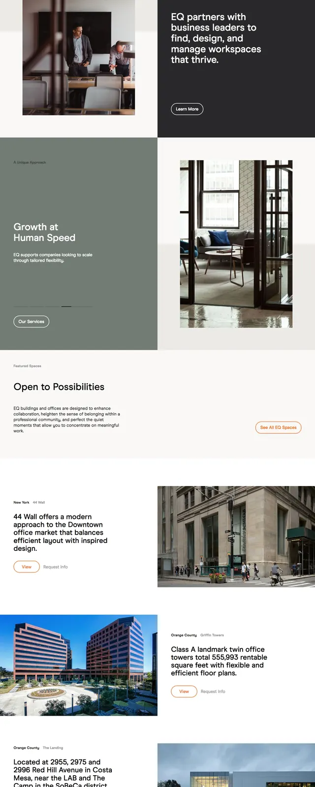
The page opens with a centered hero over a very light, washed-out background image, featuring a serif headline and a dark horizontal intro panel. A simple top navigation and small logo sit above the hero. Below, the page switches into a three-column masonry grid of bordered story cards mixing headlines, badges, portraits, product shots, photos, and illustrations. The overall composition is airy, editorial, and content-driven, with a dark footer closing the page.
Key takeaway
This layout combines a refined editorial hero with a highly reusable story-card grid for news, projects, or case studies. The contrast between the pale hero and dark intro block gives the page a calm but memorable structure.
Reuse notes
Reuse this pattern for brands that need a polished content hub or inspiration library with strong visual hierarchy. The card grid and restrained typography make it easy to swap in articles, projects, or featured stories without changing the core system.