Preview image. Unlock full-res
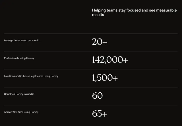
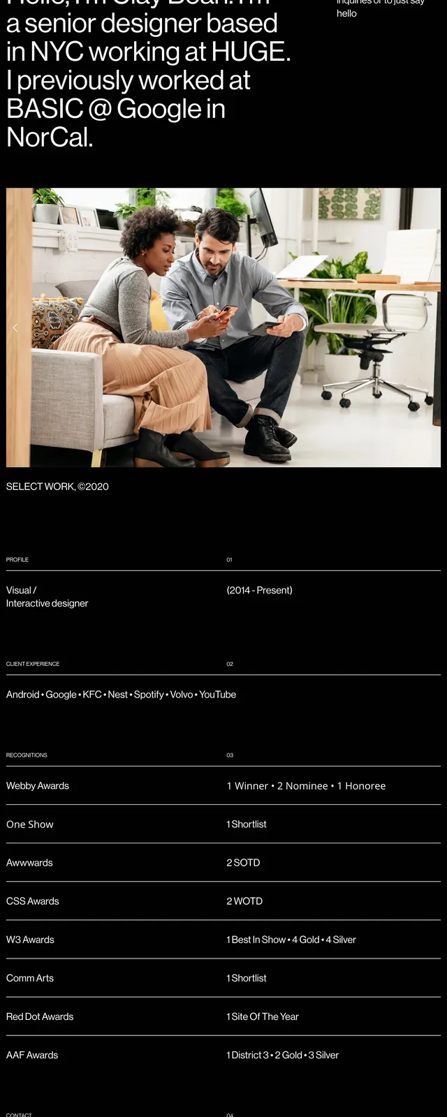
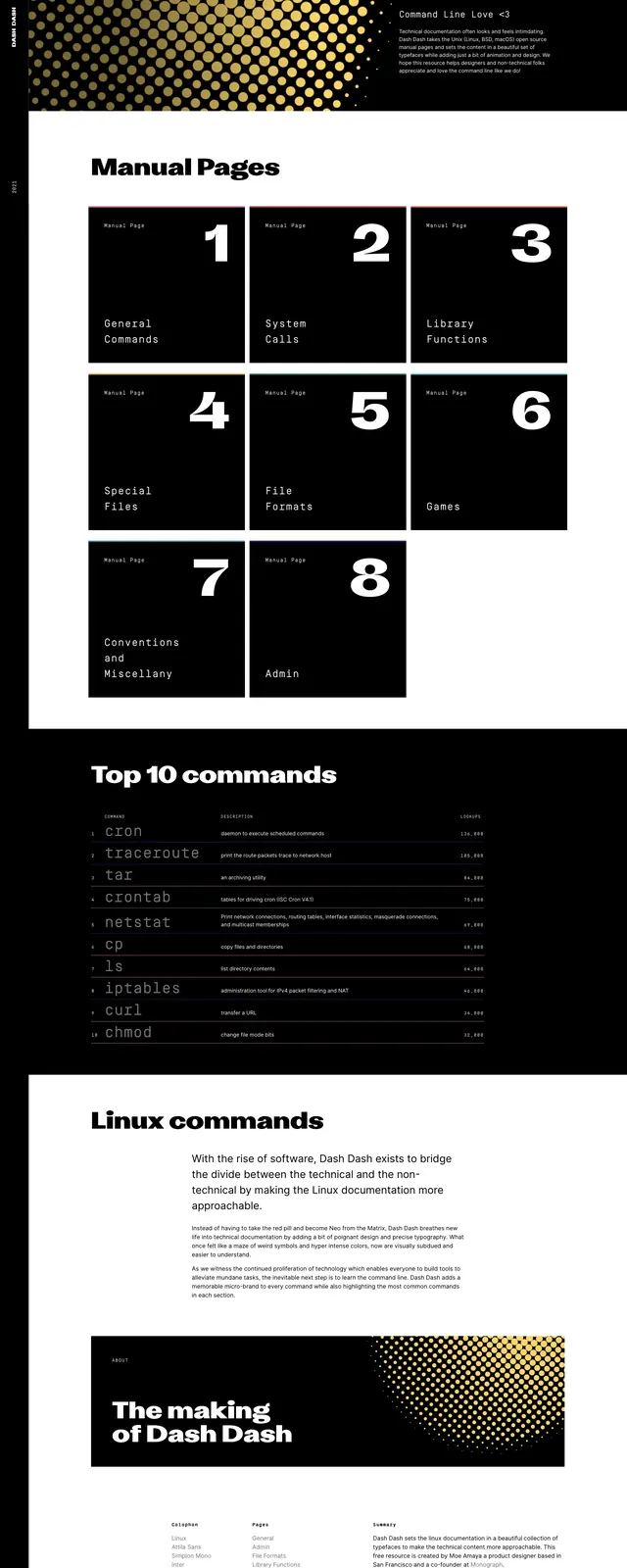
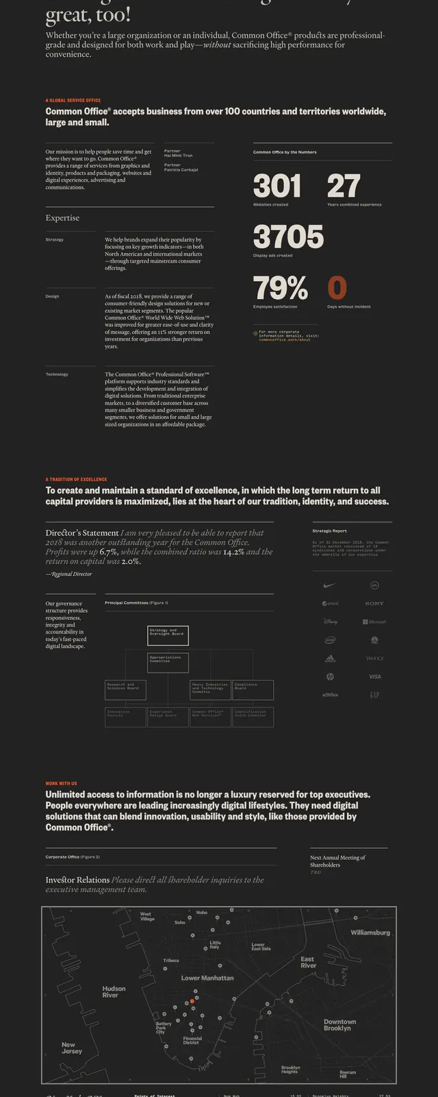
A dark, editorial-style company landing page with oversized serif headlines, thin rules, and dense informational sections.
Summary
A dark, editorial-style company landing page with oversized serif headlines, thin rules, and dense informational sections.
Visual description
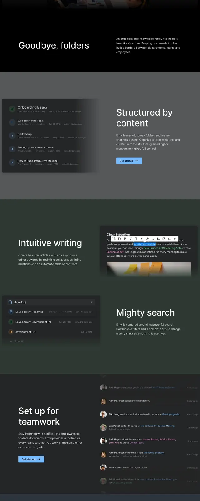
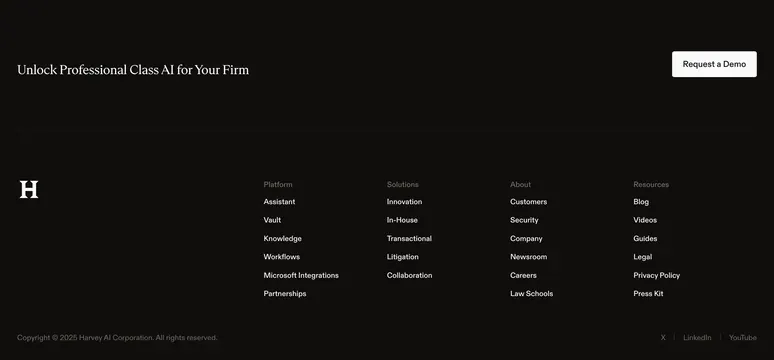
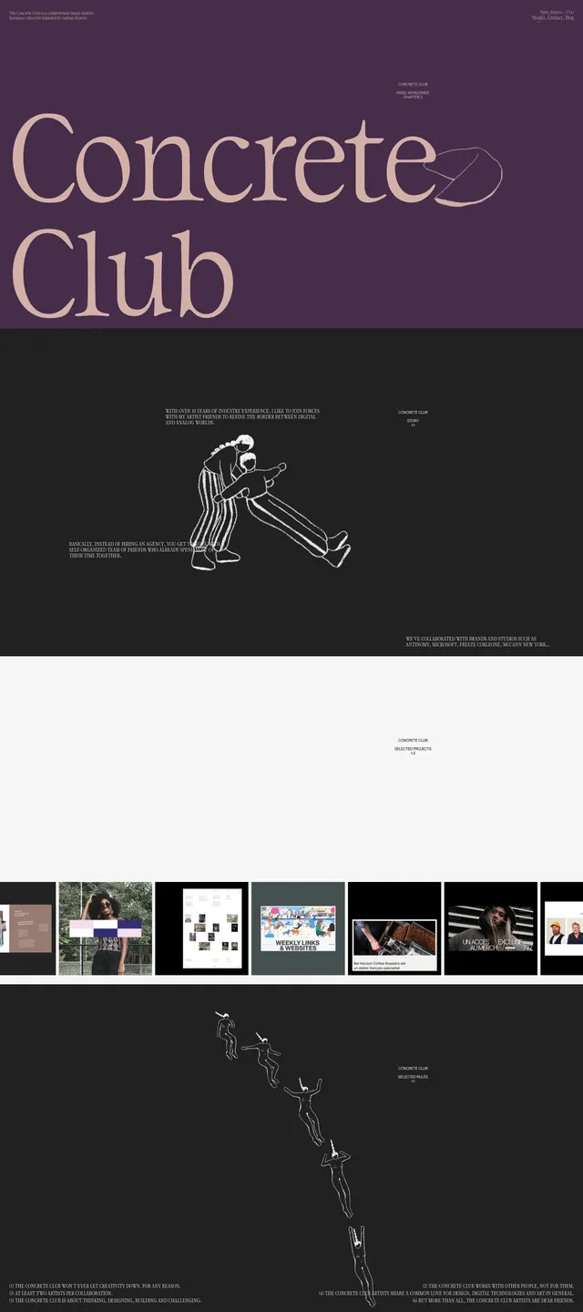
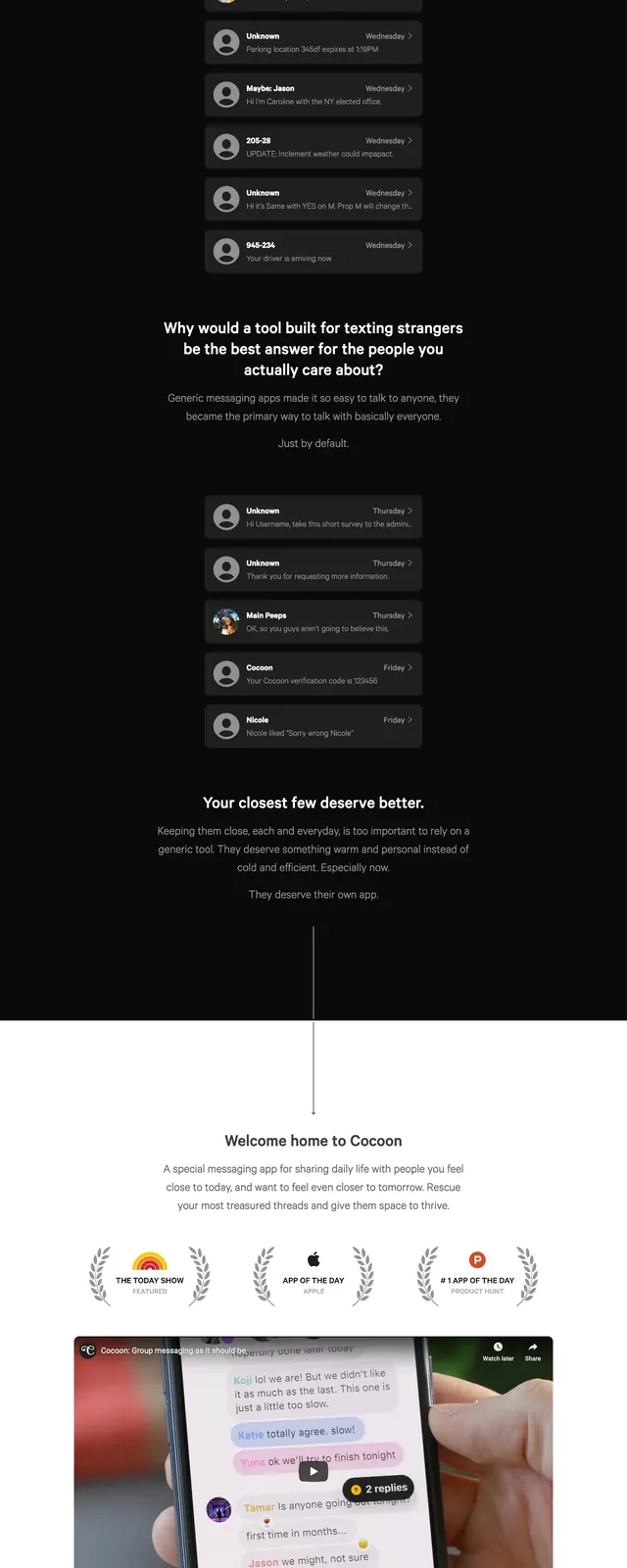
The page uses a near-black background with cream serif typography and small orange accent labels, creating a stark editorial contrast. The first screen features a small logo and top navigation, then a very large two-line headline followed by a short supporting paragraph and a horizontal rule. Lower sections mix a bold statement block, a quoted director's note, a simple org-chart diagram, a logo column, and a map-style location panel before ending on a light footer area.
Key takeaway
The strongest move is the newspaper-like hierarchy: oversized serif headlines, tight spacing, and restrained accents make the page feel premium and authoritative. The mix of long-form copy and structured data gives it the feel of a corporate annual report rather than a typical marketing site.
Reuse notes
Use this pattern for brands that want a serious, design-led corporate presence with lots of information to present. It works best when the content is text-heavy and can support editorial pacing, thin rules, and sparse color accents.