Preview image. Unlock full-res
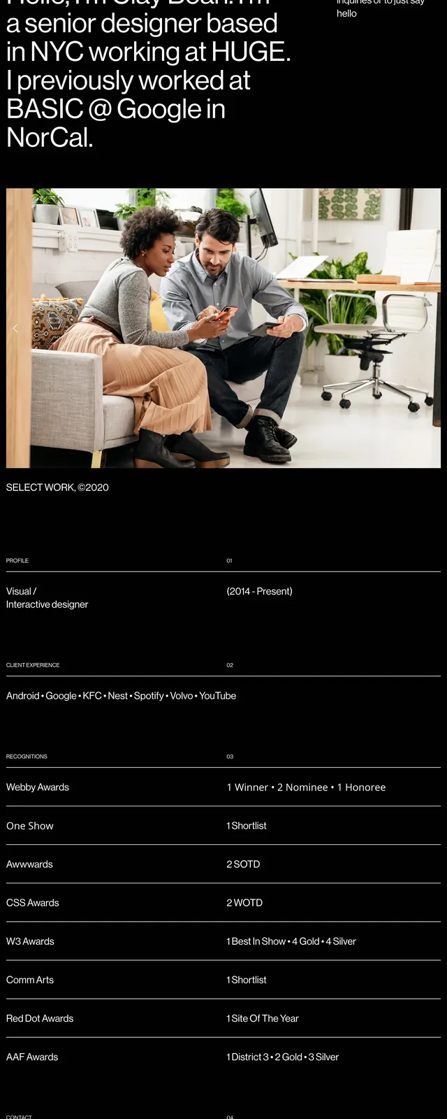
A stark black portfolio homepage built around oversized typography, editorial spacing, and a clean grid of profile details and credentials.
Summary
A stark black portfolio homepage built around oversized typography, editorial spacing, and a clean grid of profile details and credentials.
Visual description
The page opens with a large left-aligned intro paragraph in white text on a black background, paired with a small contact prompt on the upper right. Below the hero text are two wide photographic strips that act as portfolio imagery. Further down, the layout shifts into a structured resume-like section with labeled rows for profile, client experience, recognitions, and contact details separated by thin horizontal rules.
Key takeaway
The design relies on strong contrast, large typography, and deliberate spacing to feel premium and curated. It works well as a portfolio hero because it immediately communicates identity, experience, and credibility.
Reuse notes
This pattern is useful for designer or creative portfolios that need a minimal but high-status presentation. The lower section can be reused as a clean credentials module with simple dividers and compact metadata rows.