Preview image. Unlock full-res
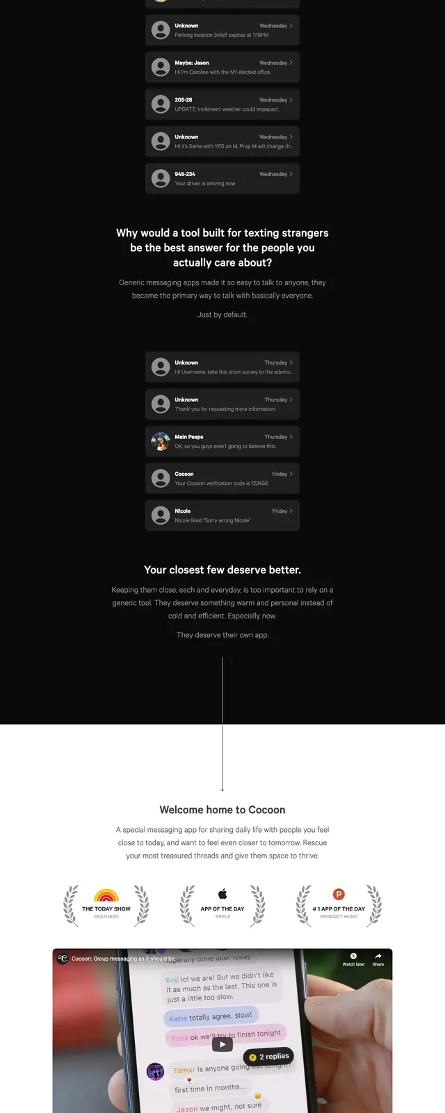
A dark, minimalist landing page for Cocoon uses a message-inbox metaphor to position the product as a safer communication app.
Summary
A dark, minimalist landing page for Cocoon uses a message-inbox metaphor to position the product as a safer communication app.
Visual description
The page opens with a centered hero on a nearly black background, a slim top navigation, and a small green primary CTA. Large headline text sits above a stacked column of rounded message cards that resemble an inbox, each with an avatar, sender name, timestamp, and preview text. Lower on the page, a short value proposition appears above a thin vertical divider leading into a faint footer area. The overall composition is sparse, high-contrast, and heavily dependent on spacing and subtle gray surfaces.
Key takeaway
The design sells privacy and closeness by turning ordinary messages into a visual argument for a dedicated app. The inbox-card stack is the core reusable pattern and the strongest visual hook.
Reuse notes
Reuse the centered headline plus card-stack layout for security, messaging, or community products. The dark monochrome palette and small green CTA are easy to adapt for other premium consumer apps.