Preview image. Unlock full-res
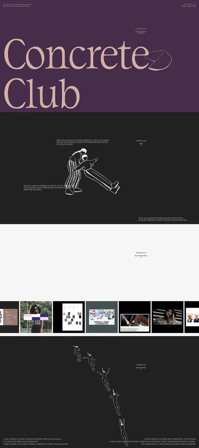
A stark editorial portfolio homepage with oversized serif branding, dark sectional breaks, and minimal project thumbnails.
Summary
A stark editorial portfolio homepage with oversized serif branding, dark sectional breaks, and minimal project thumbnails.
Visual description
The page opens with a full-bleed deep purple hero containing a huge serif wordmark reading Concrete Club, with tiny utility text in the corners. Below, the layout switches to a near-black section with centered thin white line-art figures and small blocks of condensed text, creating a gallery-like editorial rhythm. Farther down, a bright white section introduces a horizontal row of small project thumbnails and preview cards. The page continues with another dark section featuring vertically staggered line drawings and sparse footer-style copy.
Key takeaway
The main move is the contrast between oversized elegant serif typography and very sparse, dark editorial sections. Small thumbnails and line illustrations keep the layout feeling curated without adding visual clutter.
Reuse notes
Use this structure for portfolio or studio sites that need a strong art-directive presence with minimal content density. It works best when the brand can support high contrast, large type, and restrained imagery.