Preview image. Unlock full-res
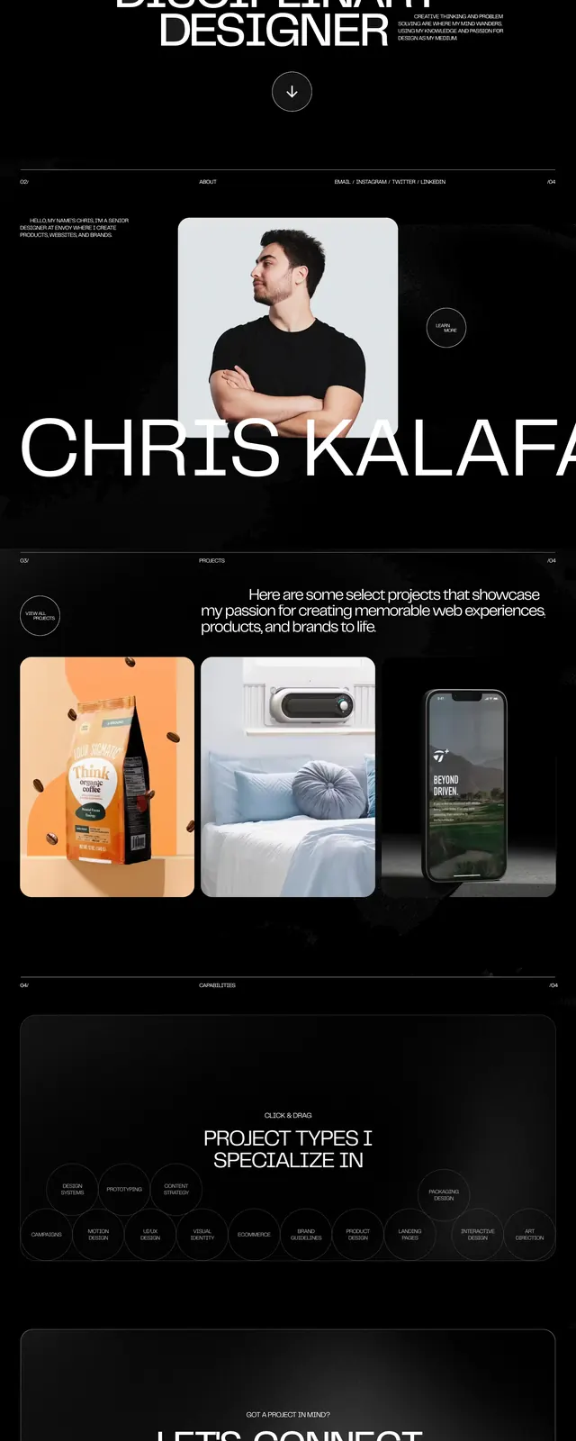
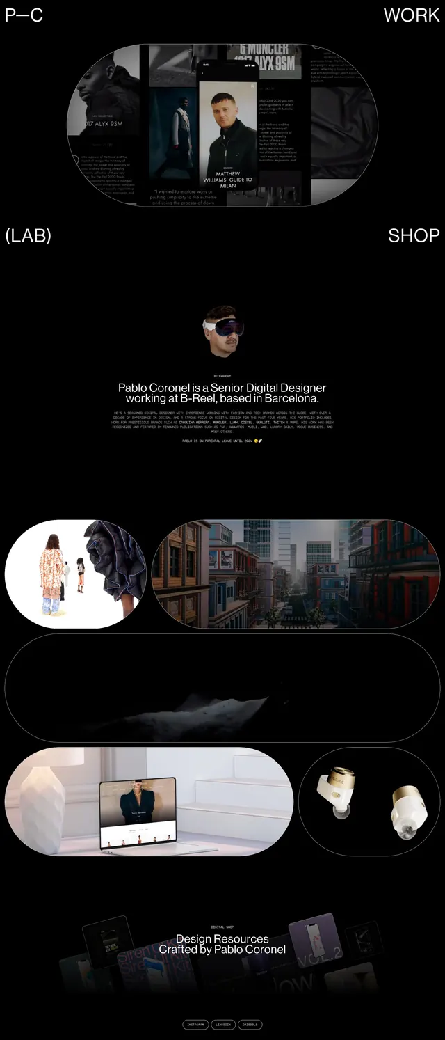
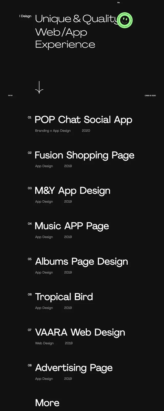
A minimalist dark portfolio homepage with oversized typography, sparse navigation, and a stacked list of featured projects.
Summary
A minimalist dark portfolio homepage with oversized typography, sparse navigation, and a stacked list of featured projects.
Visual description
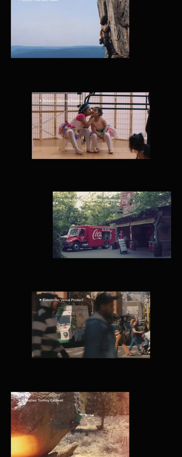
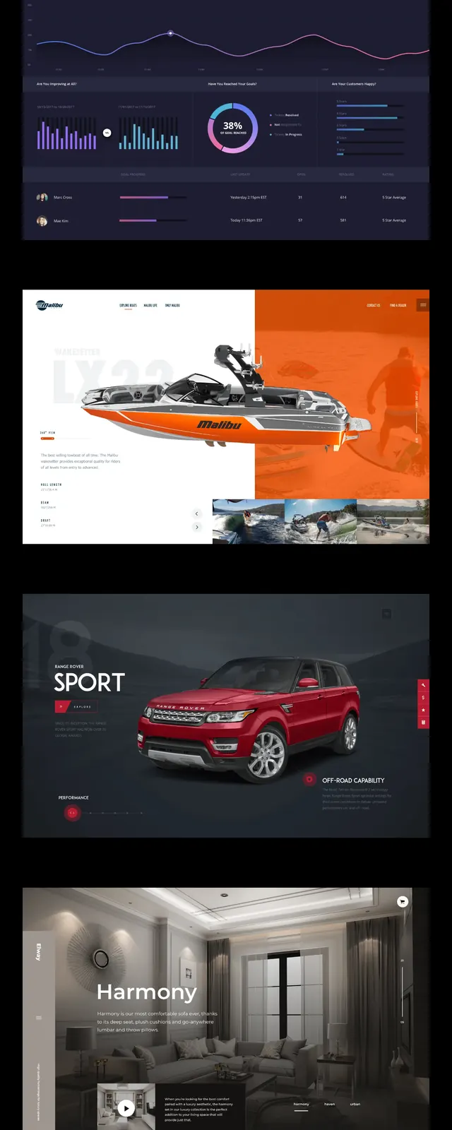
The page uses a near-black full-screen background with a small logo in the top left and minimal navigation links aligned across the top right. The hero headline is very large, white, and set in a clean sans-serif, with a smaller lead-in phrase sitting to the left and a bright circular badge overlapping the headline area. Below the fold, the layout continues as a vertical list of numbered project entries with large titles and small metadata lines, keeping the same stark black-and-white treatment throughout.
Key takeaway
Strong hierarchy comes from extreme type scale, wide spacing, and very few interface elements. The stacked project list turns the landing page into a portfolio index without breaking the visual system.
Reuse notes
Use this pattern for portfolio sites, creative studios, or personal design landing pages where the work list itself is the main content. It works best on dark backgrounds with restrained copy and a single accent graphic or badge.