Preview image. Unlock full-res
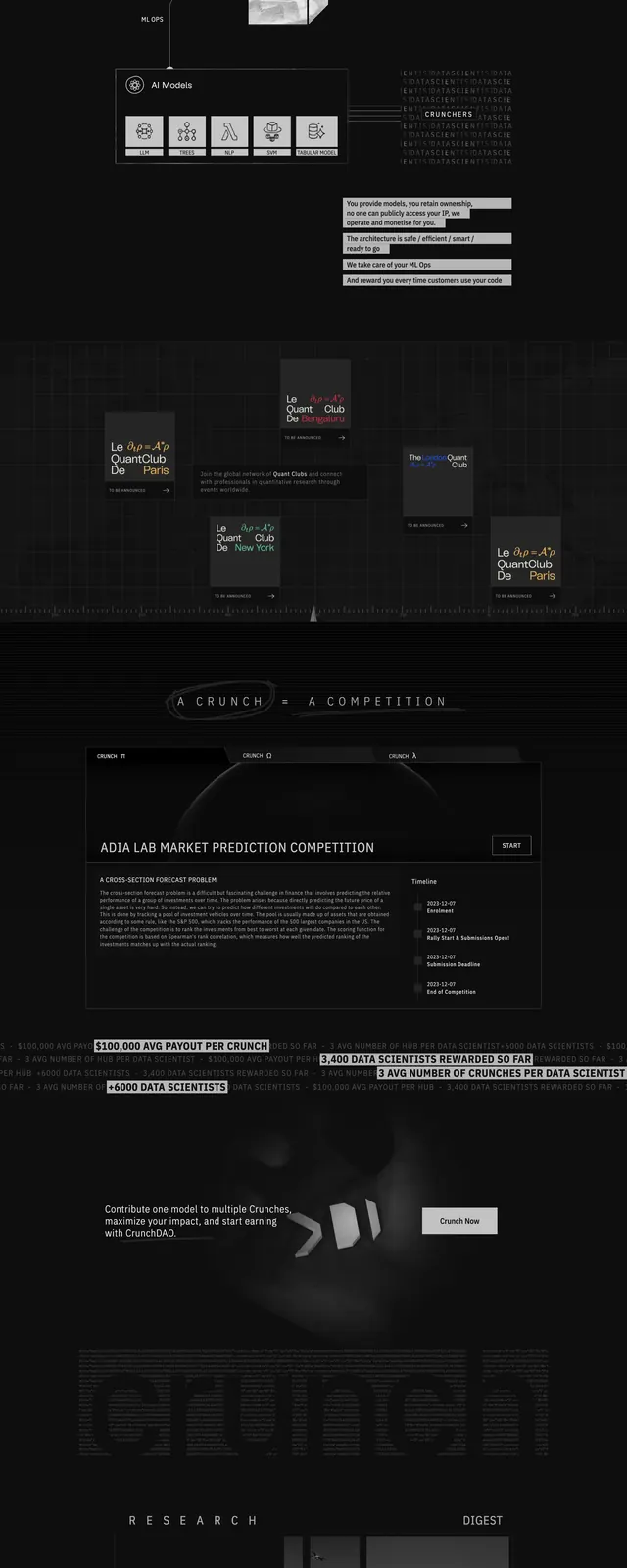
A dark, monochrome landing page for Crunchdao built around a technical grid, 3D spheres, and dense data-science messaging.
Summary
A dark, monochrome landing page for Crunchdao built around a technical grid, 3D spheres, and dense data-science messaging.
Visual description
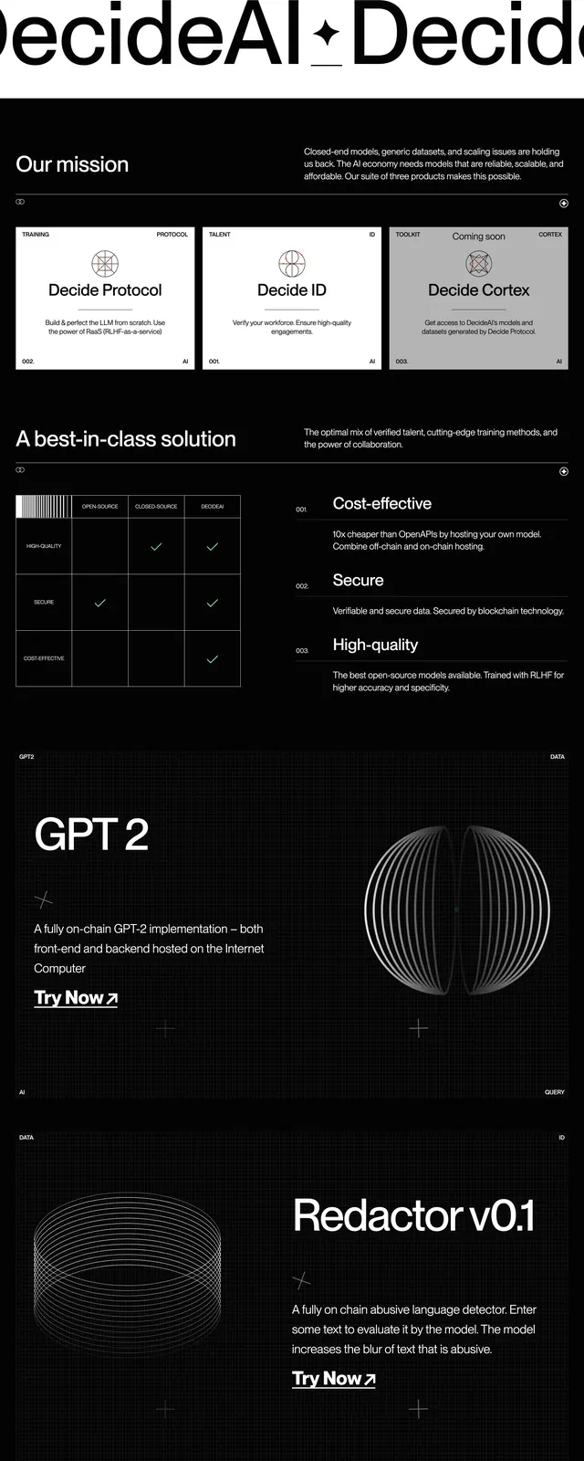
The page uses a black and charcoal palette with a rigid grid background, small top navigation, and a hero block pairing a bold headline with a single primary call to action. Large metallic 3D spheres float across the hero and continue into the next sections, reinforcing a computational, experimental feel. Below, the page shifts into dense explanatory sections with diagrams, a competition panel, statistic bars, testimonials, and a sparse footer. Most text is small and tightly arranged, with strong contrast and a heavily structured layout throughout.
Key takeaway
The strongest move is the combination of a strict grid system with tactile 3D objects, which makes a technical product feel more designed and memorable. It also shows how to keep a dark page readable by using modular blocks, restrained copy, and sharp contrast.
Reuse notes
Useful for AI, data, and developer-tool landing pages that need a serious, high-end tone. It works best when the content can support diagrams, stats, or process explanations; it will feel empty if replaced with generic marketing copy.