Preview image. Unlock full-res
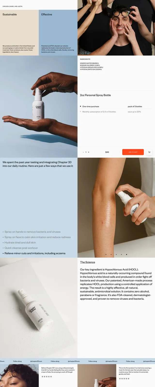
A clean, image-led product landing page for an antimicrobial skin cleanser with editorial layout and soft clinical branding.
Summary
A clean, image-led product landing page for an antimicrobial skin cleanser with editorial layout and soft clinical branding.
Visual description
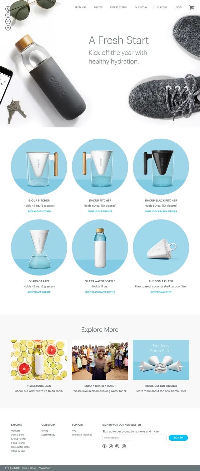
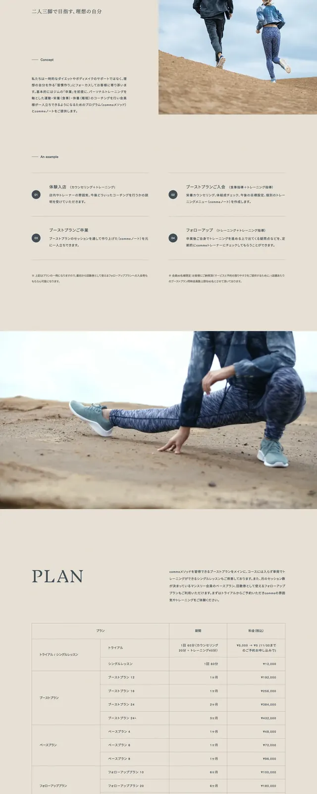
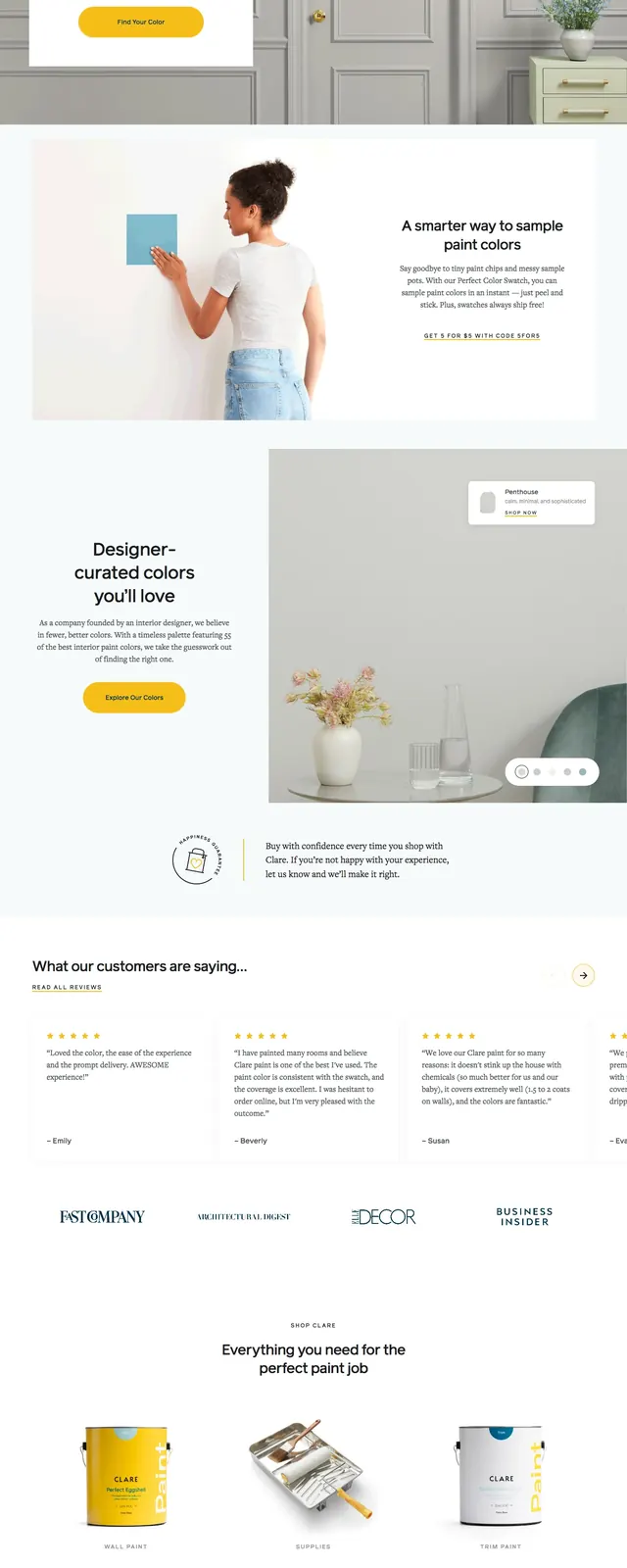
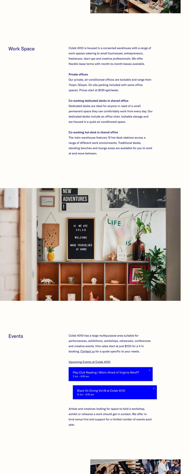
The page uses a soft blue and white palette with large product photography, tightly cropped lifestyle images, and plenty of open space. The top section presents the Chapter 20 bottle alongside short descriptive copy, followed by story text, usage notes, testimonial-style cards, and an FAQ area. The layout alternates between image blocks and text blocks in a clean editorial grid. Small navigation-like labels and minimal CTA styling keep the interface understated.
Key takeaway
The design combines clinical trust with lifestyle warmth through restrained colors, strong product imagery, and airy composition. It feels premium without becoming ornate.
Reuse notes
This approach works well for wellness, skincare, and health products that need credibility and visual softness. Reuse the asymmetric grid, minimal CTA treatment, and image-first storytelling for a polished DTC landing page.