Preview image. Unlock full-res
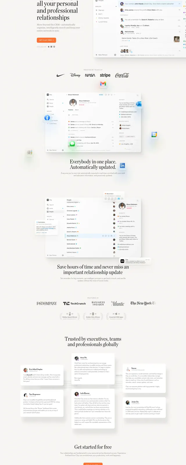
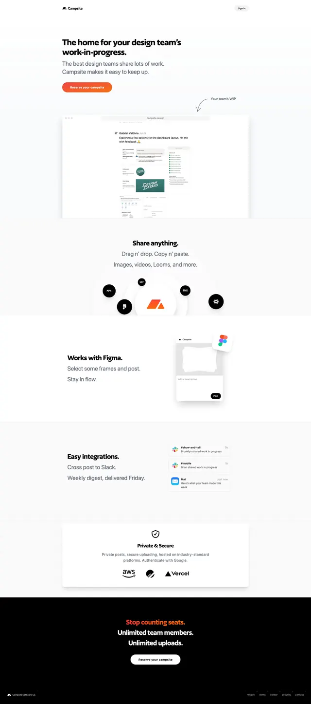
A minimal, light landing page for Campsite with an oversized work-in-progress headline, soft product mockups, and a dark closing CTA band.
Summary
A minimal, light landing page for Campsite with an oversized work-in-progress headline, soft product mockups, and a dark closing CTA band.
Visual description
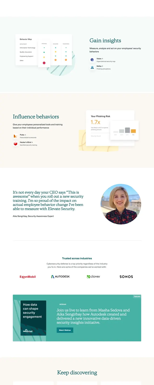
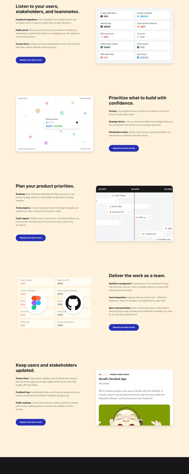
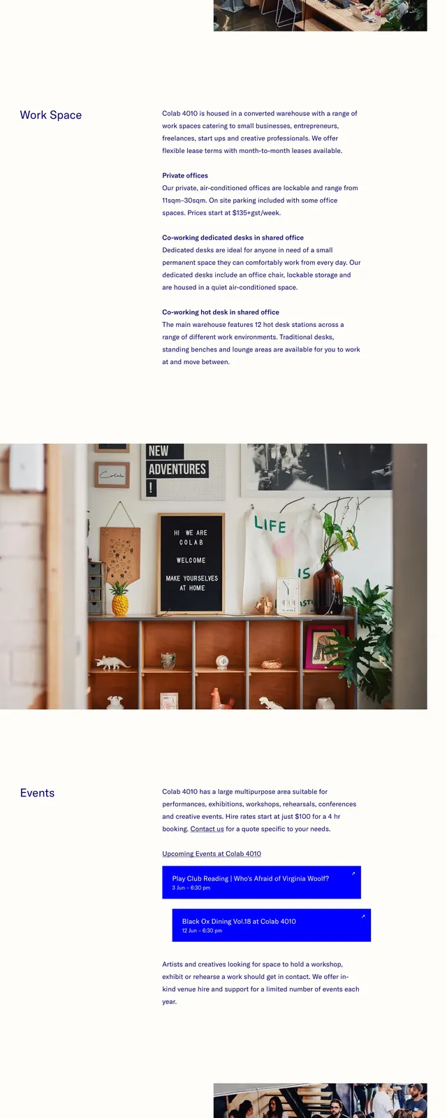
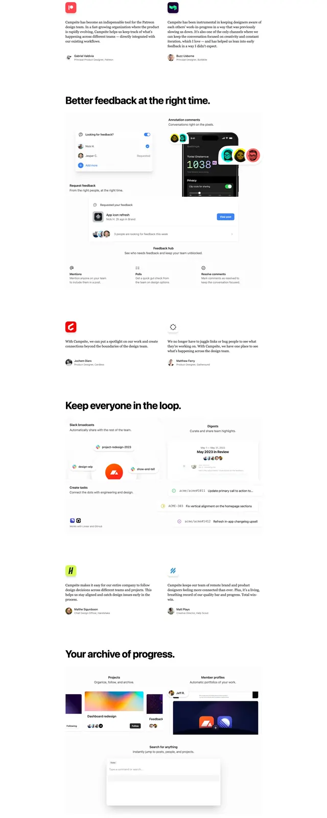
The page opens on a spacious white hero with a small Campsite wordmark at top left and a compact sign-in link at top right. A large bold headline sits left-aligned over a short supporting sentence and an orange primary button, followed by a faded product screenshot with an annotation arrow pointing to it. Lower slices show repeated feature callouts such as 'Share anything,' a Figma integration block, an integrations card row, a privacy and security panel with platform logos, and a final black CTA footer with centered white text and a rounded button.
Key takeaway
The design relies on extreme whitespace, one strong accent color, and soft floating mockups to keep the page calm but product-focused. The final dark CTA band creates a clear ending contrast without breaking the minimal system.
Reuse notes
Works well for SaaS or productivity products that want a premium, understated launch page with multiple feature sections. Reuse the floating screenshot treatment and sparse button hierarchy when the product UI is the main proof point.