Preview image. Unlock full-res
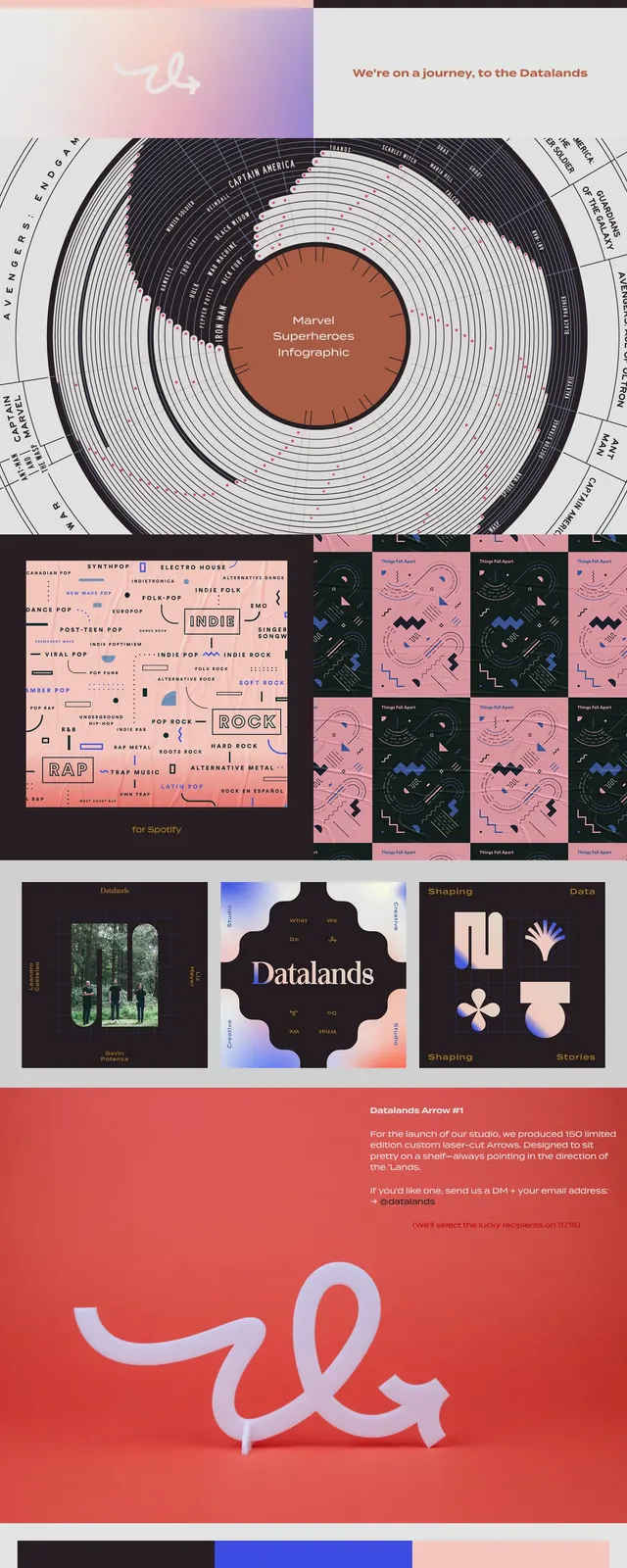
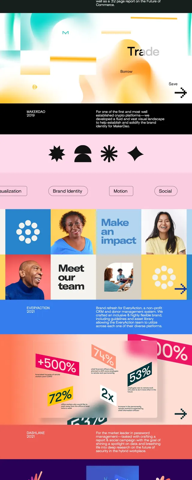
An airy agency homepage with a pastel gradient hero, editorial typography, and bold stacked content blocks.
Summary
An airy agency homepage with a pastel gradient hero, editorial typography, and bold stacked content blocks.
Visual description
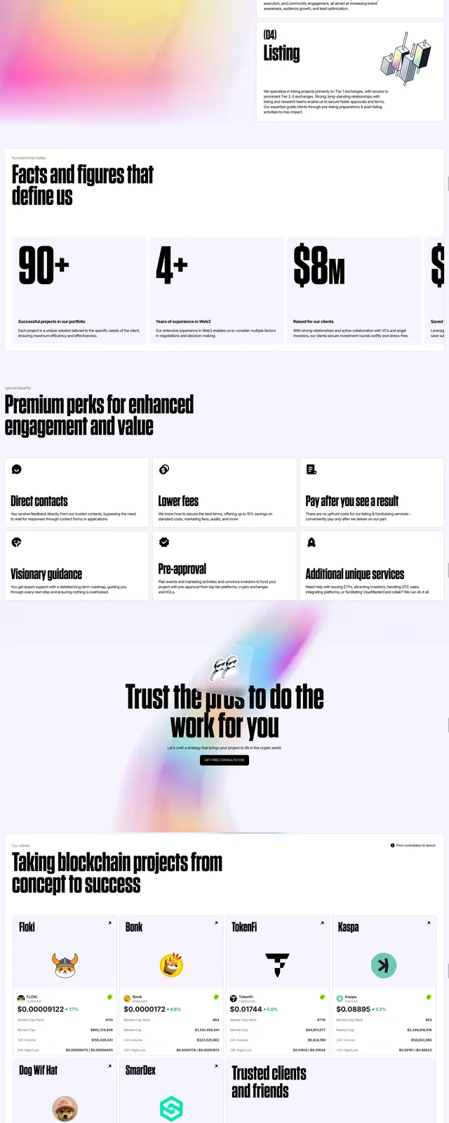
The page opens with a soft pink-to-blue gradient hero featuring the Datalands wordmark, floating line-art curves, and small status text in the corners. Below it sits a black full-width statement band with oversized serif and sans-serif typography, followed by a pink services strip with pill-shaped category chips. Midpage content includes a colorful 4-column bento-style case study grid with portraits, text tiles, and graphic blocks, then a lavender contact section and a dark footer with social links and a sign-up button.
Key takeaway
The design pairs refined editorial typography with playful abstract motion and soft gradients, creating a studio identity that feels polished but approachable. The structure is highly reusable for creative agencies or portfolio sites that want a strong brand-led opening and modular content sections.
Reuse notes
Reuse the gradient hero, oversized manifesto band, and pill-filter row as a flexible agency homepage framework. The bento case-study grid and minimal dark footer are easy patterns to adapt for portfolio, nonprofit, or brand-studio sites.