Preview image. Unlock full-res
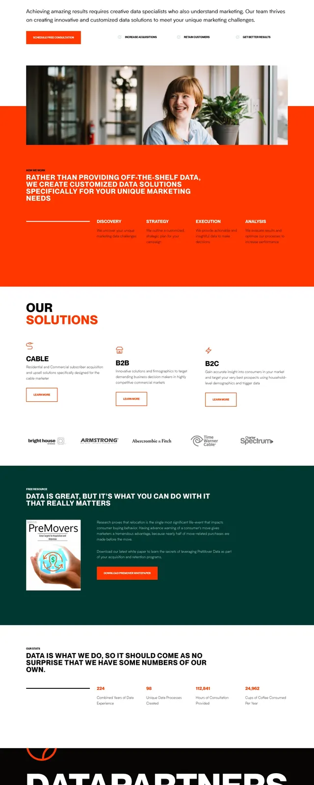
A high-contrast marketing agency hero built around oversized black typography, orange accents, and a clean white layout with stacked content slices below.
Summary
A high-contrast marketing agency hero built around oversized black typography, orange accents, and a clean white layout with stacked content slices below.
Visual description
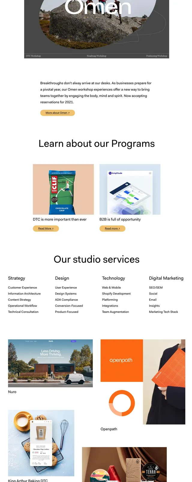
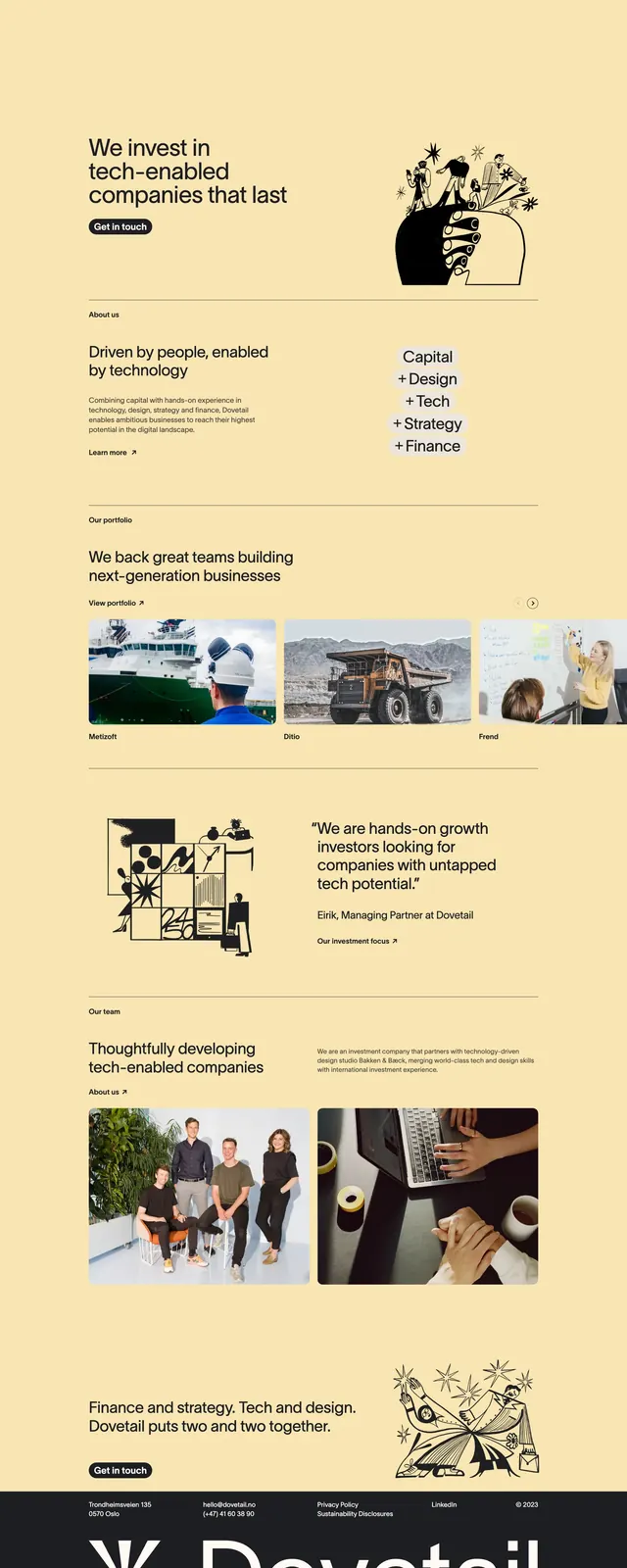
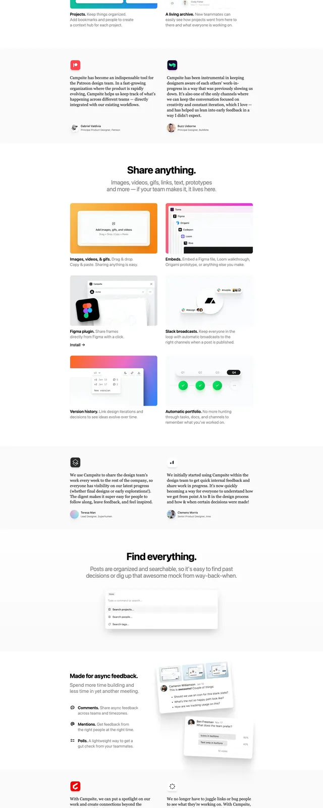
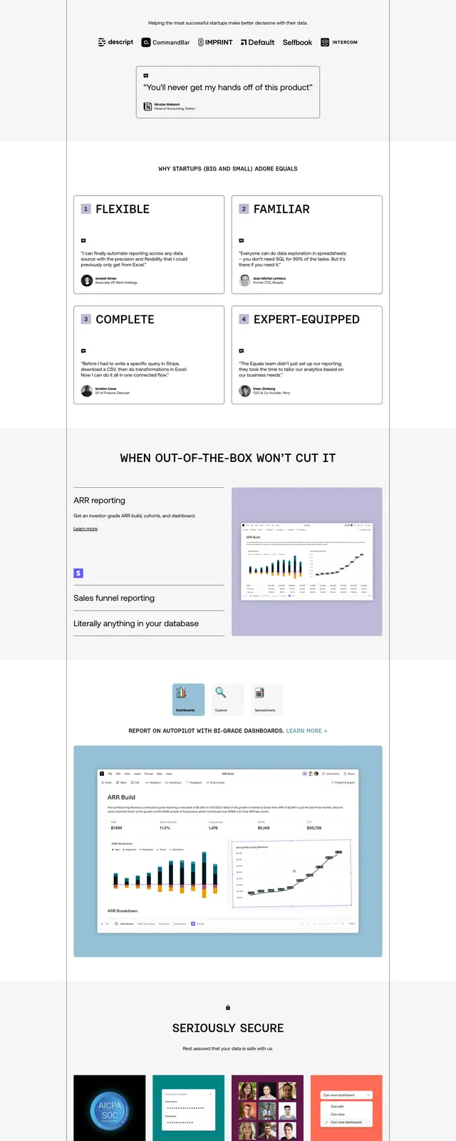
The page opens with a large centered hero headline in heavy black uppercase type, with the phrase "DATA PARTNER" highlighted in bright orange. A slim top navigation sits above a short supporting paragraph and a primary orange call-to-action button, followed by small inline benefit labels. Lower slices show a wide photographic image band, a bright orange content block, a three-column solutions grid, a dark green resource banner, a stats row, and a black footer with oversized brand wordmark.
Key takeaway
The design relies on strong hierarchy, minimal whitespace, and a vivid accent color to make a data-driven marketing message feel immediate and confident. It is structured for scanning, with repeated section blocks that can be reused in a B2B landing page.
Reuse notes
Use this as a pattern for agency or consultancy homepages that need a bold first impression without visual clutter. The headline treatment, orange CTA, and section stacking are the most reusable ideas.