Preview image. Unlock full-res
A 22-slide retail commerce report from DEPT that pairs black-on-white editorial text slides with full-bleed photographic chapter dividers, unified by an orange accent and a persistent running header and footer.
Summary
A 22-slide retail commerce thought-leadership report by DEPT, structured into six numbered chapters about the collapse of the traditional marketing funnel. Its personality comes from alternating two slide types: dense black-on-white editorial text pages and full-bleed photographic chapter dividers with white headlines, all tied together by a single orange accent and a fixed running header and footer.
Visual description
Slides run 16:9. The base system is black text (#111) on white with one orange accent (around #FF5800) used for the persistent bottom navigation bar, chart fills, callout boxes, and the period in the DEPT wordmark. A few slides also use a lighter amber (#F5A623) for secondary chart segments. Type is a clean grotesque sans, set very large for headlines (often filling the top third in mixed-case) and small for multi-column body copy. A consistent running header sits on every interior slide: the "DEPT." wordmark top-left, the centered deck title "Navigating the collapse of the retail funnel," and a page number top-right. The footer is an orange band carrying the six chapter labels ("01 RIP to the traditional funnel," "02 Owned digital channels," and so on), with the current chapter typically reversed out.
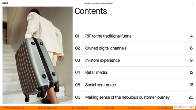
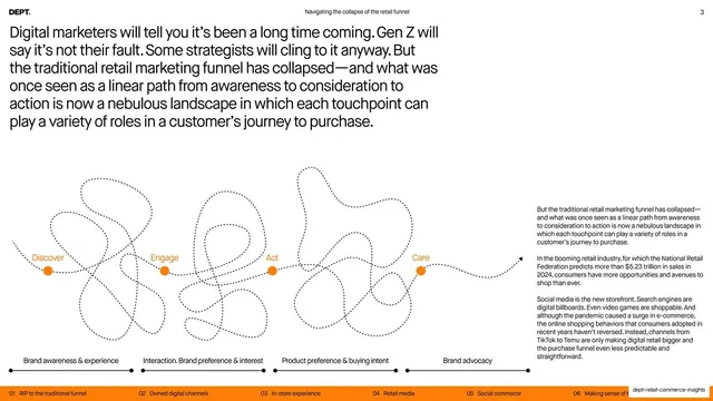
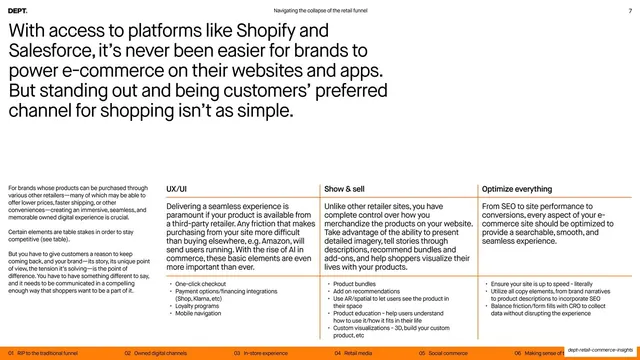
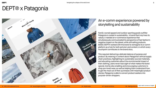
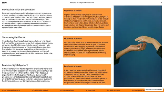
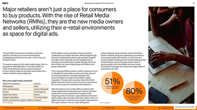
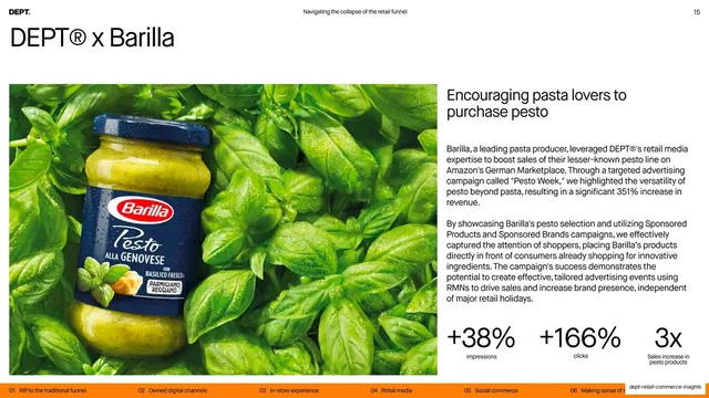
Recurring layouts: chapter-divider slides that fill the frame with moody editorial photography (portraits, still lifes, landscapes) and overlay a giant semi-transparent ghosted chapter number behind a large white chapter title; multi-column body slides with a big top headline over two to four columns of running text, sometimes with an inline image or pyramid diagram; orange callout boxes labeled "Experiences to emulate" or "research" pull-quotes; data slides built on flat orange-and-amber donut and pie charts with large percentage figures; a contents page with numbered entries and page numbers on hairline rules; and brand case-study slides ("DEPT x Patagonia," "DEPT x Barilla," "DEPT x Peter Thomas Roth") that pair a left product or UI image with a right column of body copy and a row of result metrics. The cover and closing reuse the same warm-toned portrait, and the closing "About DEPT" slide adds social icons and a contact URL.
Key takeaway
The two-mode rhythm: dense, utilitarian information slides interleaved with full-bleed photographic dividers that give the eye a rest and reset each chapter. The single orange accent doing all the wayfinding work, anchored by a persistent header and chapter-strip footer so a long report never loses its place. And the ghosted oversized chapter numeral behind the divider headline, which signals structure without a separate agenda slide.
Reuse notes
A strong reference for long-form report, whitepaper, and thought-leadership decks, especially in retail, ecommerce, marketing, and agency contexts. The chapter-divider-plus-running-footer system scales cleanly to any multi-section document and keeps dense data slides legible. Depends on genuinely good editorial photography to carry the dividers and on disciplined typographic hierarchy for the text-heavy pages. The orange-on-white palette is bright and confident but ties the deck to one brand color; reskin the accent to repurpose.