Preview image. Unlock full-res
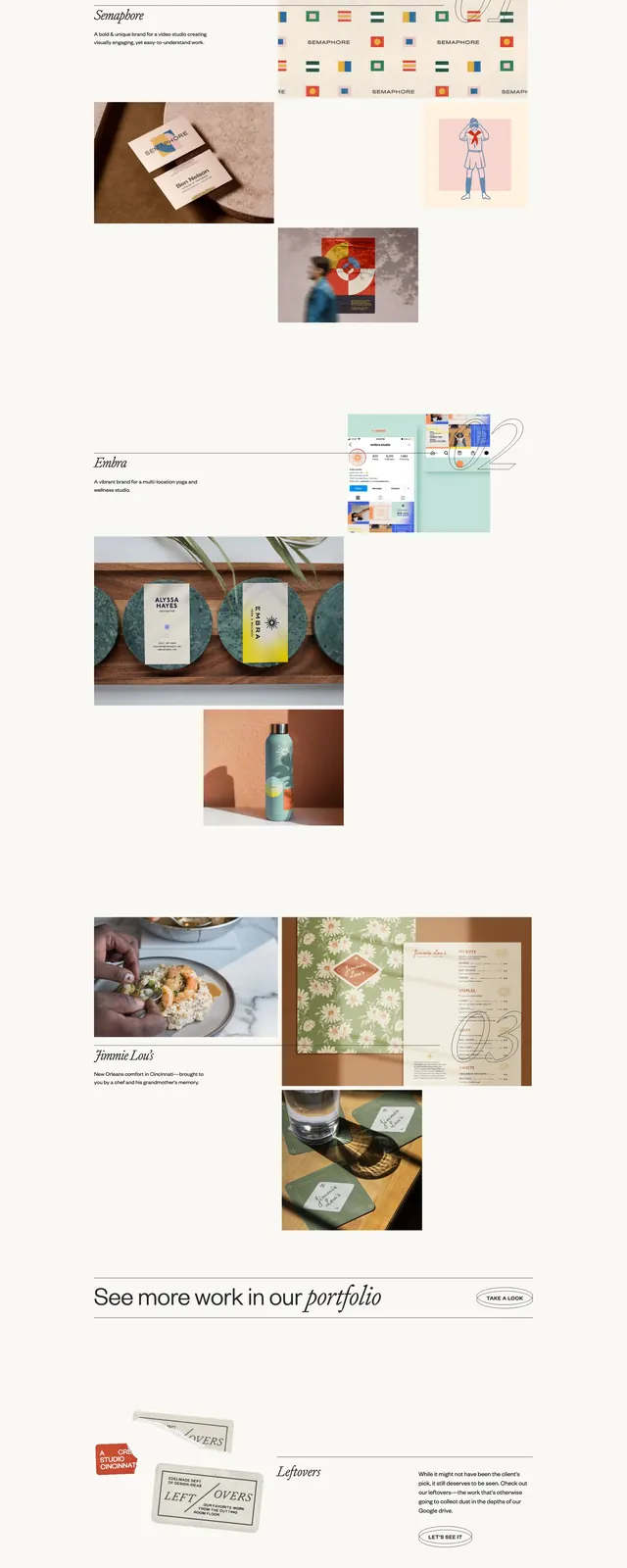
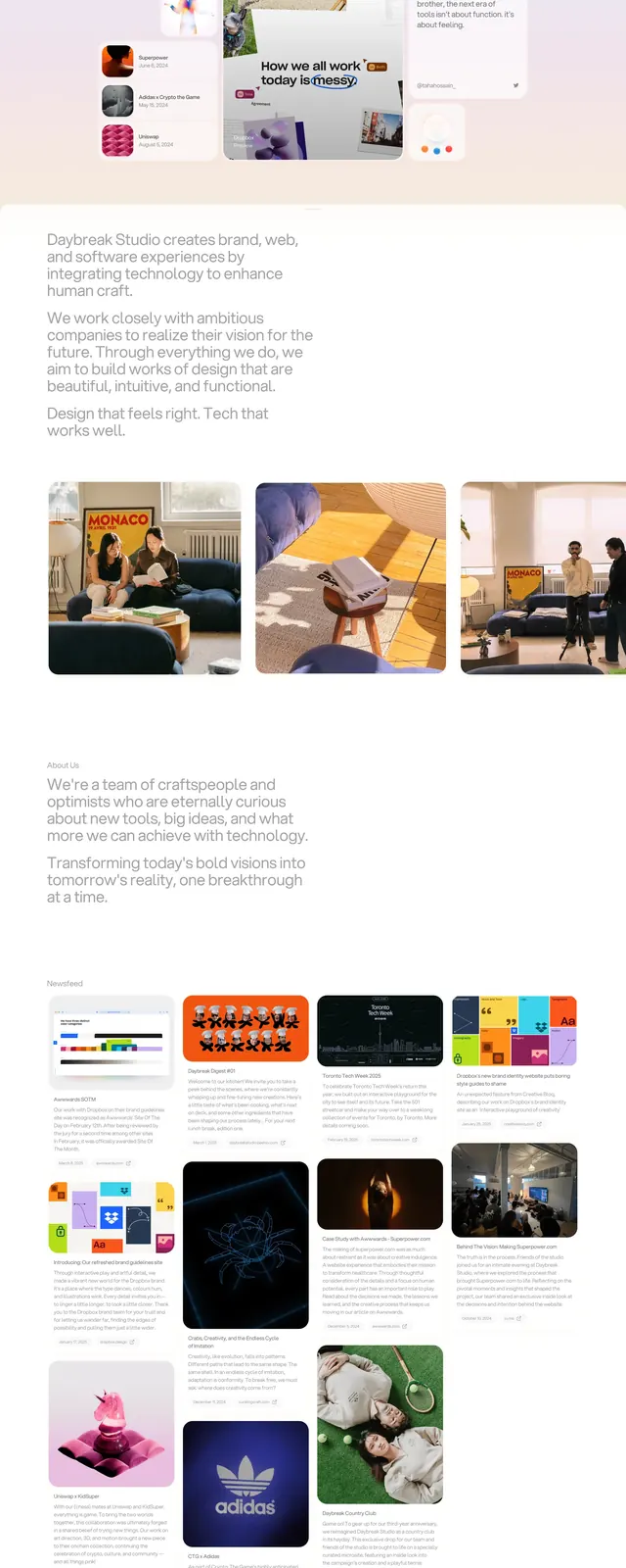
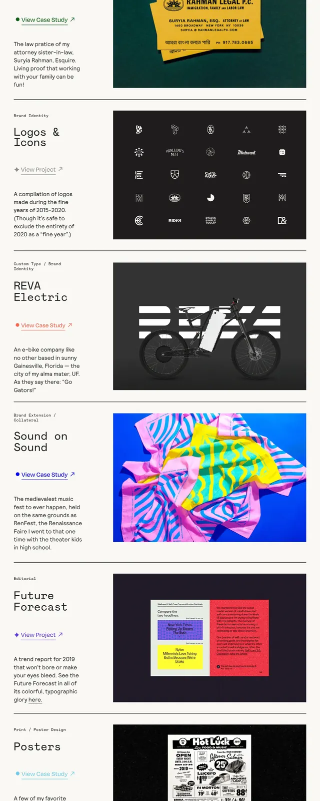
A minimalist editorial portfolio page with large typographic intros, thin dividers, and stacked project case-study previews.
Summary
A minimalist editorial portfolio page with large typographic intros, thin dividers, and stacked project case-study previews.
Visual description
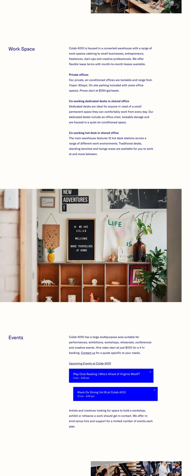
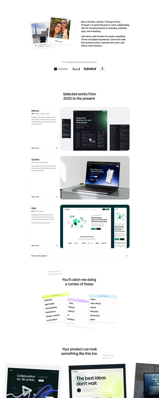
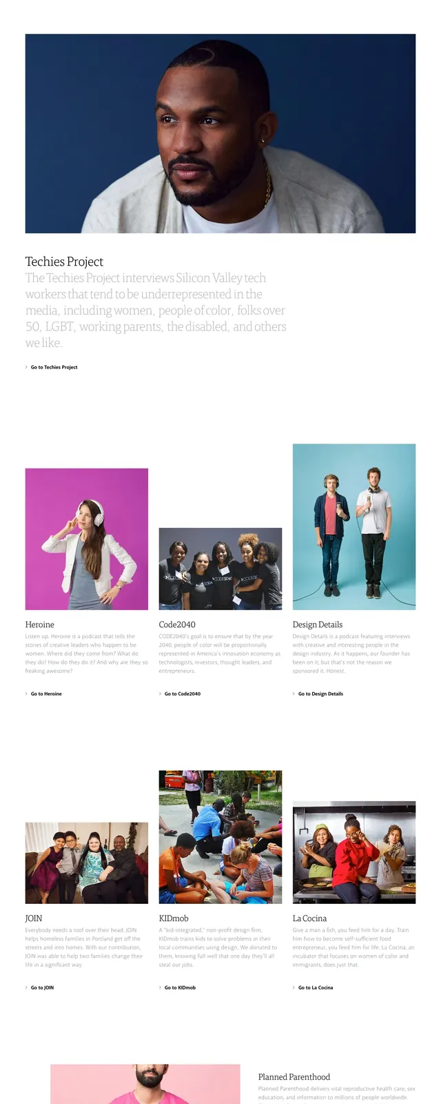
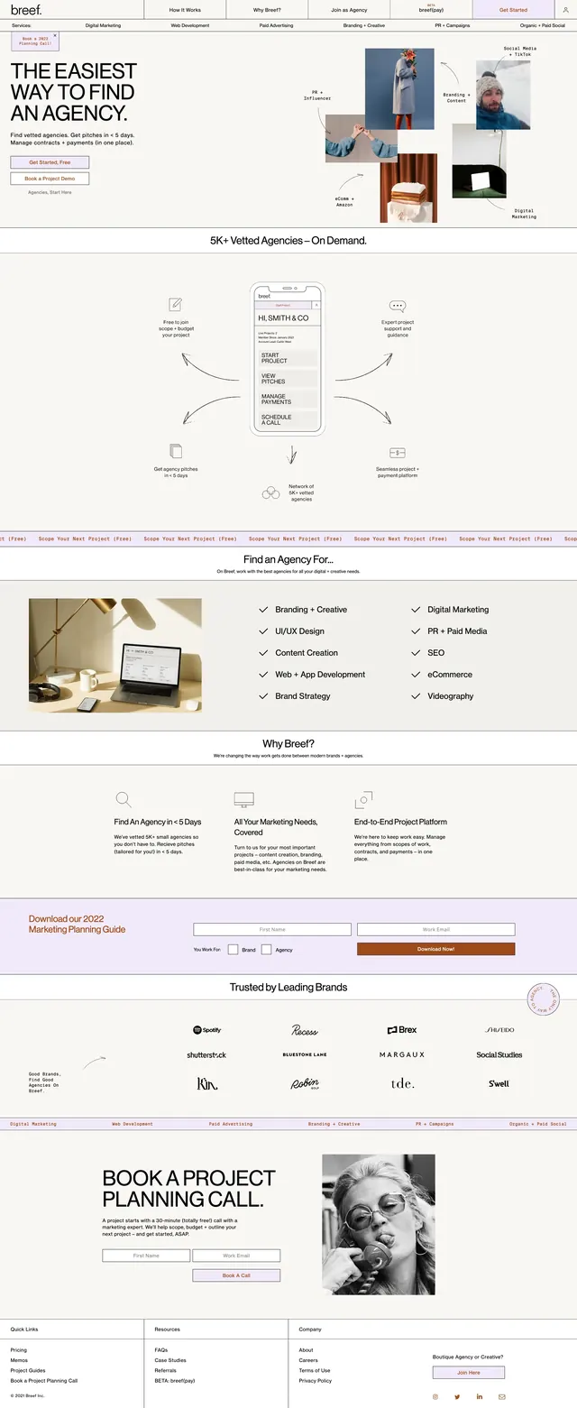
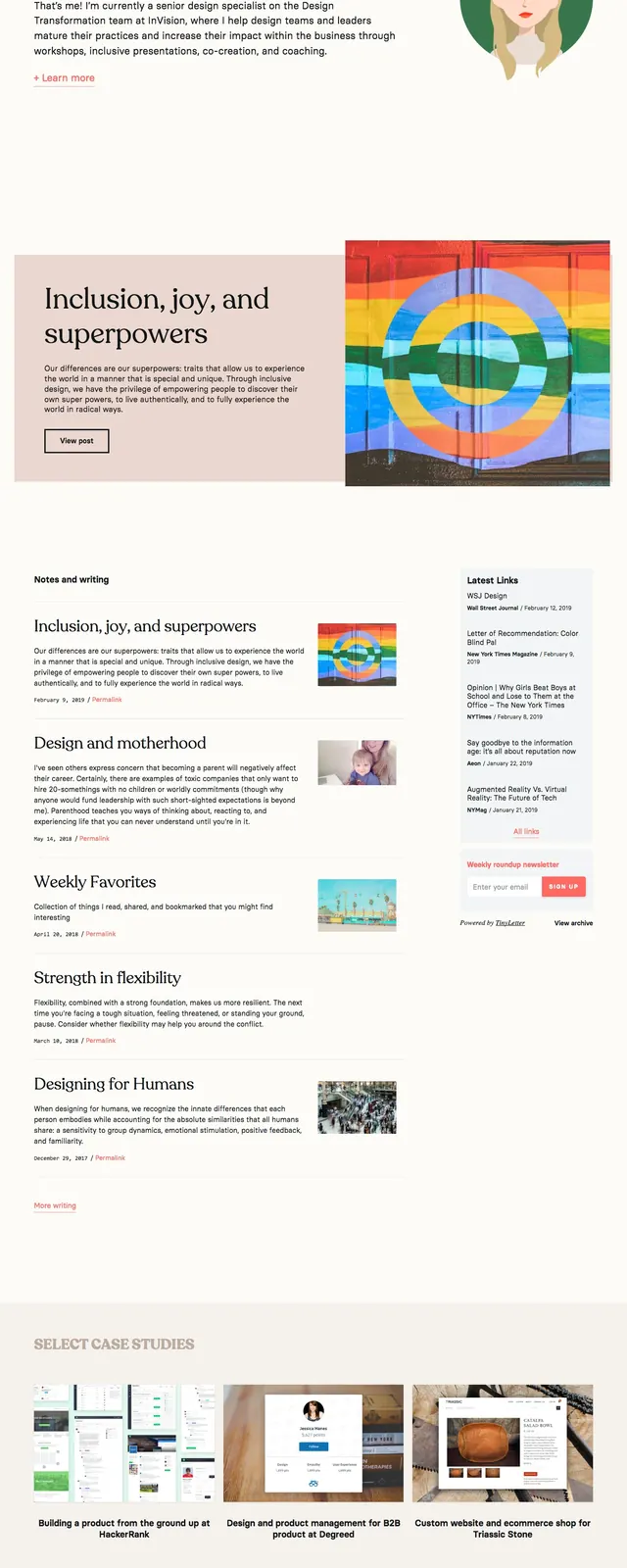
The page uses a soft off-white background with thin horizontal rules, dark charcoal text, and generous spacing. A short intro sits at the top with a simple navbar, followed by vertically stacked project entries where text appears on the left and large project images appear on the right. Each project block includes a small category label, a bold title, a case-study link, and a short descriptive paragraph. The overall composition feels like a curated editorial index rather than a standard marketing page.
Key takeaway
This design works well for creative portfolios that need to showcase multiple projects with strong visual hierarchy and restrained presentation. The combination of oversized type, light background, and large imagery makes the work feel polished and easy to scan.
Reuse notes
Reuse the structure for portfolio homepages, agency case-study indexes, or artist/project archives. Keep the dividers, left-aligned text blocks, and image-led previews to preserve the same editorial rhythm.