Preview image. Unlock full-res
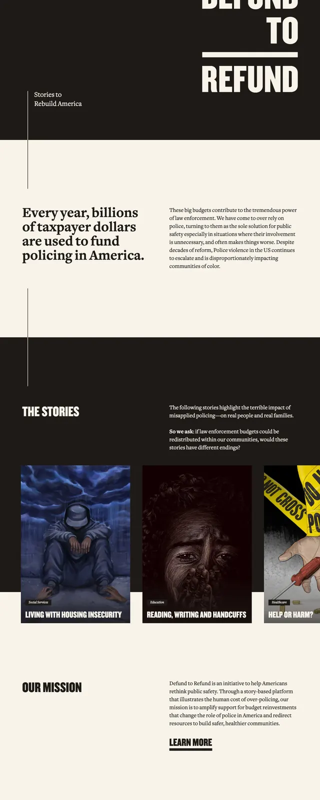
A stark activist landing page uses oversized editorial typography, deep contrast, and story cards to frame a nonprofit campaign around public safety and budget redistribution.
Summary
A stark activist landing page uses oversized editorial typography, deep contrast, and story cards to frame a nonprofit campaign around public safety and budget redistribution.
Visual description
The page opens with a dark hero panel featuring a huge stacked headline on the right and a small menu icon in the top-left. Below, a cream content band holds a large serif statement paired with a narrow explanatory paragraph, separated by thin vertical rules. Farther down, a dark section introduces 'The Stories' with three image cards in a row, each carrying bold all-caps titles and small category badges. The page ends with a mission statement area and a minimal footer with social icons and links.
Key takeaway
The design leans on strong contrast, editorial hierarchy, and activist messaging to create urgency and authority. Large typography and restrained spacing make it feel like a magazine cover translated into a campaign site.
Reuse notes
Reuse the layout for cause-driven or editorial brands that need a high-impact first impression and a narrative-driven scroll. The split dark/light sections and story-card grid are especially adaptable for nonprofit campaigns and documentary-style storytelling.