Preview image. Unlock full-res
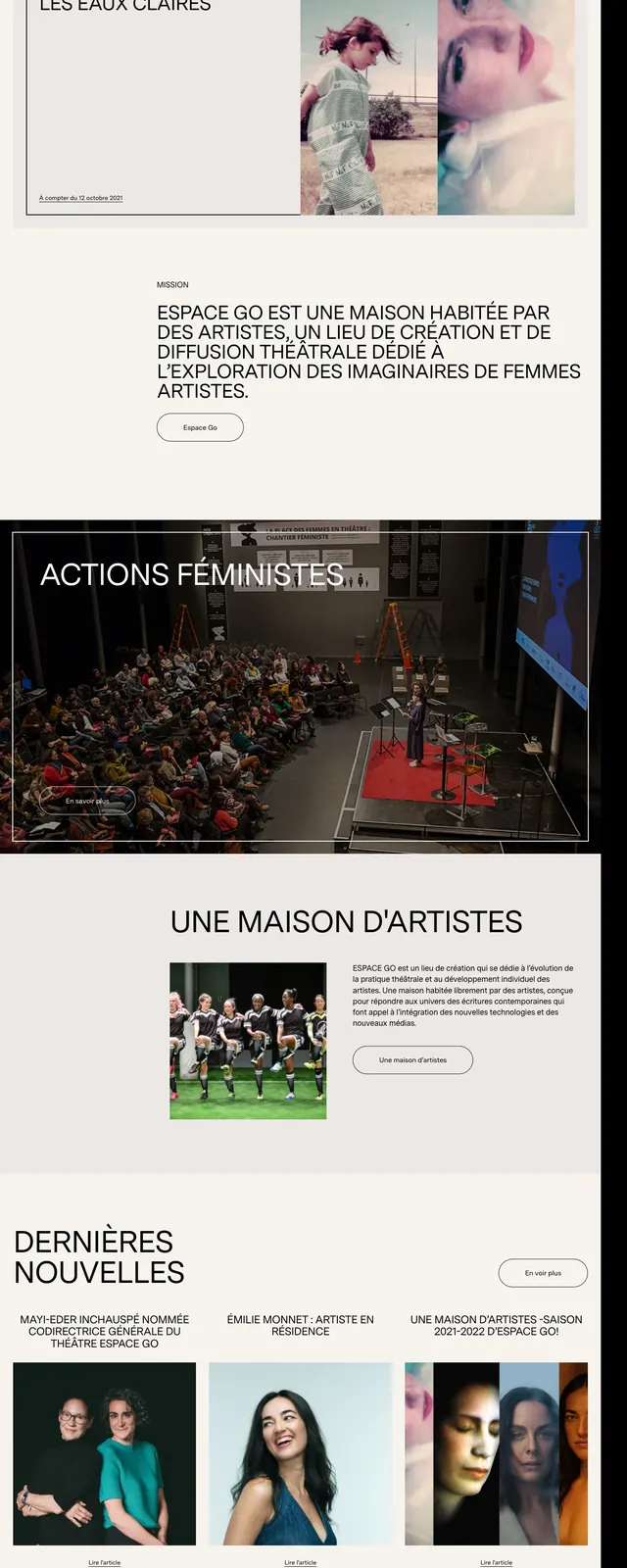
A stark black-and-cream cultural homepage with oversized typography, tall portrait imagery, and magazine-style section blocks.
Summary
A stark black-and-cream cultural homepage with oversized typography, tall portrait imagery, and magazine-style section blocks.
Visual description
The page opens with a large black hero area dominated by the stacked wordmark "ESPACE GO" on the left and a row of tall portrait images on the right. Thin white UI text, small menu labels, and outlined pill buttons sit over the dark background with a very restrained Swiss editorial feel. Lower slices show a light section with article-like cards, a full-bleed event photo framed by a thin border, an about block with centered headline and supporting text, and a dark footer-style subscription area with oversized typography and a simple email form.
Key takeaway
Use oversized type, strong black-and-white contrast, and vertical portrait crops to create a refined arts-and-culture landing page. The layout mixes framed content blocks with generous whitespace for a gallery-like editorial rhythm.
Reuse notes
Best reused for nonprofit, cultural, or exhibition websites that need a sophisticated landing page with a strong visual identity. The structure works well when sections alternate between full-bleed imagery and clean text-led panels.