Preview image. Unlock full-res
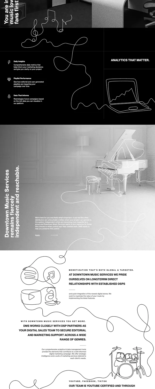
A monochrome, split-layout music/agency landing page with hand-drawn line art, bold vertical messaging, and a stark black-and-white aesthetic.
Summary
A monochrome, split-layout music/agency landing page with hand-drawn line art, bold vertical messaging, and a stark black-and-white aesthetic.
Visual description
The page opens with a dark hero featuring a top navigation bar, a large line-art musician illustration, and vertically set headline text along the left edge. A right-side text block introduces the brand with a compact call-to-action. Below, the design shifts into a light section with another line-art composition and then into a grayscale promotional section with vertical copy over a photographic background. The lower portion includes a contact area with form fields, a large message box, and a minimal dark footer with brand details and contact information.
Key takeaway
The design relies on extreme contrast, restrained typography, and continuous hand-drawn line art to create a memorable editorial feel. Its split-screen structure and vertical text treatment make the layout feel unconventional but still highly navigable.
Reuse notes
This approach works well for music, creative agencies, or culture-focused brands that want a premium monochrome identity. Reuse the vertical headline treatment, sparse CTA blocks, and sketch-like illustrations to make otherwise simple sections feel curated.