Preview image. Unlock full-res
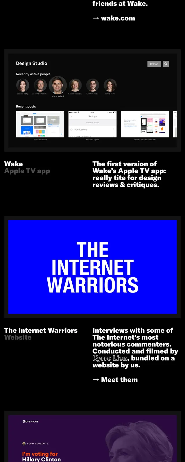
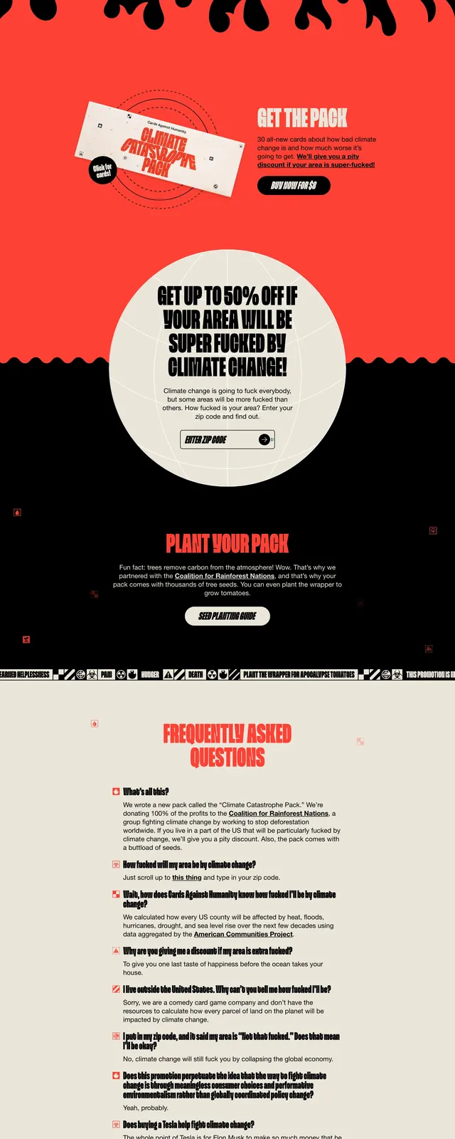
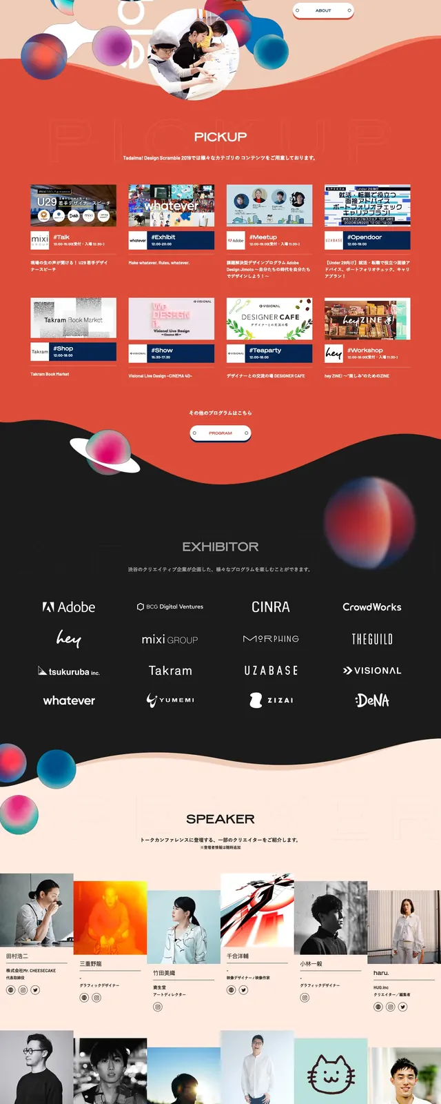
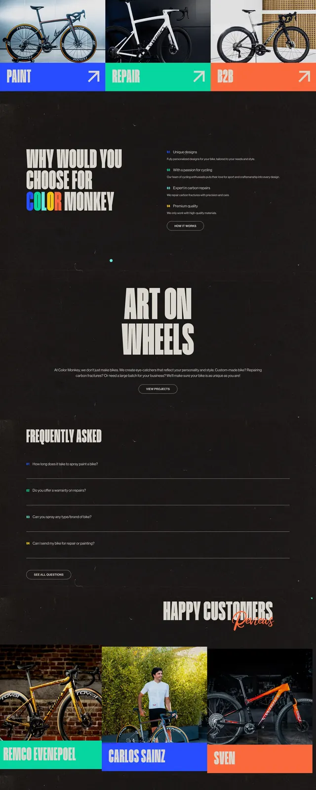
A bold event landing page with oversized typography, electric orange blocks, and editorial image cut-ins.
Summary
A bold event landing page with oversized typography, electric orange blocks, and editorial image cut-ins.
Visual description
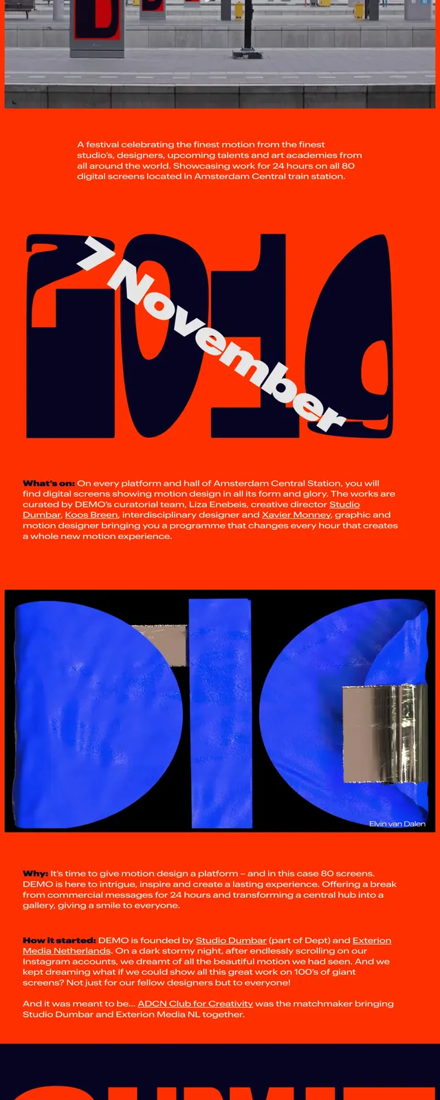
The page uses a bright orange background with deep navy panels and huge cropped letterforms that dominate the composition. A thin top navigation sits above a poster-like hero, followed by embedded photography and stacked promotional sections. The layout mixes large typographic blocks, diagonal text treatment, and small informational copy to create a festival-poster feel. Footer-like sponsor and contact rows close the page with compact logos and links.
Key takeaway
The strongest idea is turning the entire page into a motion-poster system, where typography becomes the primary visual asset. It feels aggressive, curated, and event-driven rather than like a standard marketing site.
Reuse notes
Reuse this approach when you want a landing page to feel like an immersive campaign poster with strong brand recall. The same structure works well for conferences, festivals, exhibitions, and creative calls to action.