Preview image. Unlock full-res
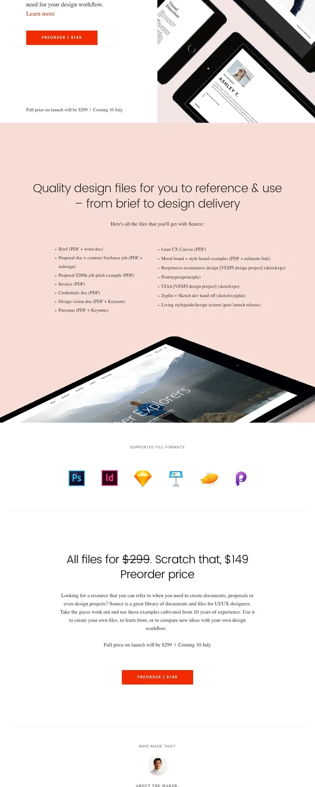
A minimal editorial landing page for Design Source with a large hero, product mockups, and a preorder CTA.
Summary
A minimal editorial landing page for Design Source with a large hero, product mockups, and a preorder CTA.
Visual description
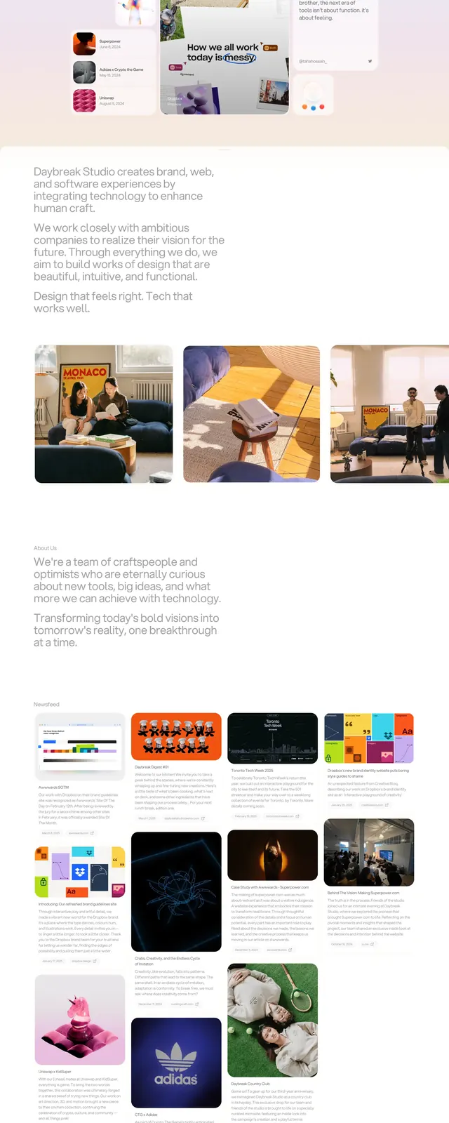
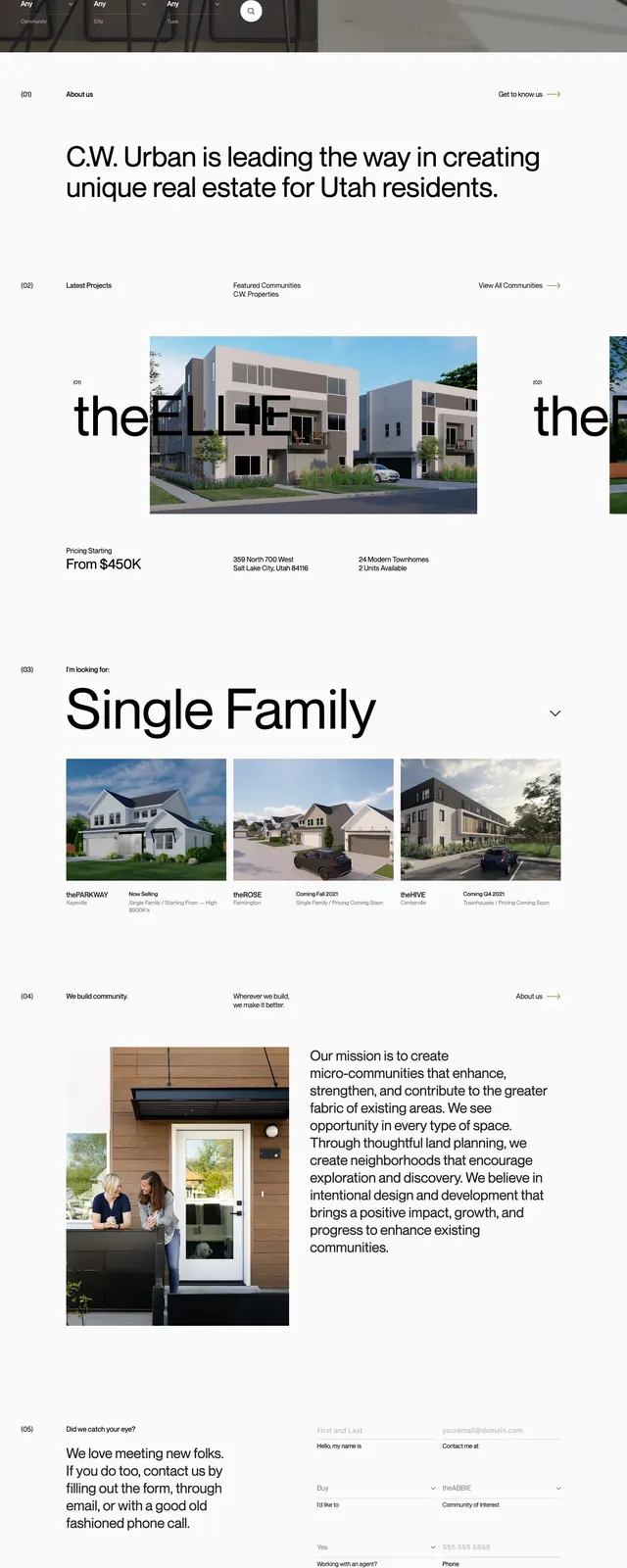
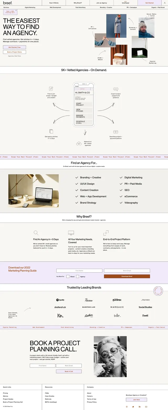
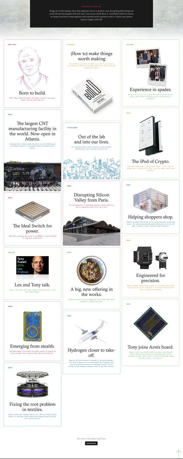
The top screen is a split hero with the wordmark at upper left, a large oversized headline, short supporting copy, and a bright orange preorder button. The right side is filled with angled tablet and device mockups on a pale pink background, creating a product-showcase feel. Below the hero are small bullet lists of included files, a supported-formats strip with app icons, a second centered CTA, and a simple about-the-maker section with a small avatar and short bio. The overall page uses very large white space, thin serif accents, and restrained black text with one vivid accent color.
Key takeaway
A strong reuse pattern is the mix of minimalist editorial spacing with large angled product imagery to make a digital product feel tangible. The single vivid CTA color provides clear hierarchy without breaking the calm layout.
Reuse notes
Works well for preorder pages, digital product launches, creative tool kits, or portfolio product pages. Best when the goal is to feel polished and premium; it depends on high-quality mockups and will look sparse if the imagery is weak.