Preview image. Unlock full-res
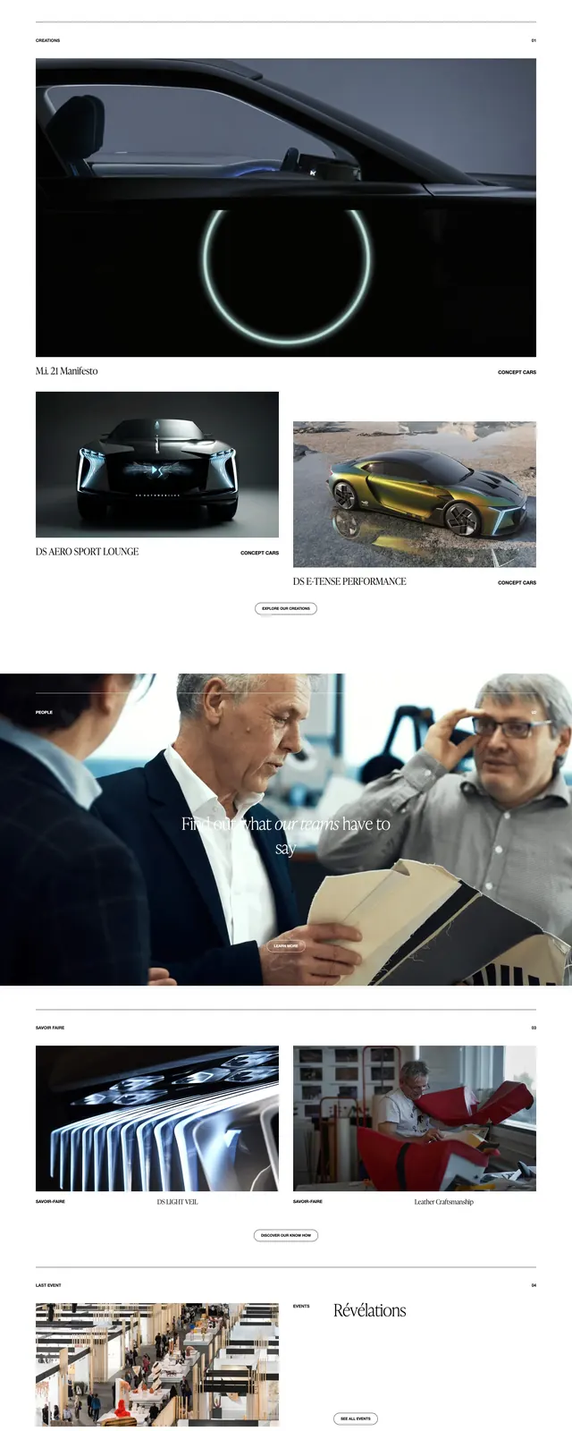
An editorial, museum-like landing page that combines oversized serif headlines with dark gallery sections and sparse white content blocks.
Summary
An editorial, museum-like landing page that combines oversized serif headlines with dark gallery sections and sparse white content blocks.
Visual description
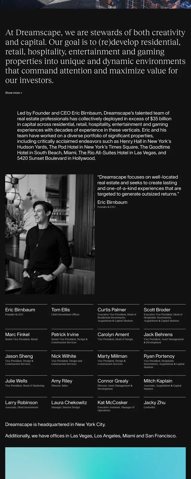
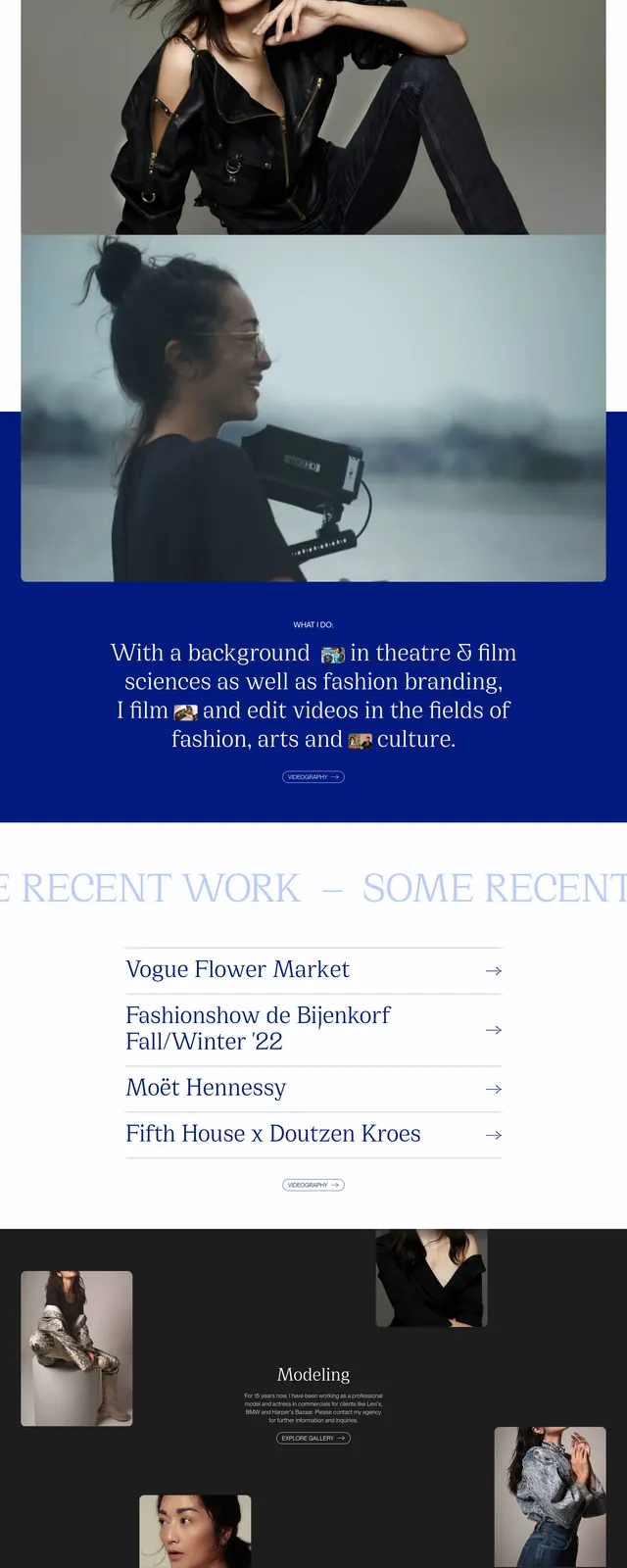
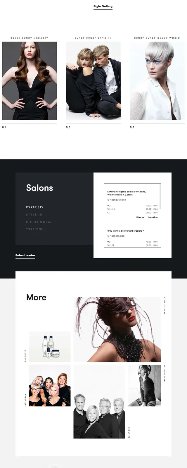
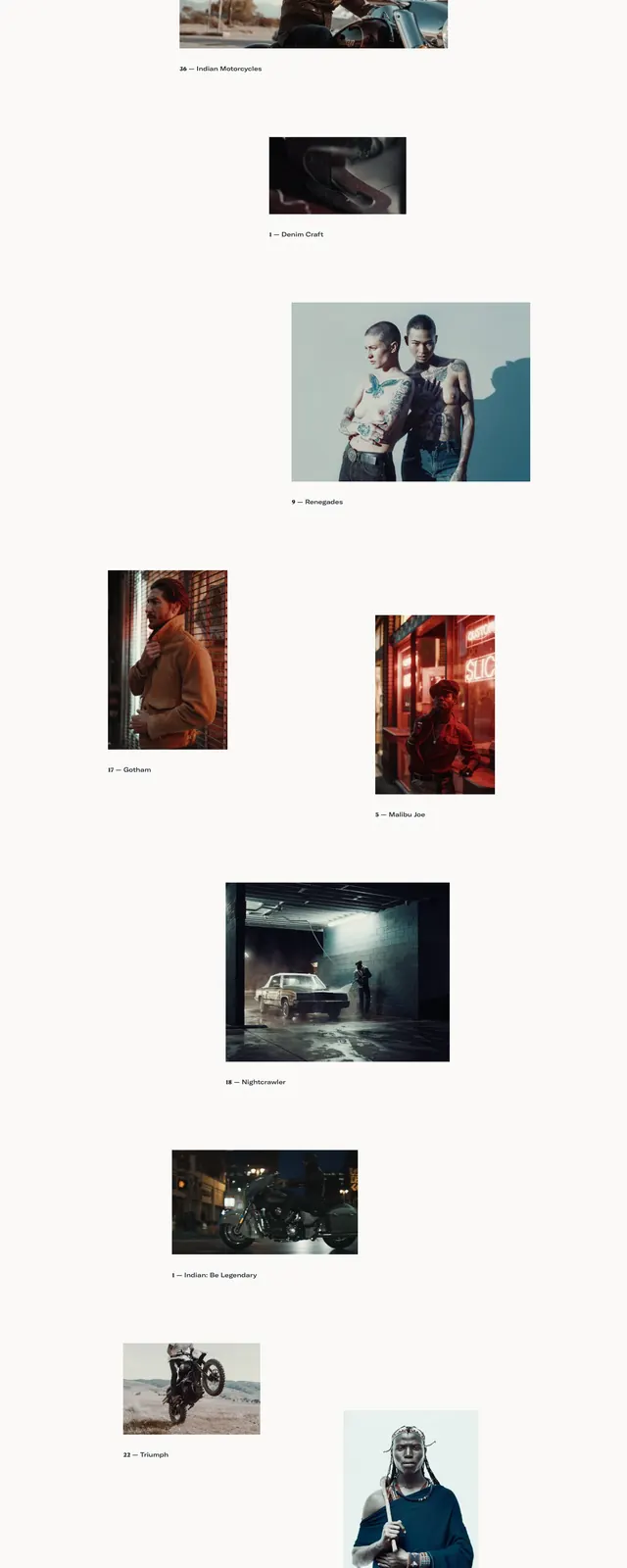
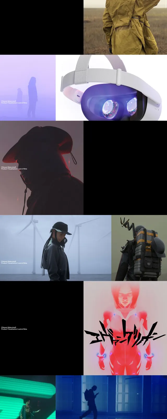
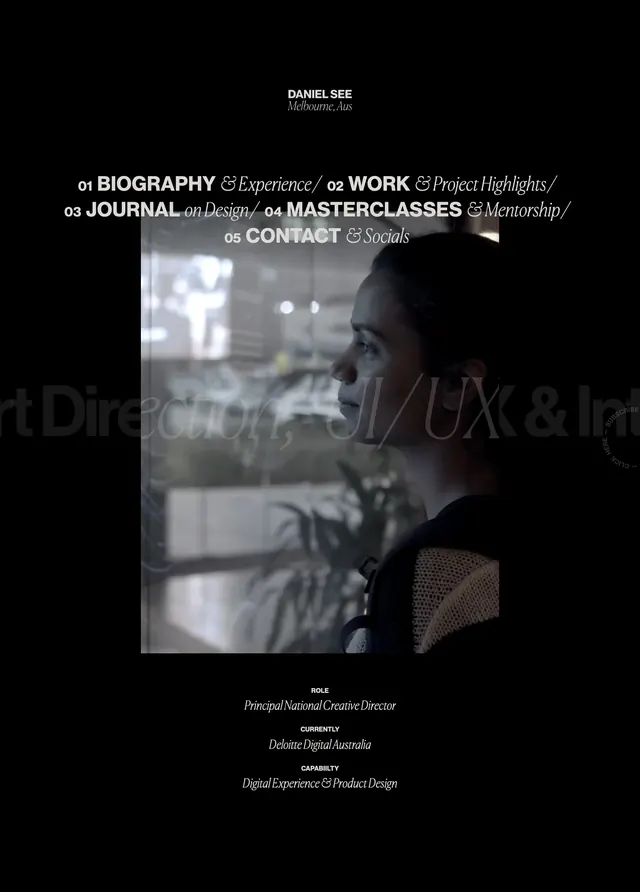
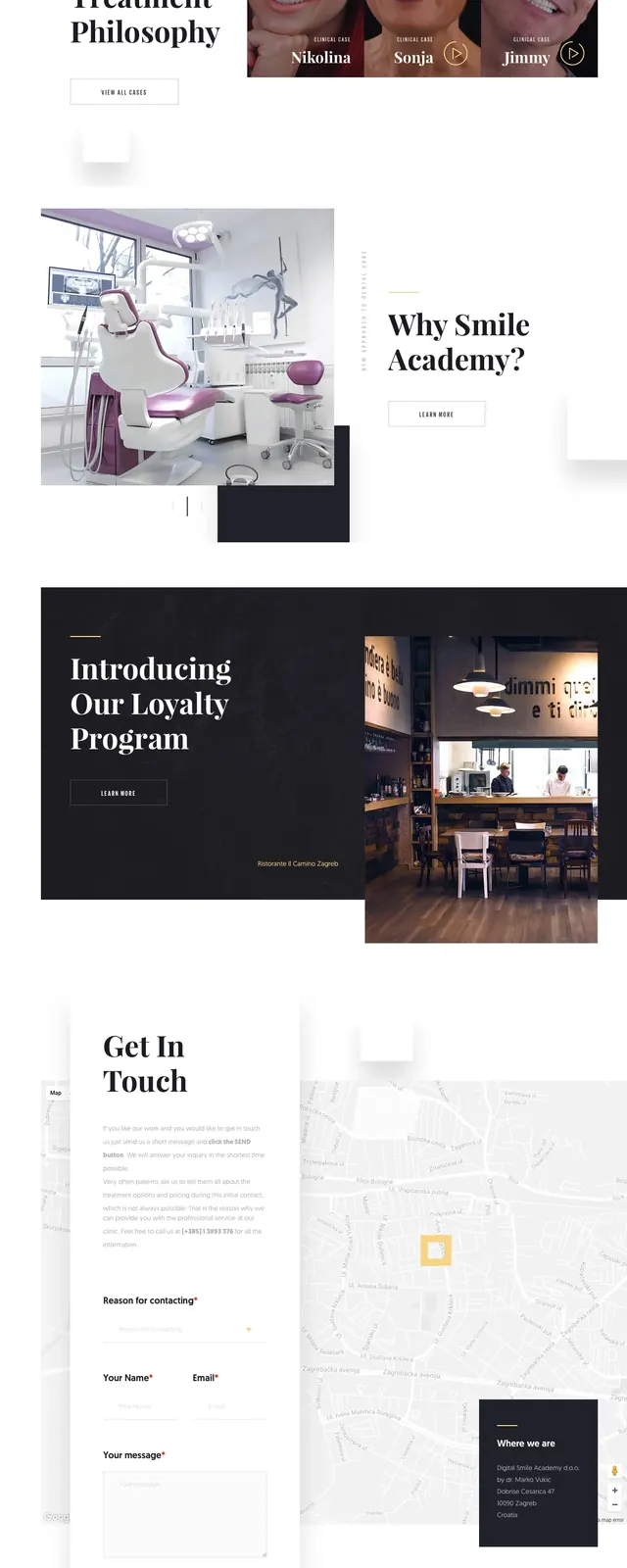
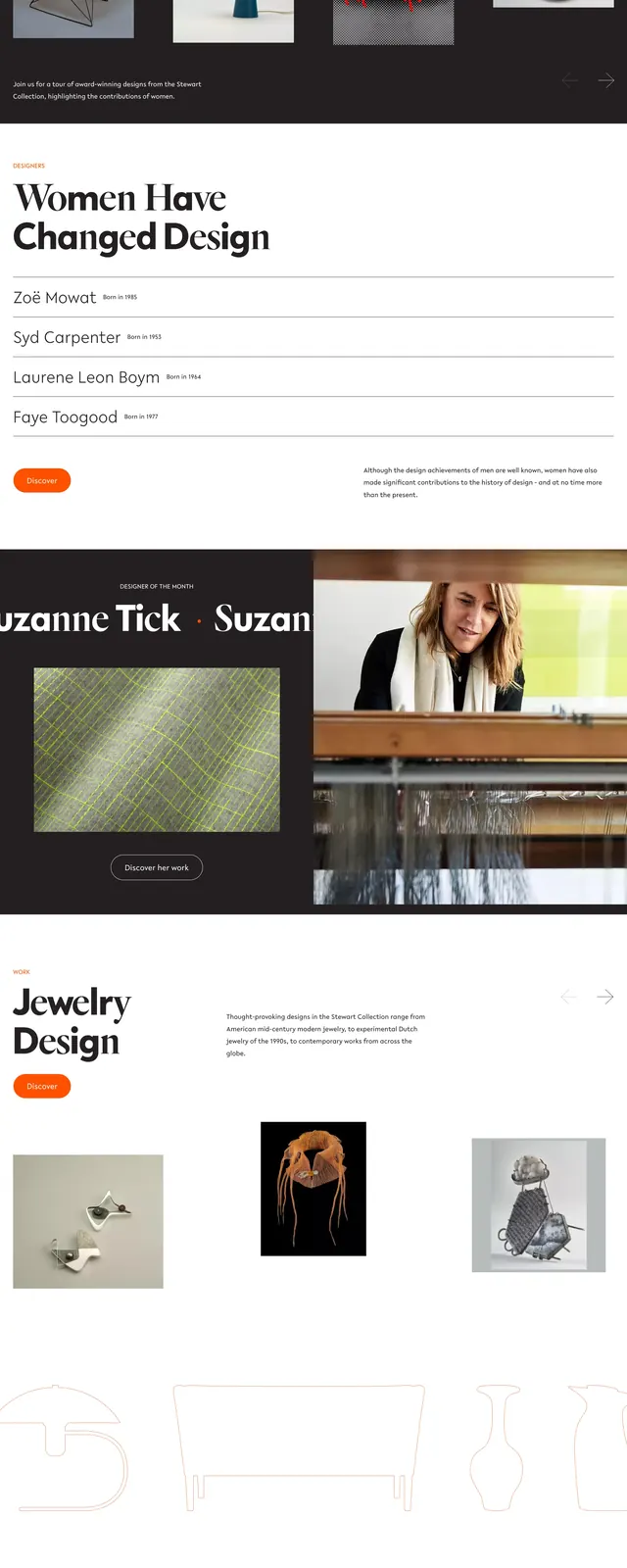
The page opens with a dark full-bleed hero featuring scattered product and object imagery around a centered serif headline, with a small logo at top left and compact utility icons at top right. Below, a white two-column about section pairs a large left-aligned statement and pill button with a smaller explanatory paragraph on the right. Further down, alternating dark and light editorial blocks present a featured designer, a large archival image with captioning, and a minimal footer with grouped navigation links and a large closing wordmark. The overall composition relies on generous spacing, asymmetry, and large typographic contrast.
Key takeaway
Use oversized serif type and curated imagery to make a cultural or exhibition site feel editorial and high-value. The alternating dark/light section rhythm keeps long-form content engaging without needing dense UI.
Reuse notes
Best for nonprofit, museum, design-archive, or portfolio sites that need a premium editorial tone. It works especially well when the content is image-driven and can be broken into modular story sections rather than a conventional product flow.