Preview image. Unlock full-res
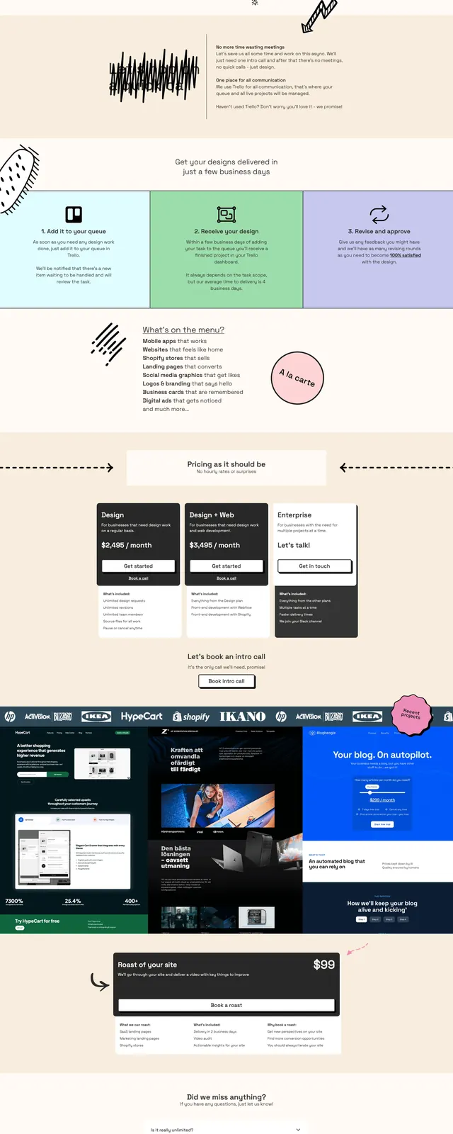
A warm, illustrated agency landing page built around a playful subscription pitch, bold pricing blocks, and a long FAQ-driven sales flow.
Summary
A warm, illustrated agency landing page built around a playful subscription pitch, bold pricing blocks, and a long FAQ-driven sales flow.
Visual description
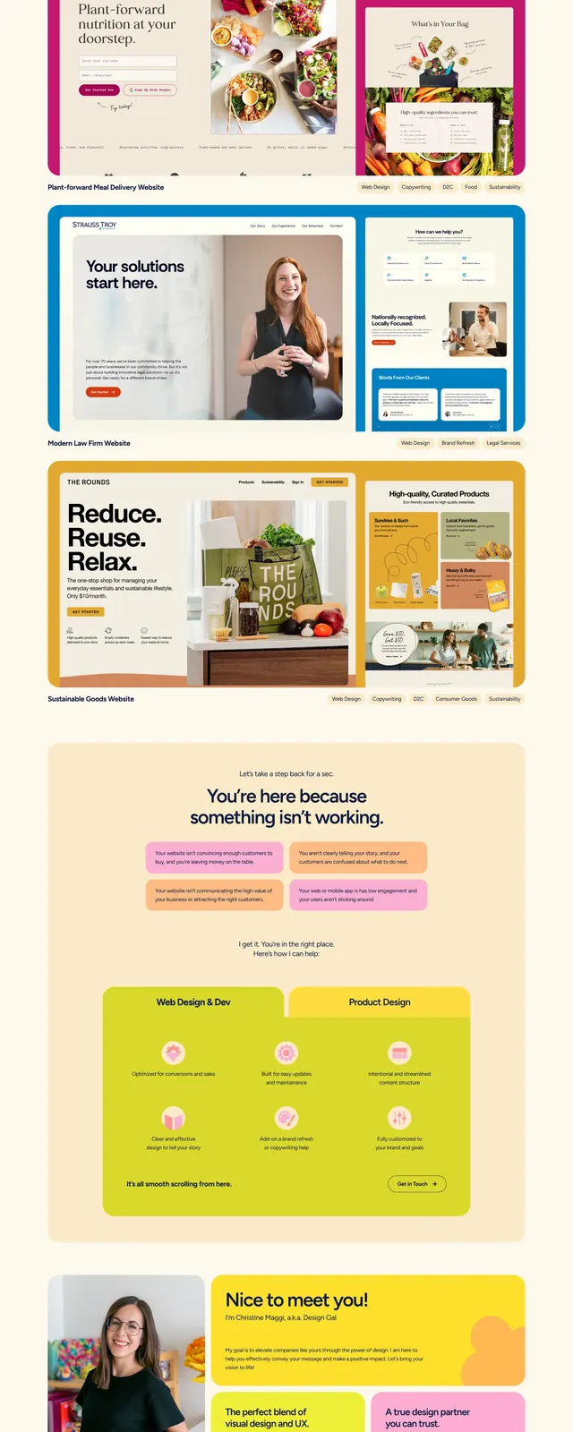
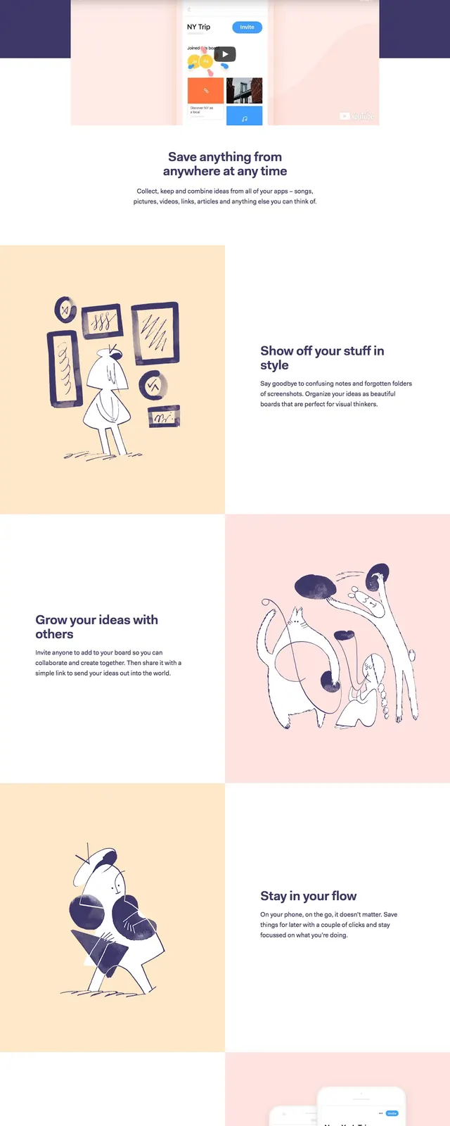
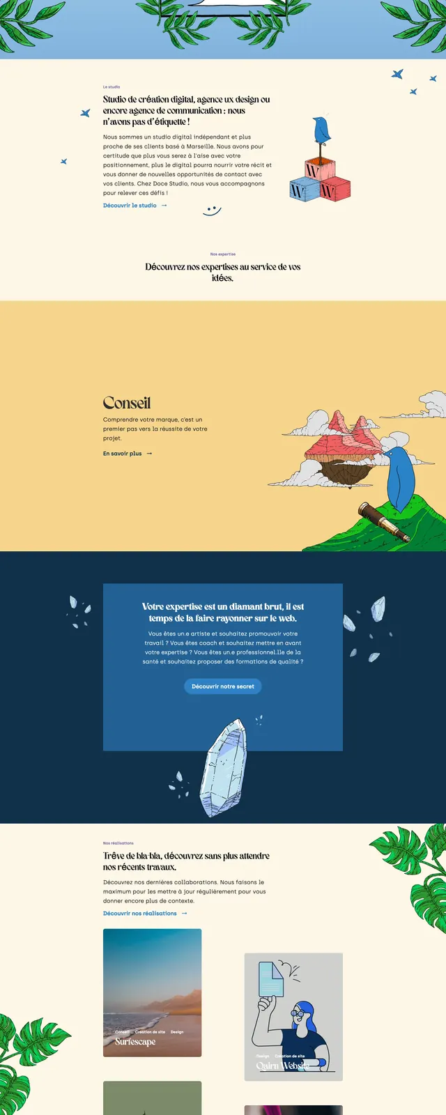
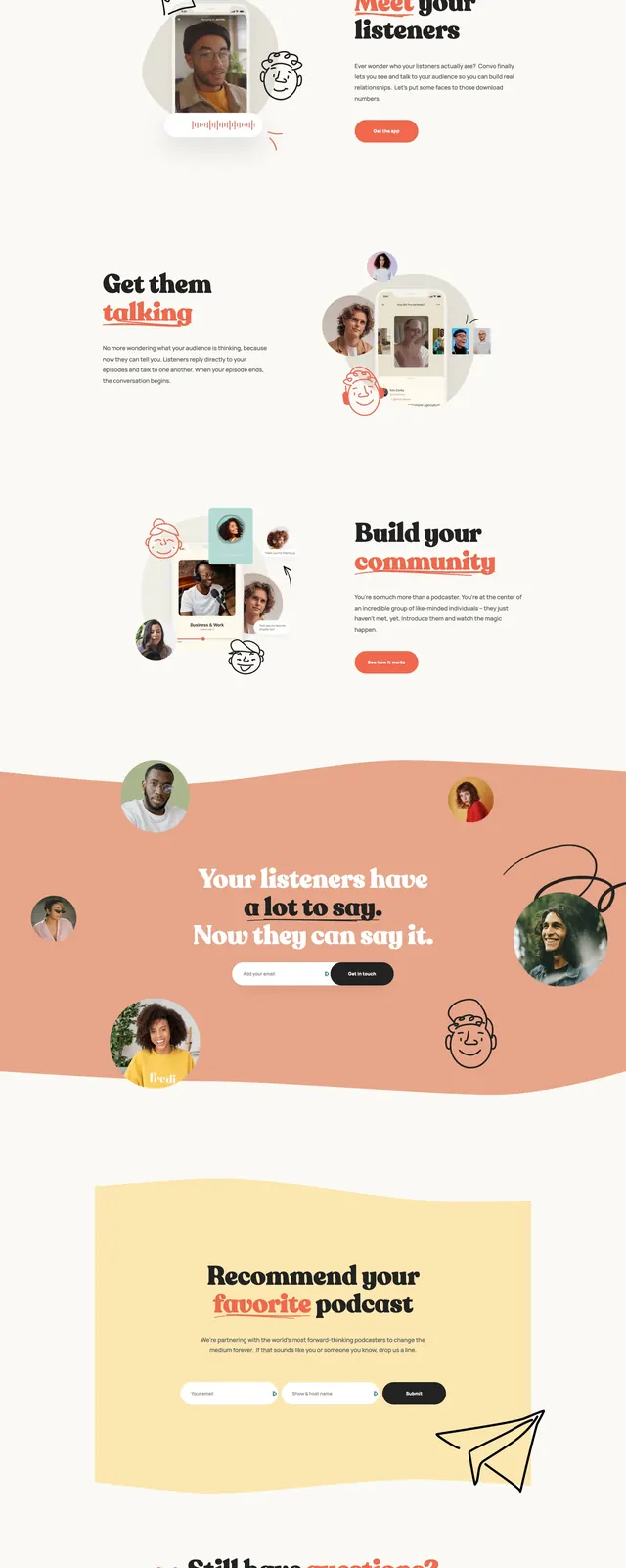
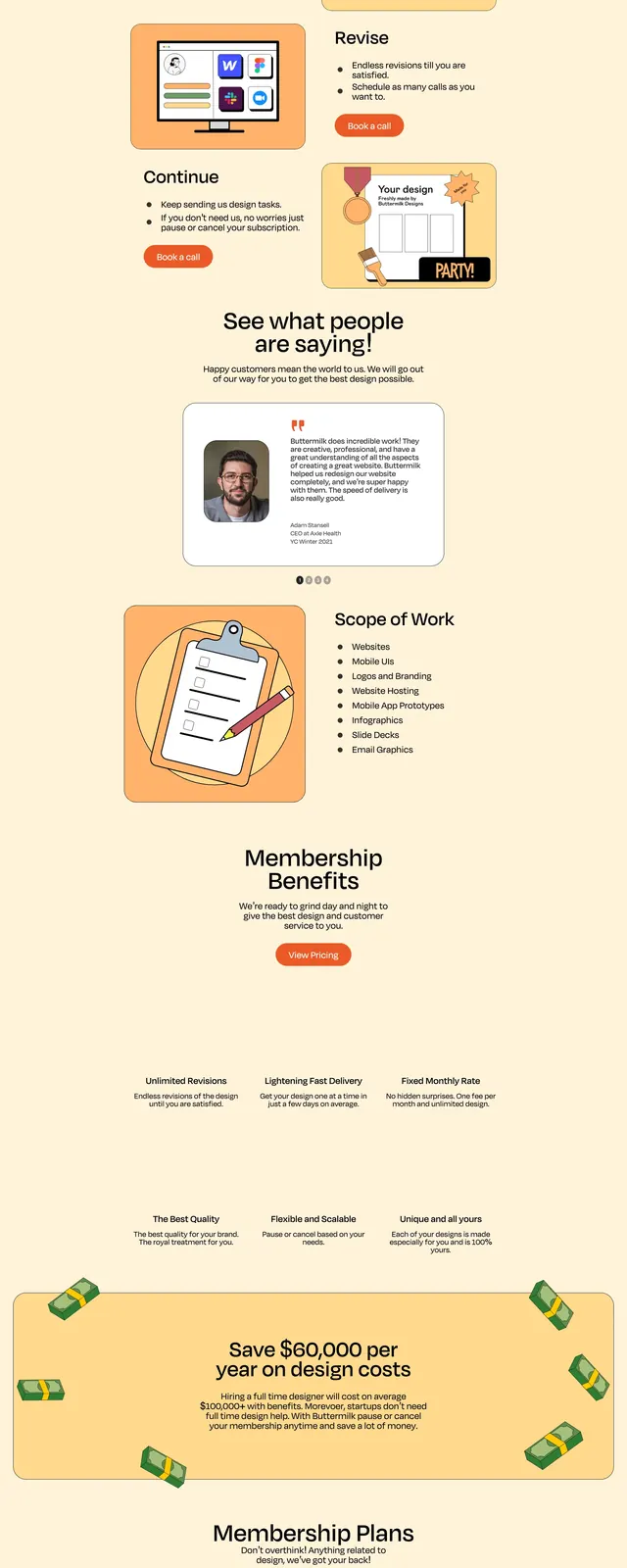
The page uses a soft cream background with a large split hero: oversized serif headline and supporting copy on the left, and a hand-drawn ape illustration on the right. Below the hero are colorful feature cards, pricing cards, a logo strip, and a long accordion FAQ section. The layout stays centered and spacious, with thick borders, rounded card edges, and a mix of playful sticker-like graphics and minimal content blocks. The overall composition feels like a subscription service landing page with a handcrafted editorial look.
Key takeaway
The design combines a friendly illustrated brand voice with a straightforward sales structure built from hero, benefits, pricing, and FAQ sections. It is easy to reuse for subscription-based agencies or creative service offerings that want to feel approachable but premium.
Reuse notes
Reuse the split hero, boxed pricing cards, and accordion FAQ pattern for service businesses with a fixed monthly offer. The illustrated accent style and soft neutral palette can be adapted to other playful agency brands without changing the layout logic.