Preview image. Unlock full-res
A clean editorial-style landing page for a design systems publication, combining oversized typography, bright abstract shapes, and a grid of article cards.
Summary
A clean editorial-style landing page for a design systems publication, combining oversized typography, bright abstract shapes, and a grid of article cards.
Visual description
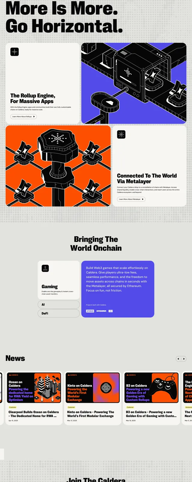
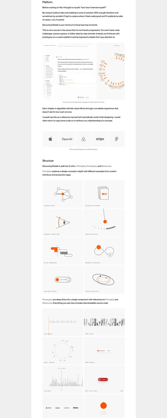
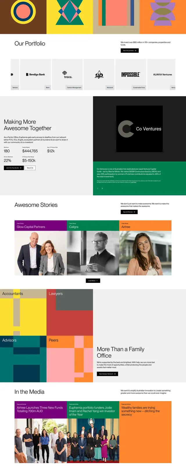
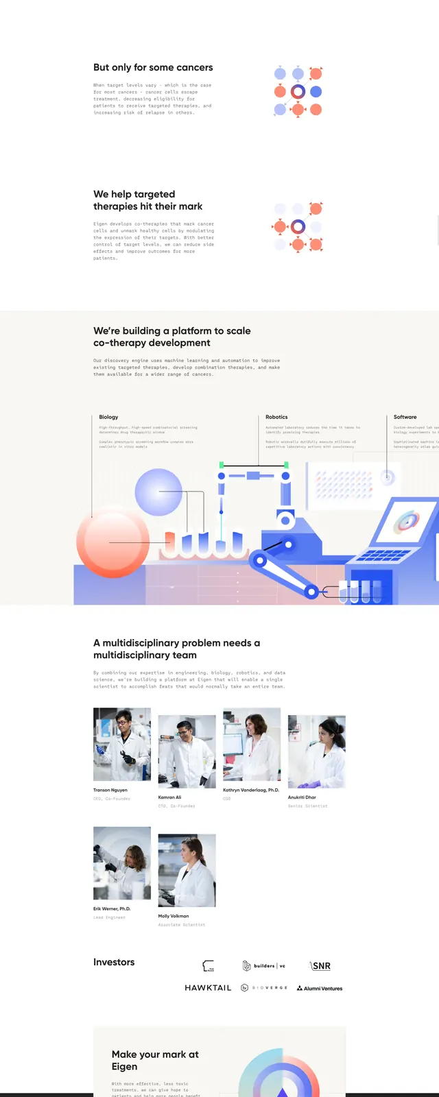
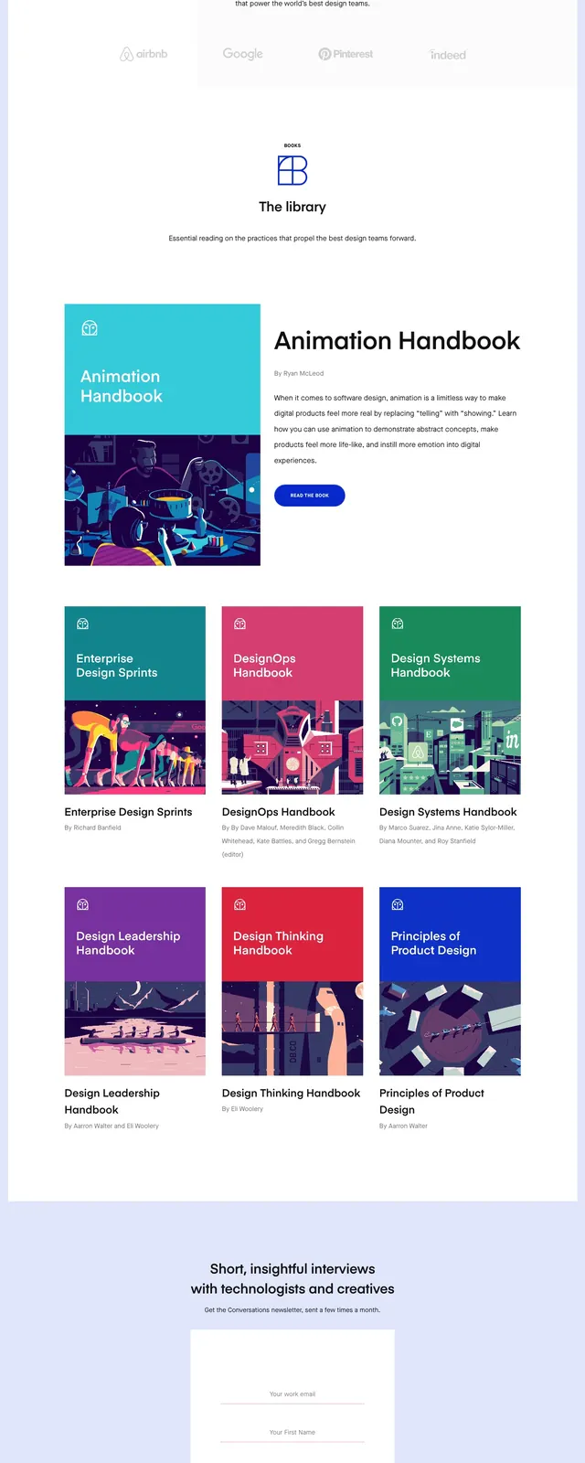
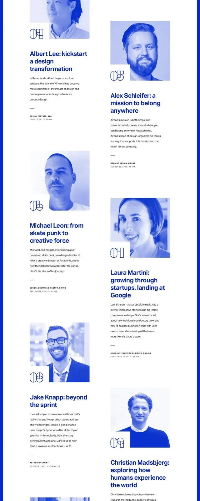
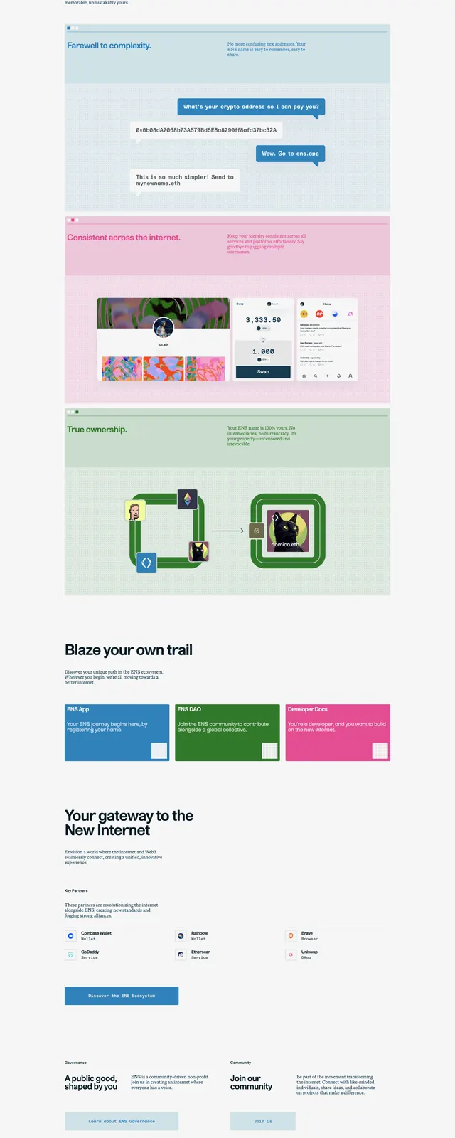
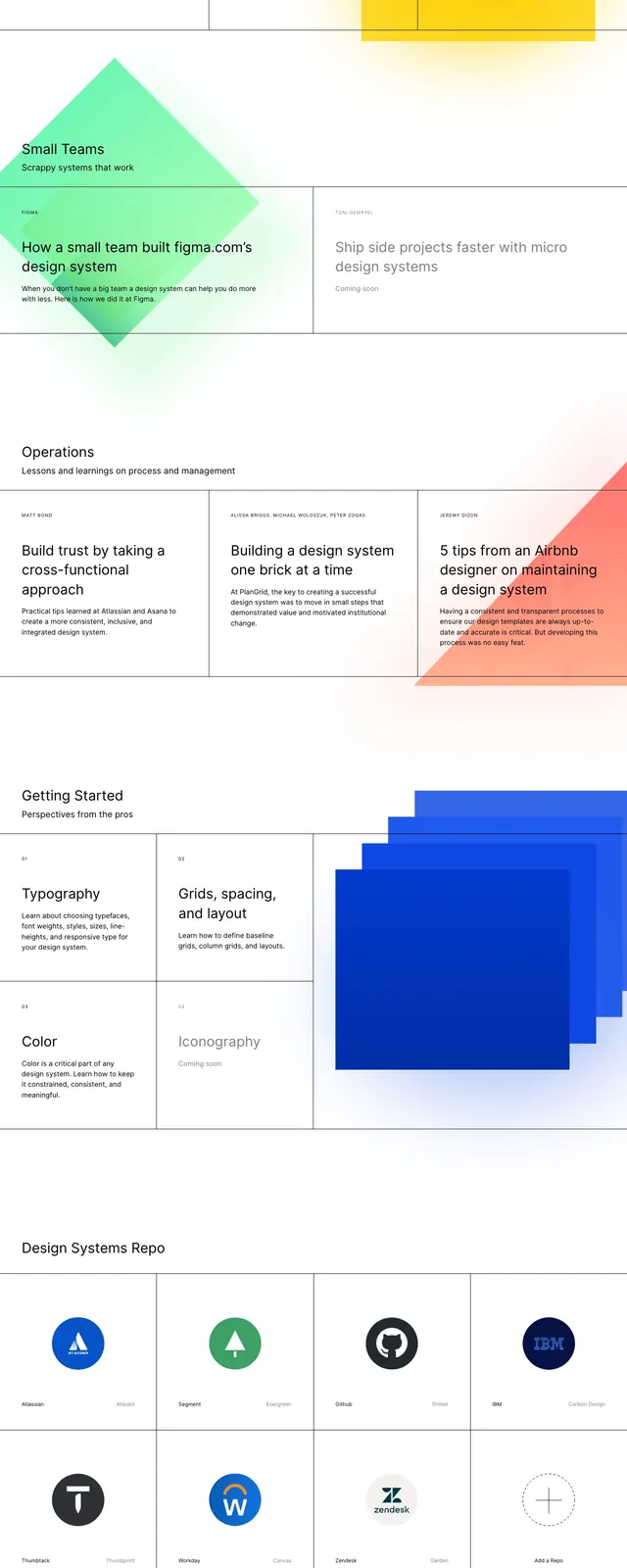
The page opens with a sparse top header, a left-aligned wordmark, a short description line, a signup field, and a small menu icon. The hero area uses a large black headline over a white background, with oversized overlapping gradient circles and simple brand marks placed around the composition. Below the hero, the page shifts into a strict grid of article cards, a getting-started section with square content tiles, a horizontal timeline row of circular milestones, and a two-column footer CTA area with a newsletter signup field.
Key takeaway
The strongest move is the contrast between highly structured grid layout and playful oversized gradient forms. The page feels editorial but still systematic, which suits a design systems publication.
Reuse notes
Useful for content-heavy editorial or documentation sites that need personality without losing clarity. Reuse the grid/card pattern and keep the color accents limited to a few large abstract shapes so the layout stays legible.