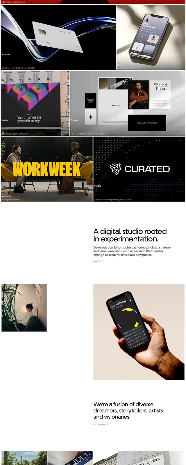
Preview image. Unlock full-res
A blue-and-white editorial landing page for the DesignBetter.Co podcast with a centered hero, navigation, and stacked featured episode cards.
Summary
A blue-and-white editorial landing page for the DesignBetter.Co podcast with a centered hero, navigation, and stacked featured episode cards.
Visual description
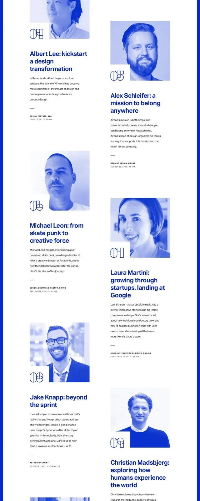
The page opens with a full-width deep blue hero area, a top navigation bar, a small podcast label, and a large centered headline with a rounded subscribe button beneath it. Below the hero, large white content panels overlap the blue background and present podcast episode features in a clean editorial layout with bold headlines, short descriptions, and portrait imagery. The portraits and small brand marks are tinted blue, while the body text remains mostly black on white with generous spacing. A simple footer-style closing section ends with a logo, a bold statement, and another centered call-to-action button.
Key takeaway
The main reuse value is the strong contrast between a saturated branded hero and airy editorial content blocks below it. The overlapping white cards and blue duotone portraits create a polished magazine-like podcast presentation.
Reuse notes
Use this pattern for media, podcast, or editorial landing pages that need both a strong brand color and scannable featured content. It works best when you have portrait imagery and short episode summaries to support the stacked layout.