Preview image. Unlock full-res
An editorial landing page for DesignBetter with a large illustrated hero, book/resource promotion, a grid of handbook cards, and a simple closing CTA.
Summary
An editorial landing page for DesignBetter with a large illustrated hero, book/resource promotion, a grid of handbook cards, and a simple closing CTA.
Visual description
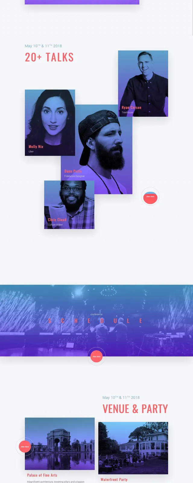
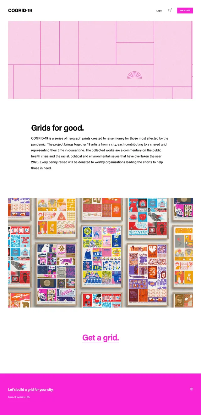
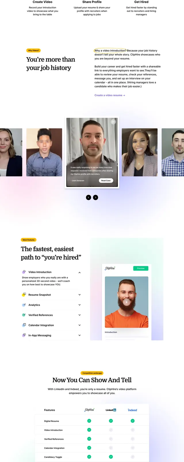
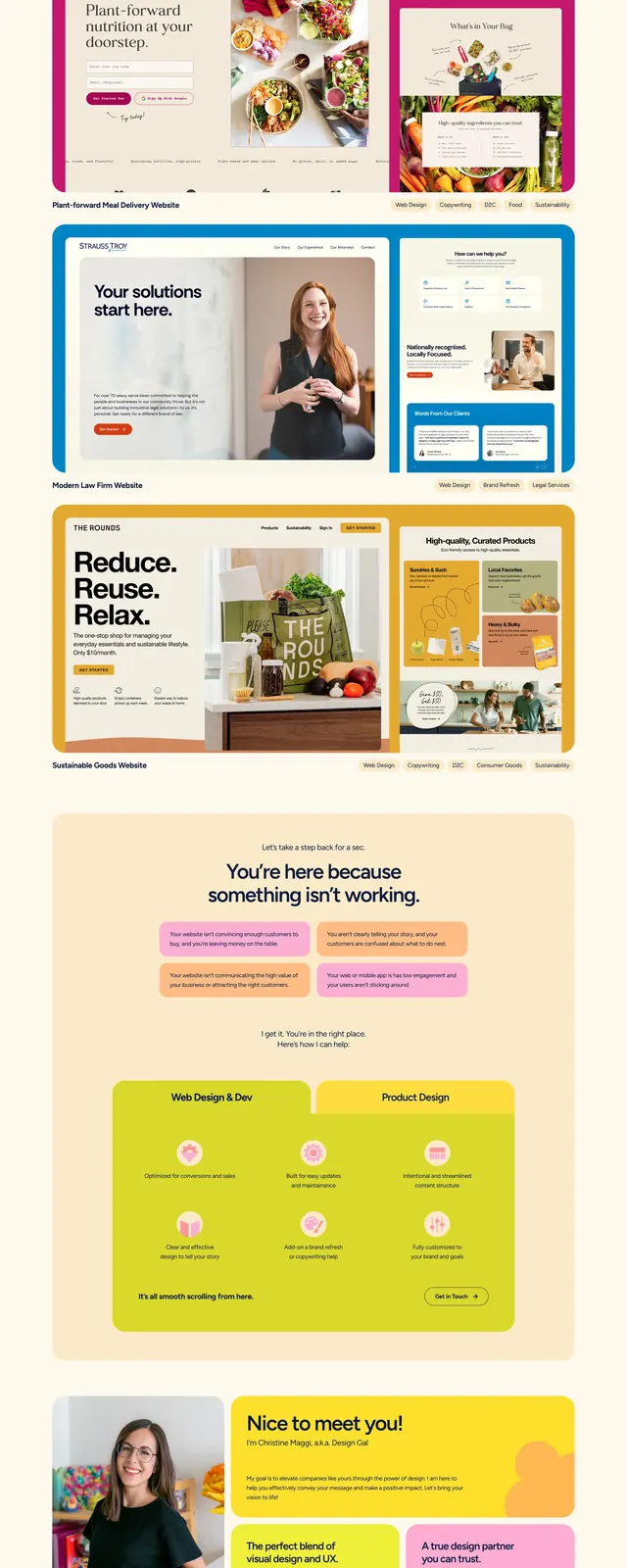
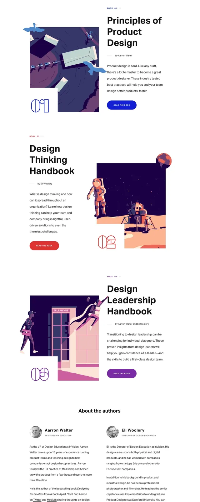
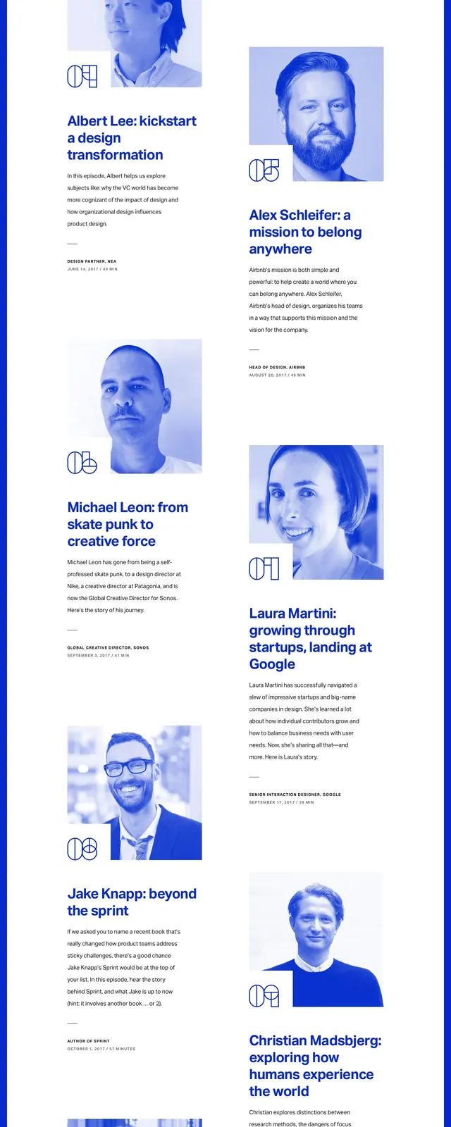
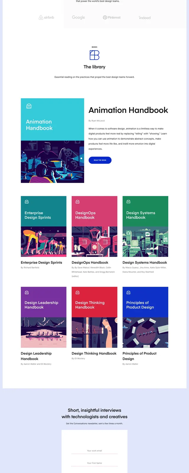
The page opens with a white navigation bar and a large hero panel containing a bold headline, a short supporting line, and a blue primary button. A large illustrated scene sits to the right of the hero copy, with purple, pink, and navy shapes creating a vivid editorial look. Below, a content section promotes a book with a small image on the left and a button on the right, followed by a three-column grid of colorful handbook cards with titles and author lines. The page ends with a centered CTA on a white field and a solid blue footer bar with small utility links and brand marks.
Key takeaway
The strongest reusable idea is the combination of a simple editorial layout with a highly expressive illustration system. The card grid below the hero gives the page a clear content-library feel without adding visual noise.
Reuse notes
Use this pattern for editorial brands, resource hubs, or learning platforms that need a polished but approachable homepage. It works best when the page has a strong illustration style and a limited number of primary calls to action.