Preview image. Unlock full-res
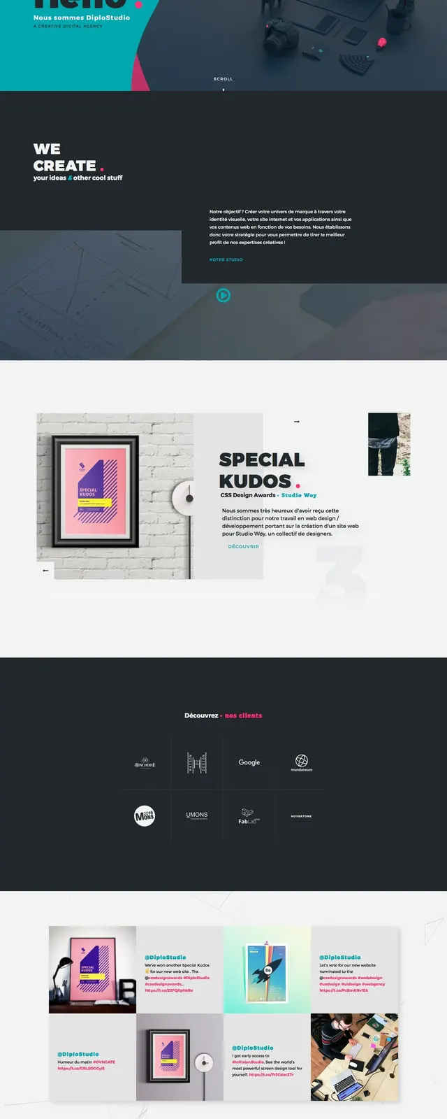
A dark, high-contrast agency homepage with oversized intro typography, teal and pink accent shapes, and mixed editorial sections below.
Summary
A dark, high-contrast agency homepage with oversized intro typography, teal and pink accent shapes, and mixed editorial sections below.
Visual description
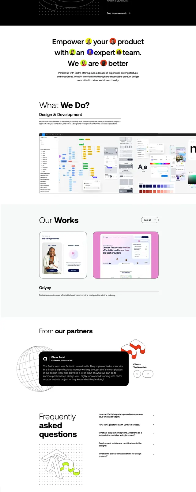
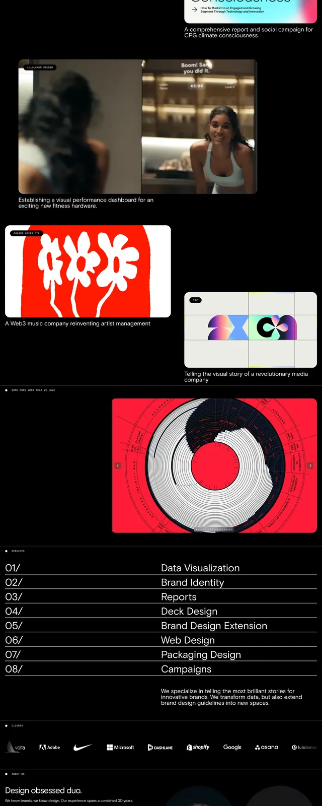
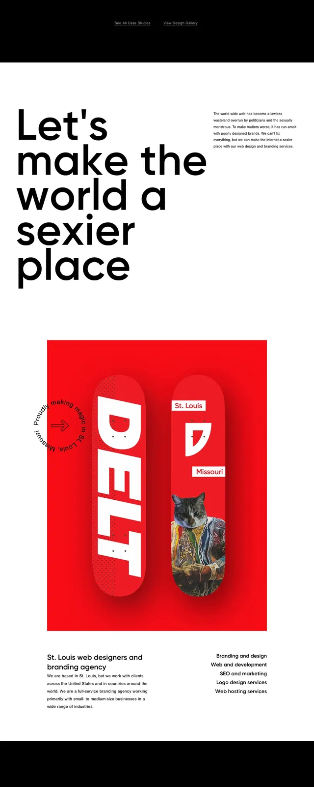
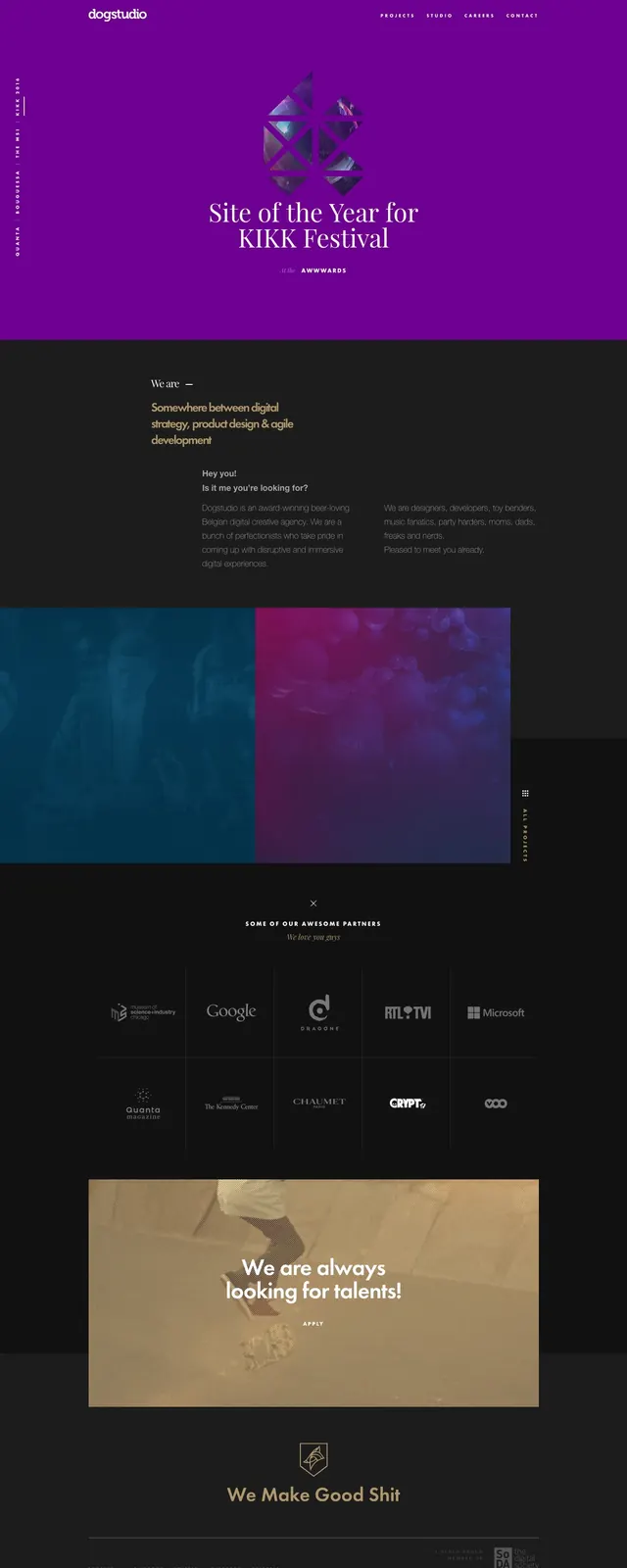
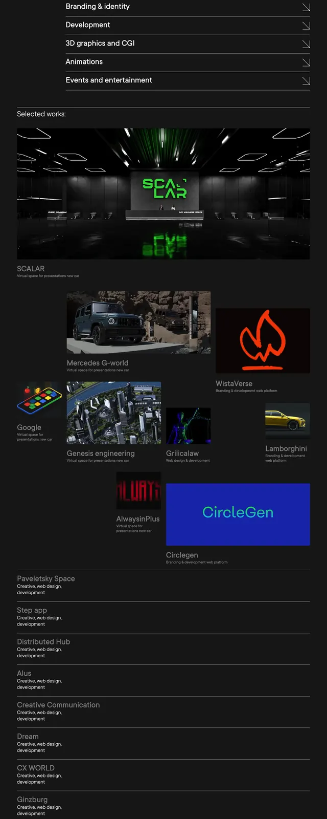
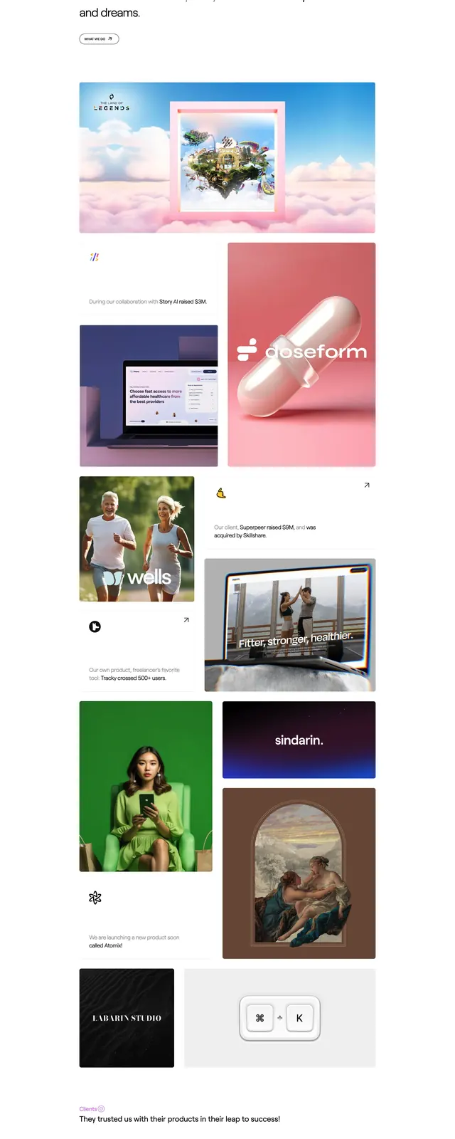
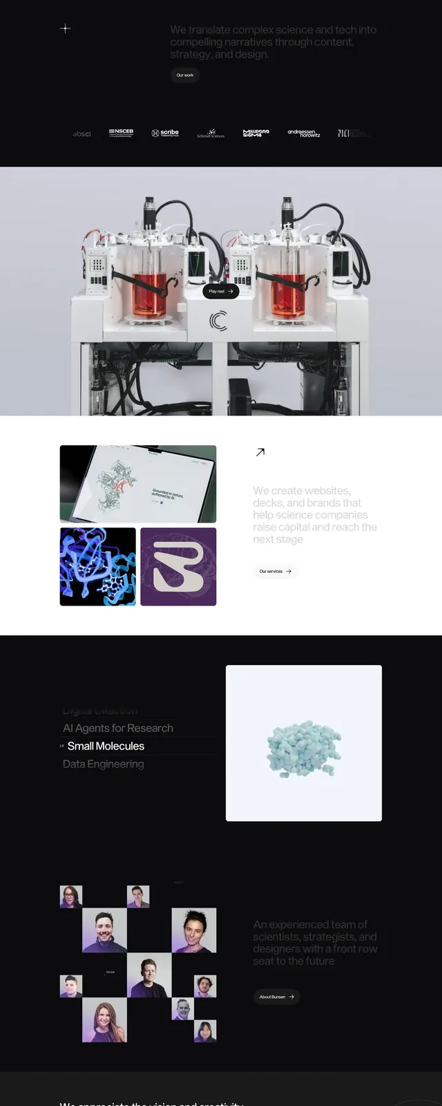
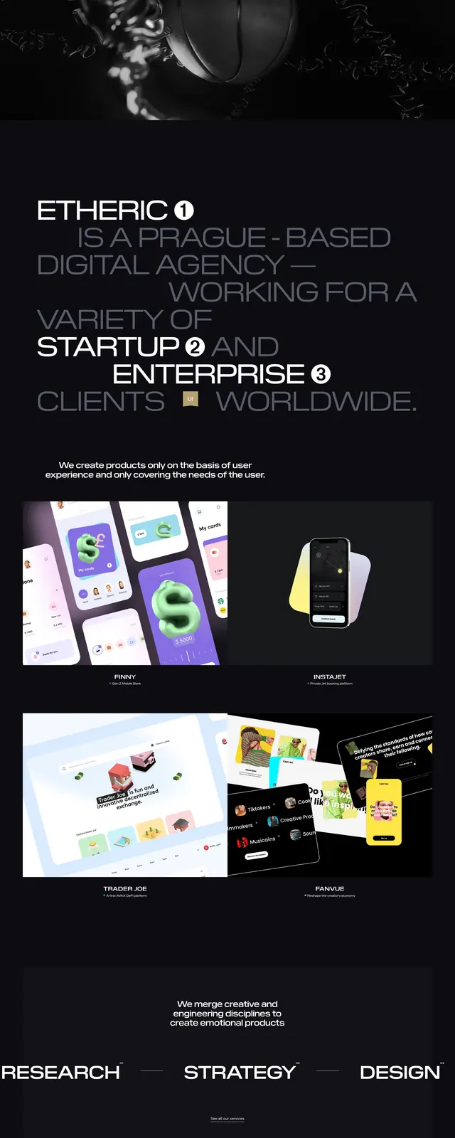
The page opens with a split hero: a large teal organic shape on the left with the greeting text, and a dark 3D-rendered workspace scene on the right. Below it are stacked sections on a charcoal background and a light section with a framed award image and editorial text blocks. Farther down, the layout alternates between a dark client strip and a light masonry-style grid of social or portfolio cards, ending with a pale footer area containing contact details and links.
Key takeaway
The strongest move is the contrast between playful teal/pink brand shapes and restrained dark editorial layouts. The 3D desktop still lifes give the agency a distinctive, modern identity without relying on heavy UI chrome.
Reuse notes
Works well for creative agencies, studios, and portfolio sites that need a premium but expressive first impression. Reuse the split hero plus alternating dark/light section rhythm when you want a long-form landing page with strong visual pacing.