Preview image. Unlock full-res
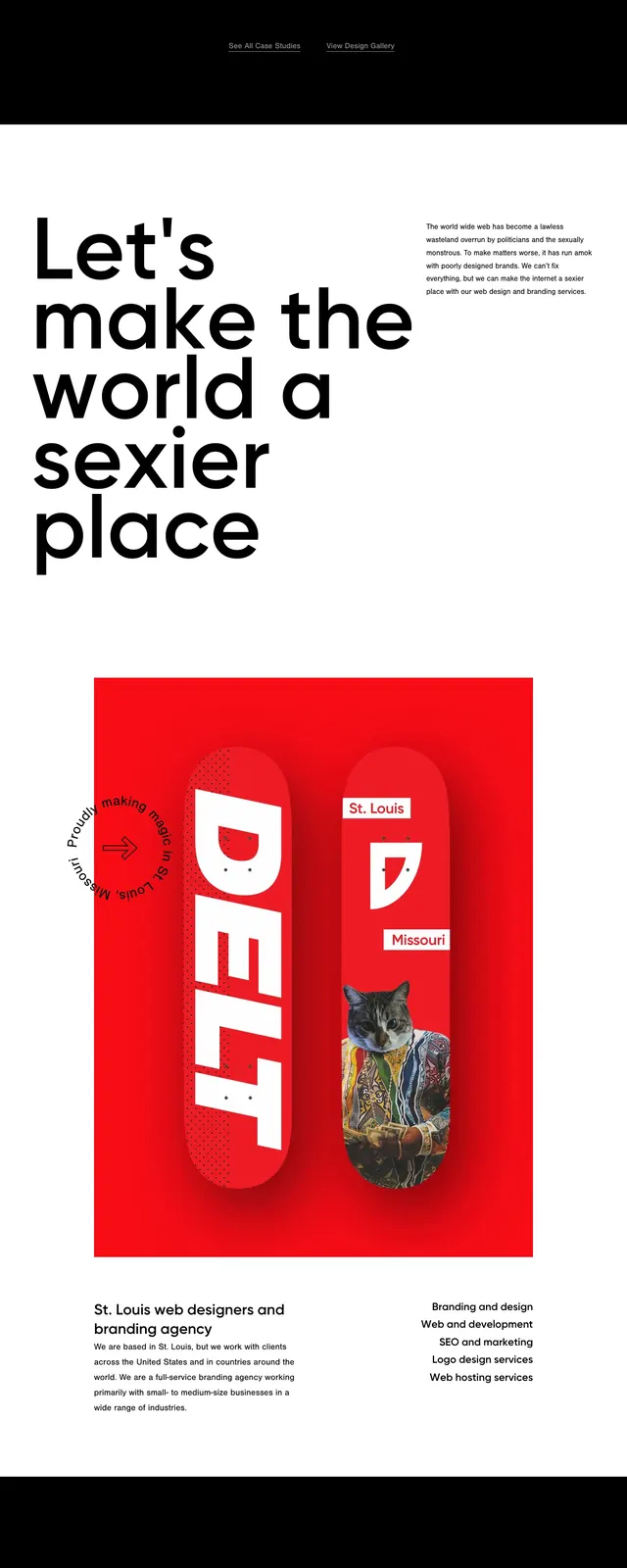
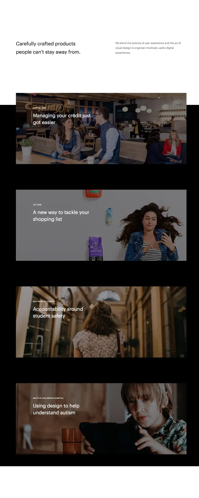
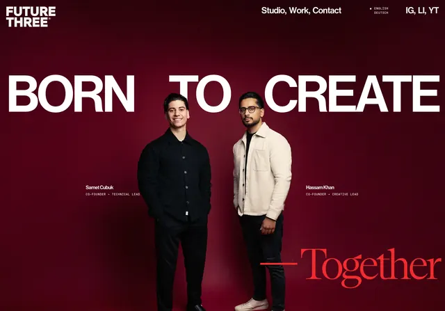
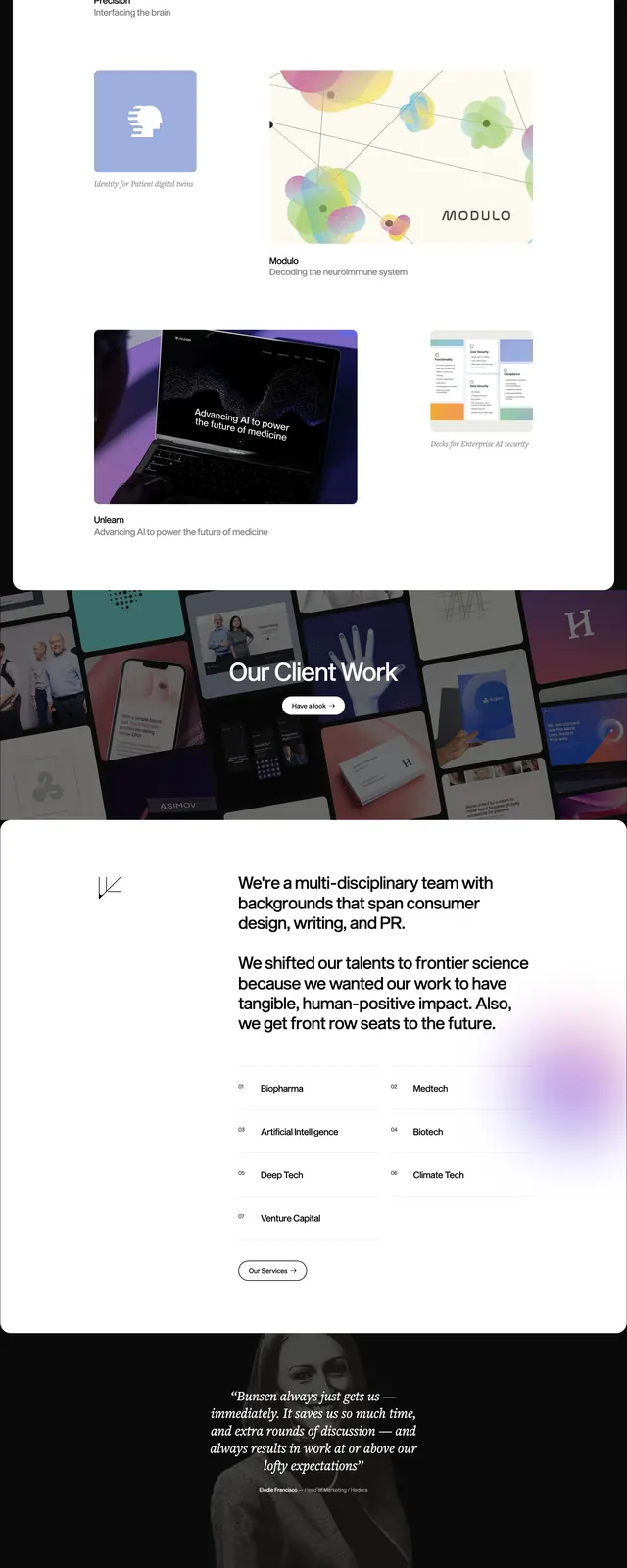
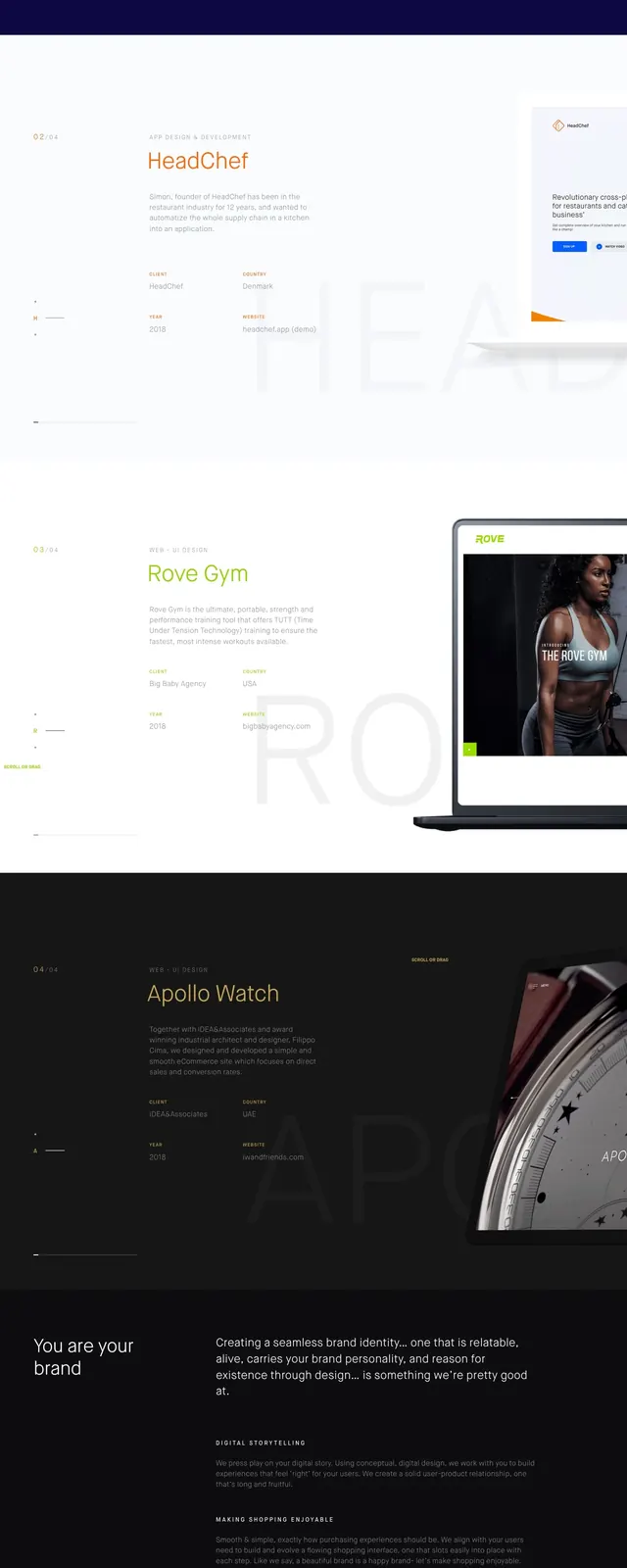
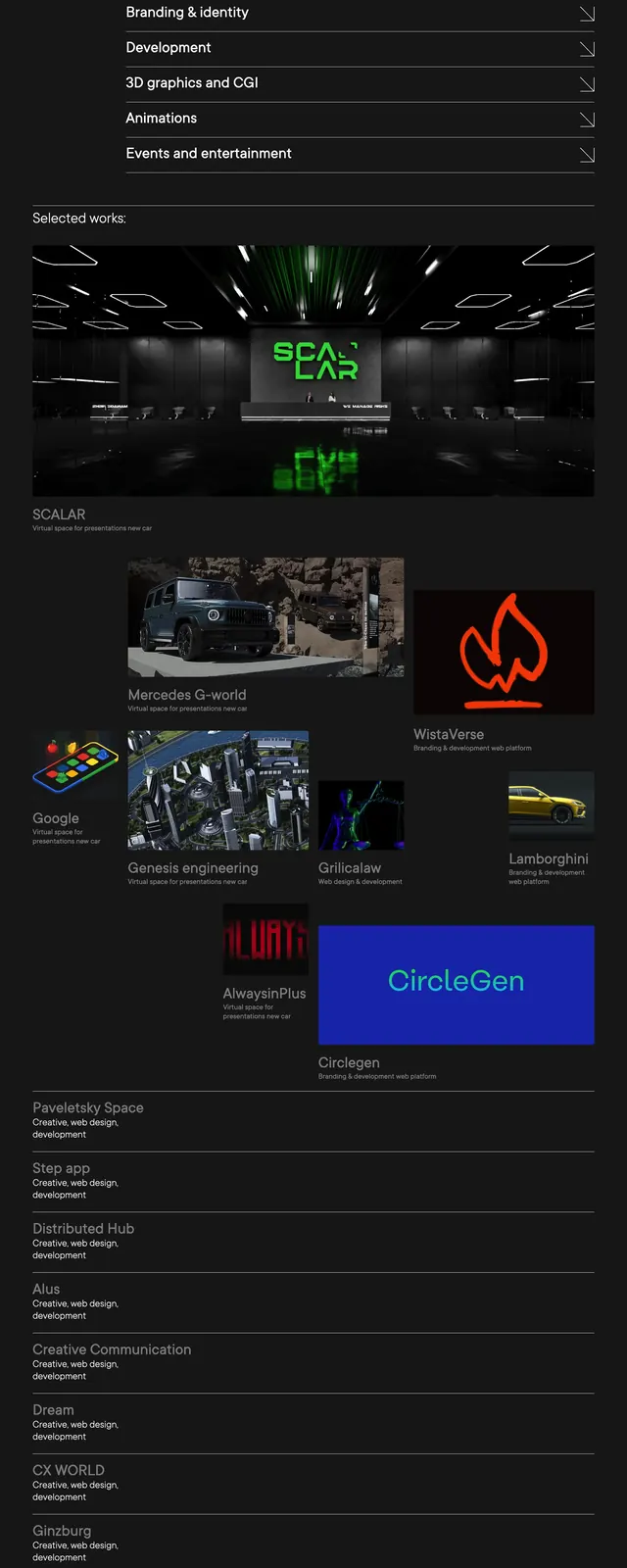
A dark, full-page agency website with oversized white headlines, orange accent strokes, and a grid-based portfolio section.
Summary
A dark, full-page agency website with oversized white headlines, orange accent strokes, and a grid-based portfolio section.
Visual description
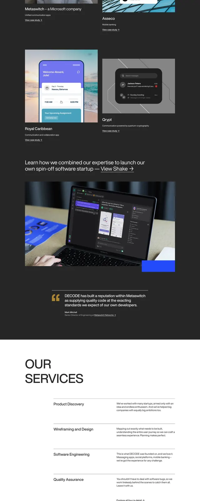
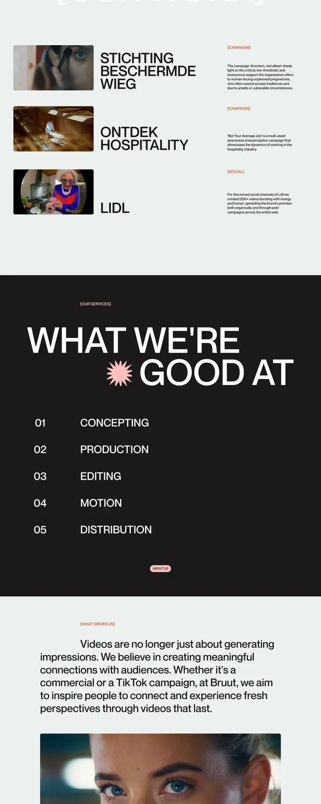
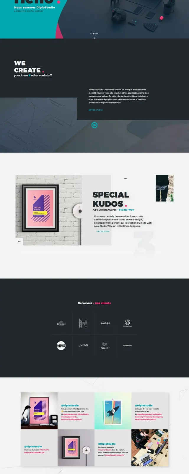
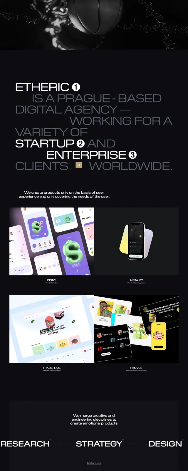
The page uses a nearly black background with white text and vivid orange-red underline strokes across parts of the main headline. The first screen has a top navigation, a small brand mark, a large multiline hero statement, and a compact image card on the right. Lower on the page there is an about strip, a dense portfolio gallery of project thumbnails in an irregular grid, and a strong contact section with a large circular orange button. The footer area continues the minimal dark layout with location columns, contact details, and social links.
Key takeaway
The strongest pattern is the combination of oversized editorial typography with a restrained dark palette and a single high-saturation accent color. The layout also shows how to mix a bold hero, compact supporting copy, and a project mosaic without losing clarity.
Reuse notes
Best for creative agencies, studios, and portfolio sites that want a serious but expressive look. Reuse the orange highlight treatment and the dark high-contrast palette when the goal is to make typography the main visual element.