Preview image. Unlock full-res
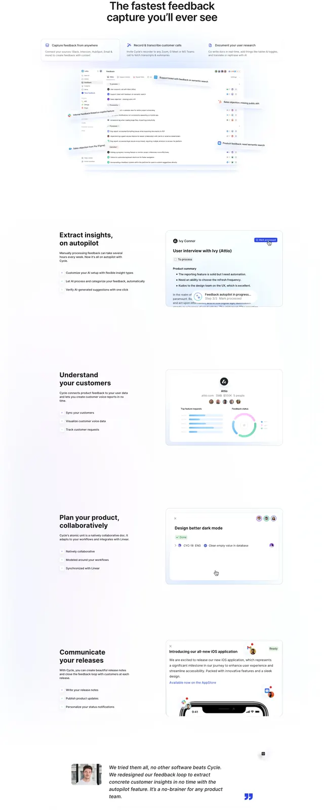
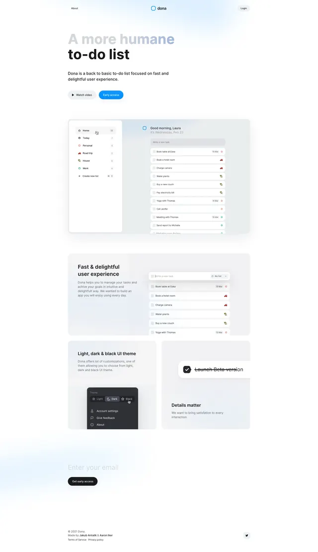
A soft, minimalist landing page for a productivity app with a centered hero, pastel gradient background, and stacked feature previews.
Summary
A soft, minimalist landing page for a productivity app with a centered hero, pastel gradient background, and stacked feature previews.
Visual description
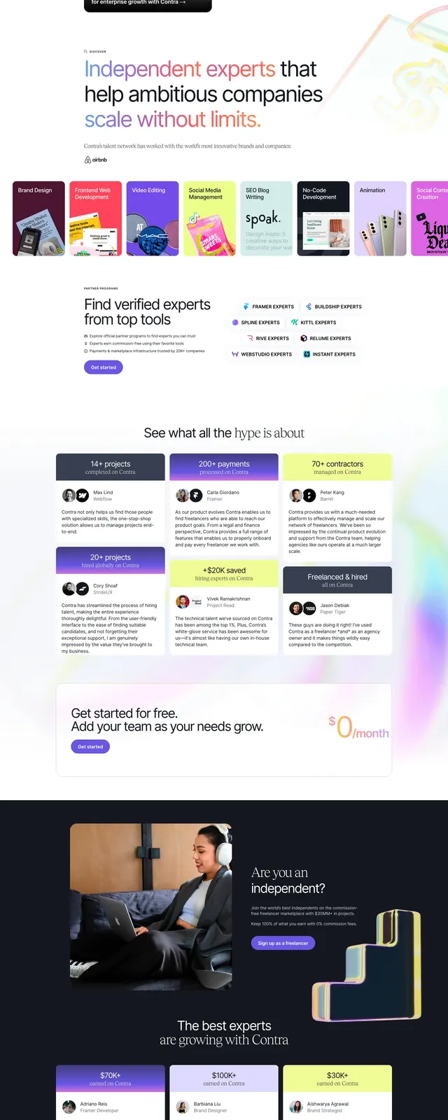
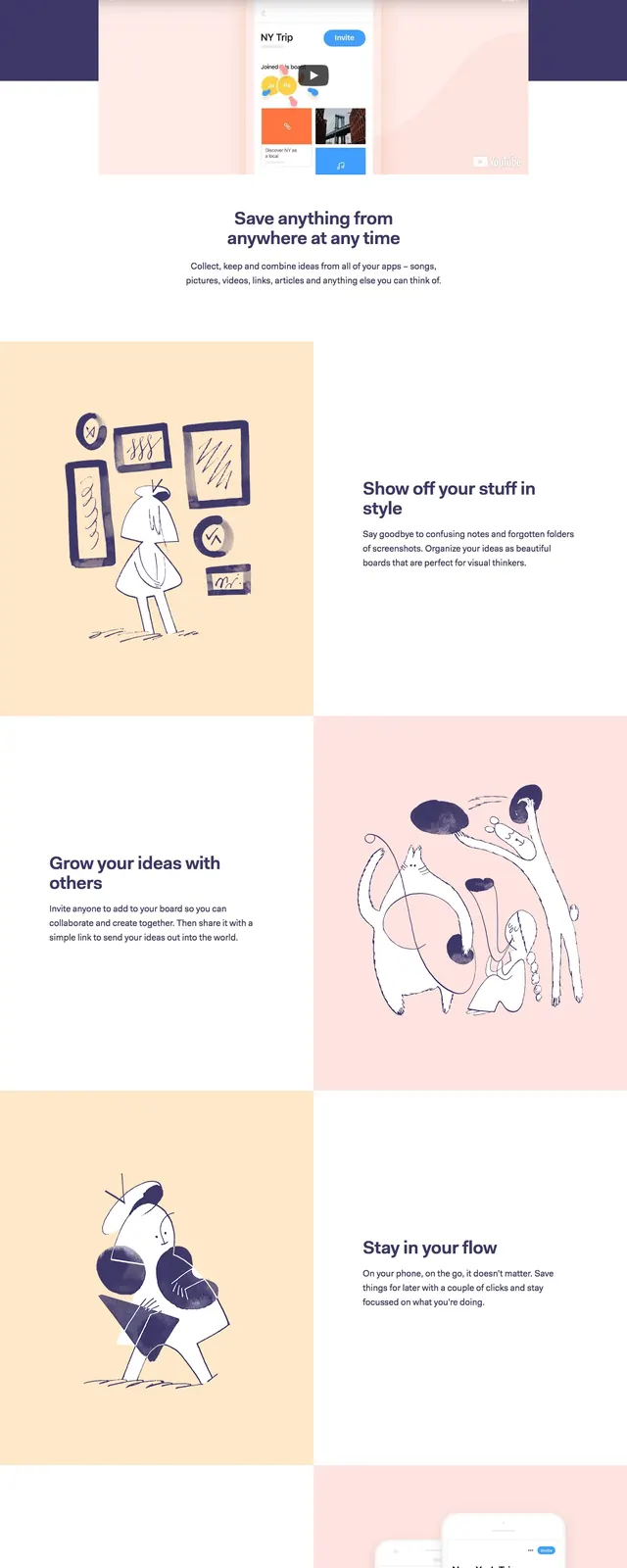
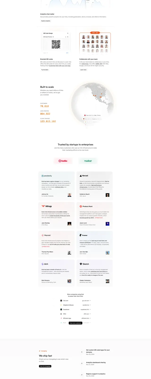
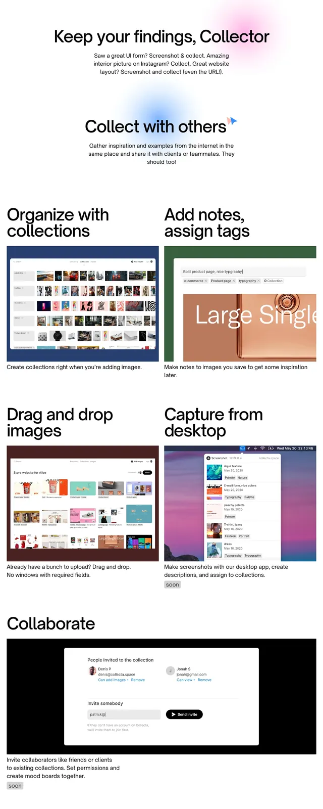
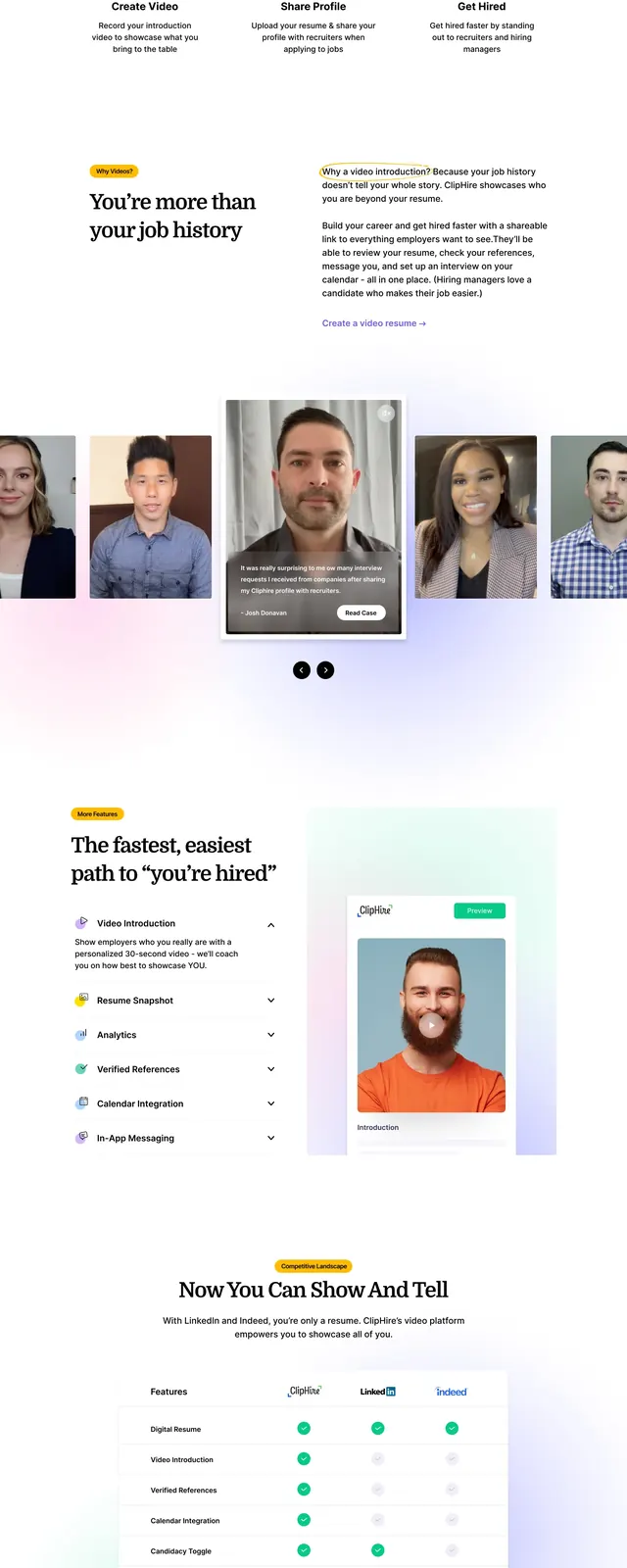
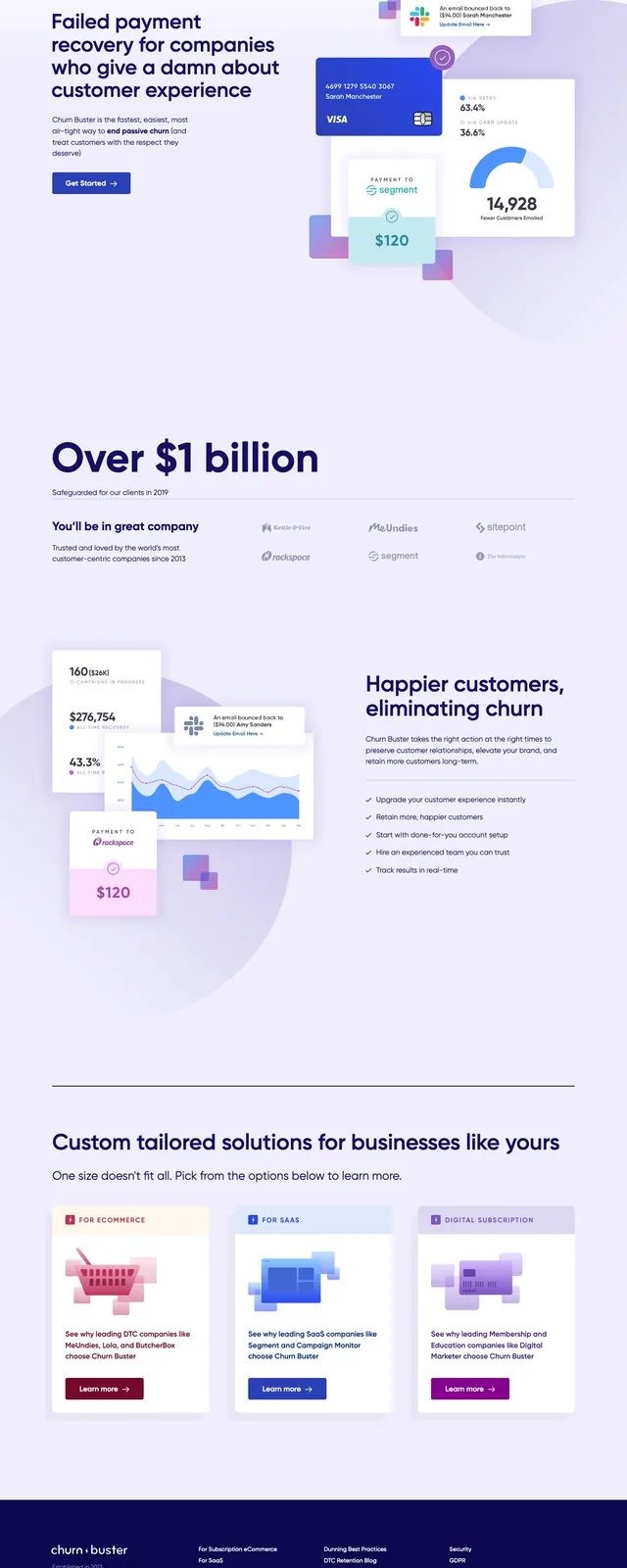
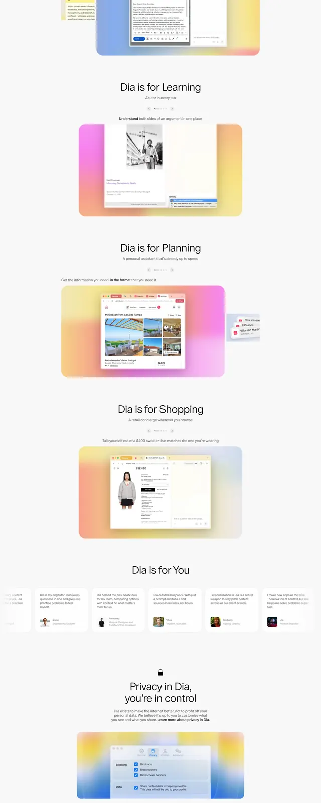
The page uses a bright white canvas with a subtle blue gradient glow around the edges and a centered top navigation. The hero features a large headline, short supporting copy, two rounded call-to-action buttons, and a large app screenshot mockup below. Further down, the layout stacks soft-shadow feature cards in a bento-like arrangement with additional UI previews and a newsletter/email capture area near the bottom.
Key takeaway
The design leans on whitespace, gentle gradients, and rounded UI to make a productivity product feel approachable and calm. It is a strong reference for lightweight SaaS landing pages that need polish without visual noise.
Reuse notes
Reuse the centered hero structure, pill buttons, and pastel gradient backdrop for consumer productivity products. The stacked feature cards and embedded product screenshots are especially effective for showcasing app UX in a simple landing-page format.