Preview image. Unlock full-res
A clean, centered SaaS landing page for Dub with soft warm gradients, minimal navigation, and stacked trust-building sections.
Summary
A clean, centered SaaS landing page for Dub with soft warm gradients, minimal navigation, and stacked trust-building sections.
Visual description
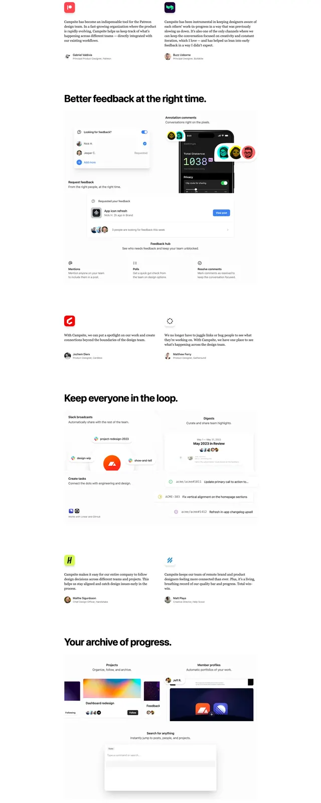
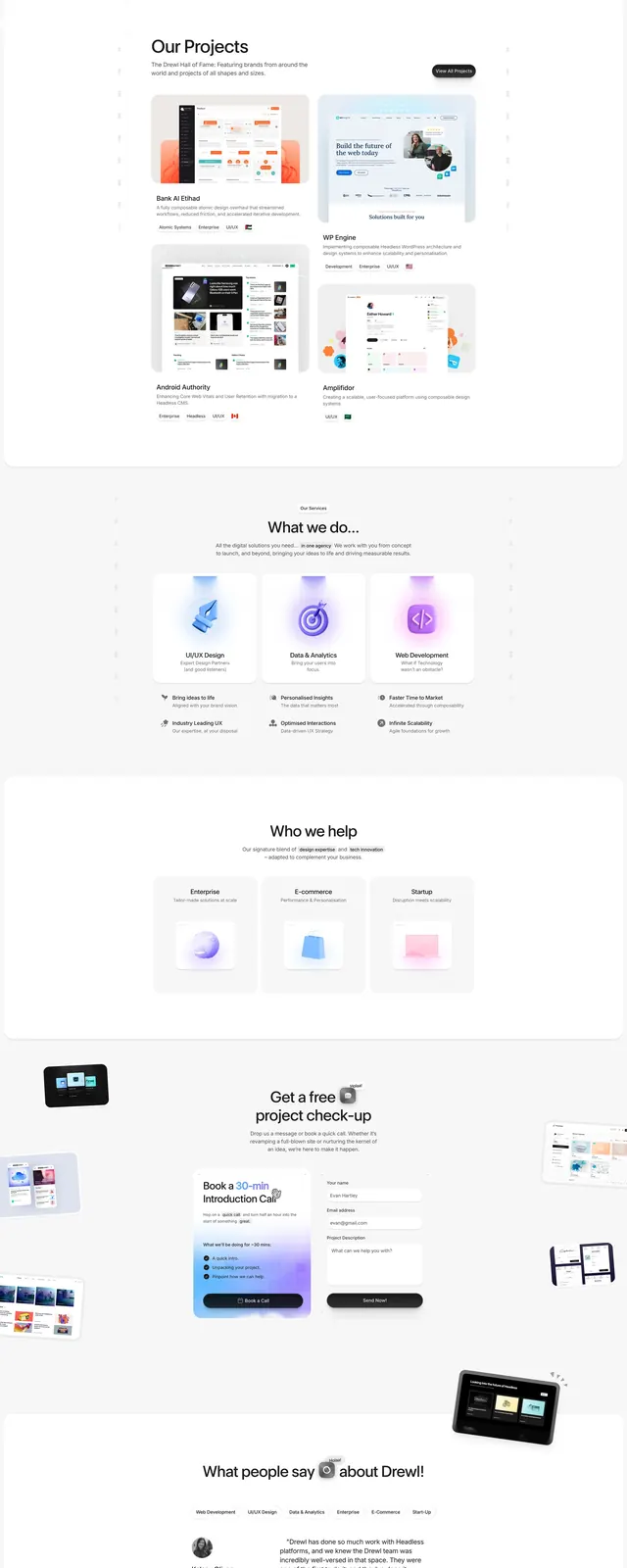
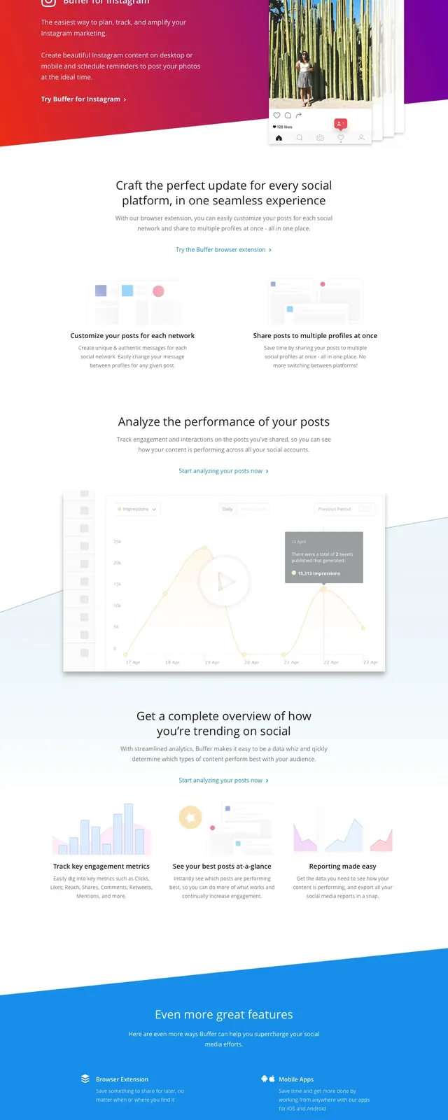
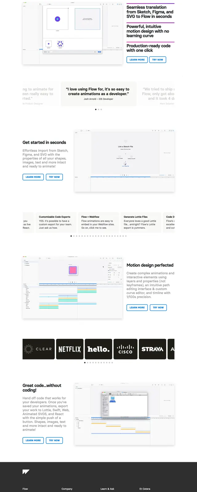
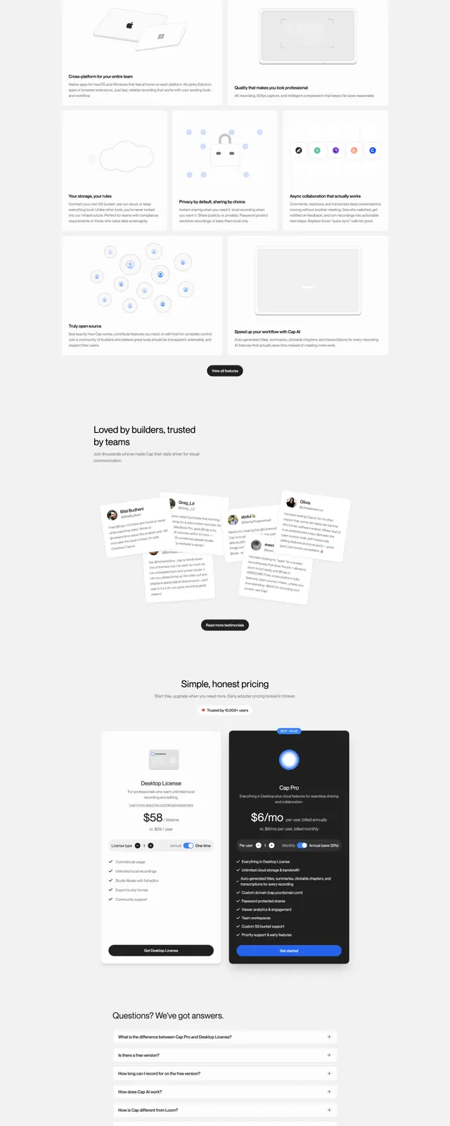
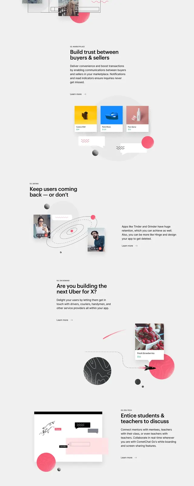
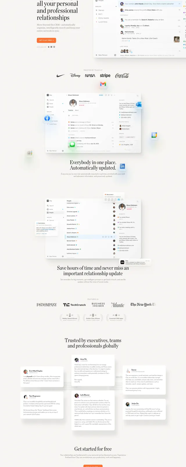
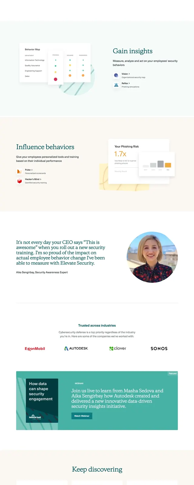
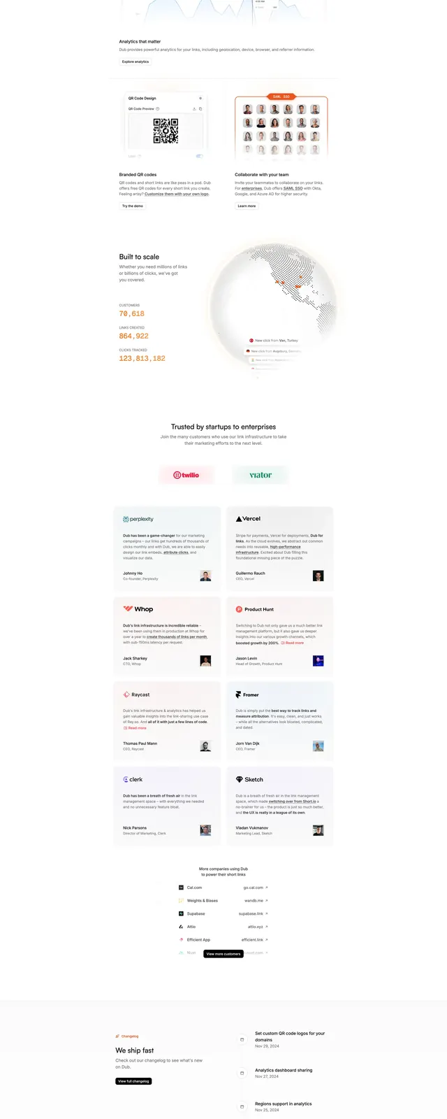
The page opens with a centered hero that features a small announcement badge, a large headline, short supporting copy, and two primary call-to-action buttons. A product preview sits inside a soft beige gradient panel with subtle grid texture, followed by a horizontal strip of customer logos. Below, the page continues with a two-column features section, a logo/trust section, a grid of testimonial cards, an open-source callout, and a final CTA block above a compact footer.
Key takeaway
The design relies on spacious alignment, restrained typography, and gentle gradients to make a technical product feel polished and approachable. Trust is reinforced through logos, testimonials, and open-source credibility rather than heavy visual complexity.
Reuse notes
This structure works well for B2B or developer-focused products that need a calm, credible first impression. The hero, logo strip, testimonial grid, and closing CTA are especially reusable as modular landing-page sections.