Preview image. Unlock full-res
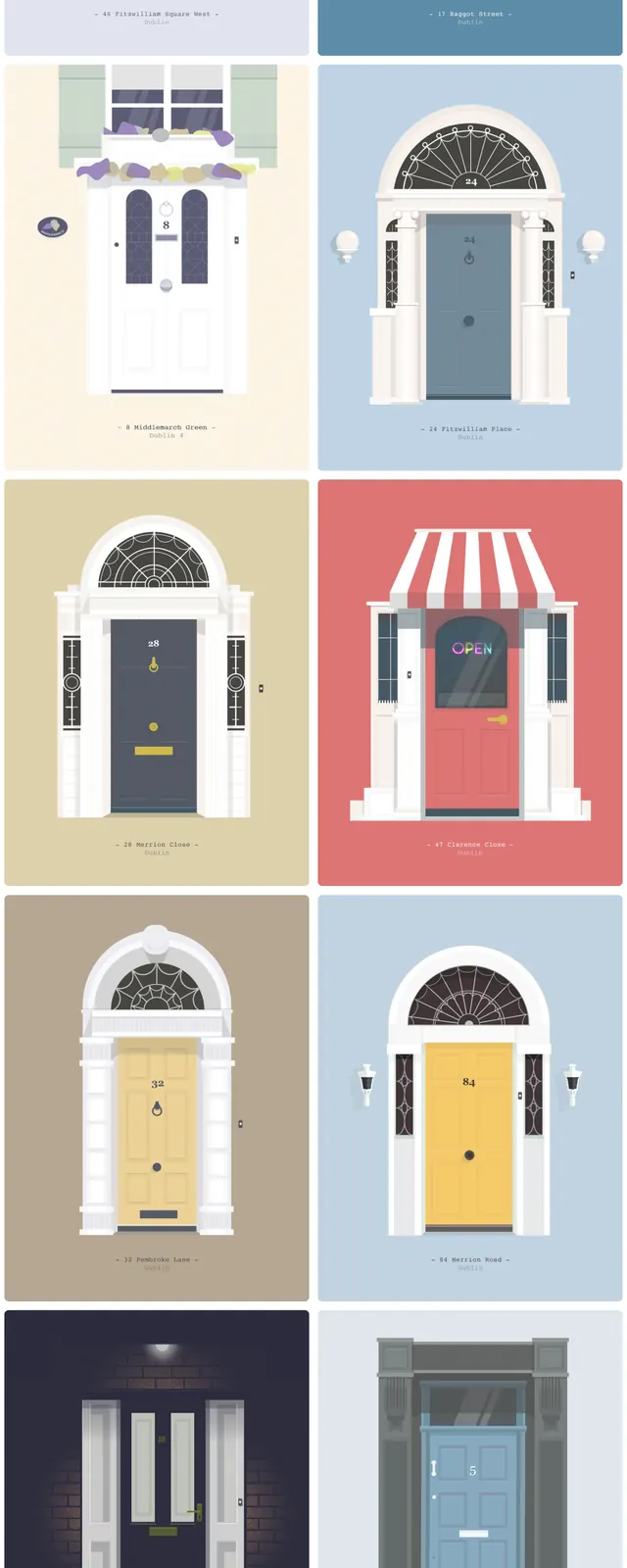
A clean editorial landing page showcasing illustrated Dublin door fronts in a grid of colorful poster-like cards.
Summary
A clean editorial landing page showcasing illustrated Dublin door fronts in a grid of colorful poster-like cards.
Visual description
The page opens with a simple top navigation, centered wordmark, and a large serif headline introducing the Doors of Dublin collection. Below it, large square and rectangular cards present illustrated door fronts in a two-column grid with pastel backgrounds and generous white space. Each card feels like a poster, with strong symmetry, bold doorway framing, and small location labels beneath some images. The overall composition is airy and scrollable, with the content dominated by the artwork rather than UI chrome.
Key takeaway
This design uses a restrained editorial frame to let colorful illustrations act as the primary content. The grid-based gallery format is easy to reuse for visual collections, portfolios, or curated image archives.
Reuse notes
Reuse the layout for any collection page where each item needs to feel like an art print or exhibit card. The combination of a minimal header, oversized title, and repeated image tiles works well for photography, illustration, or travel archives.