Preview image. Unlock full-res
A soft, editorial travel landing page with an illustrated hero, city discovery cards, and magazine-style content modules.
Summary
A soft, editorial travel landing page with an illustrated hero, city discovery cards, and magazine-style content modules.
Visual description
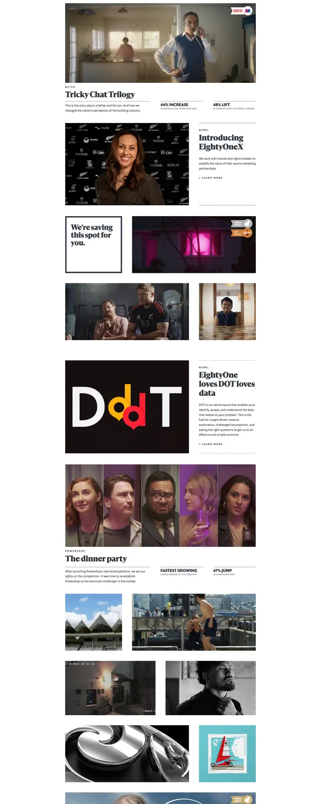
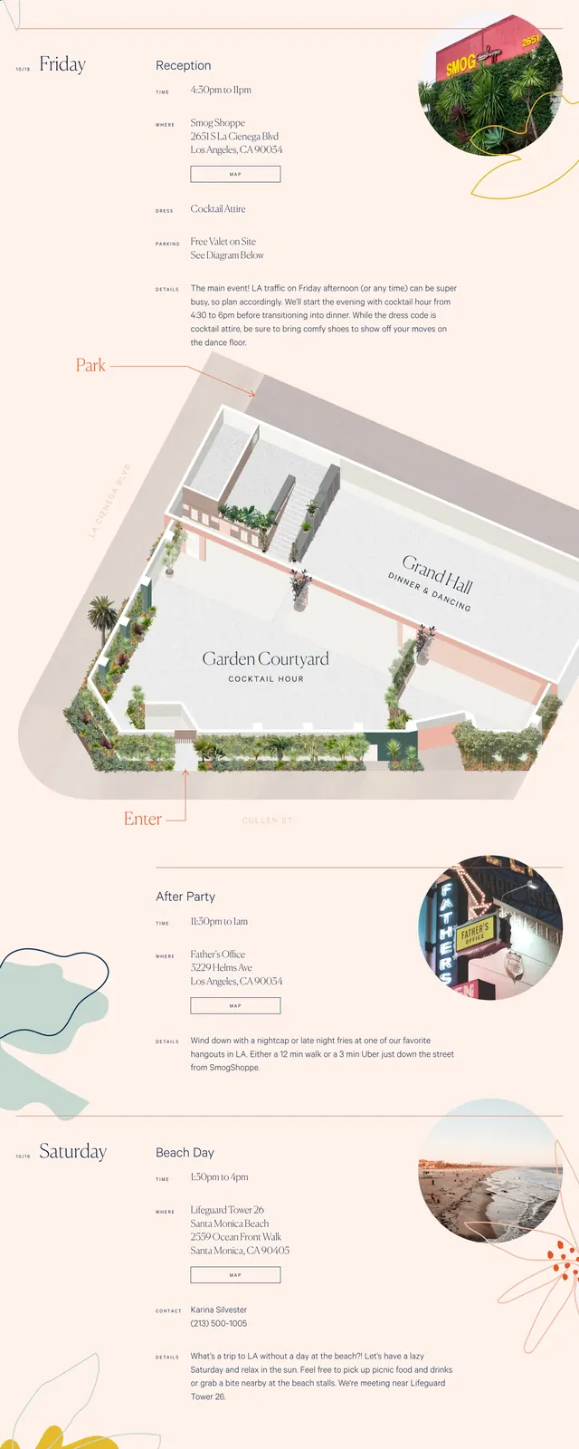
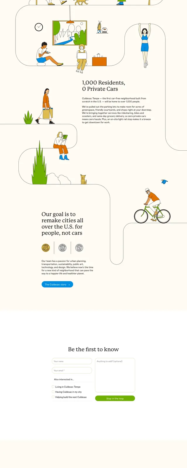
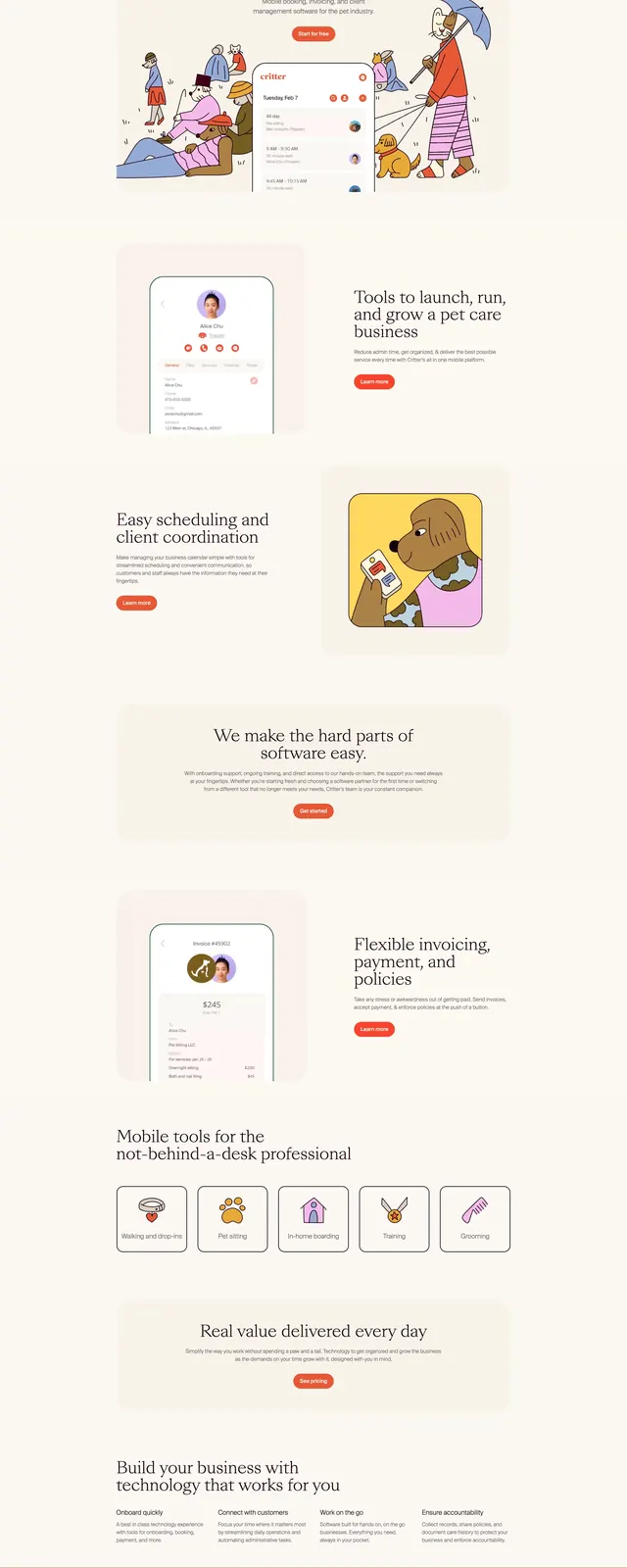
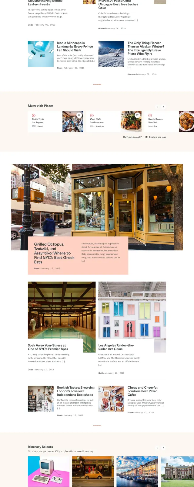
The page opens with a wide hero featuring a large typographic headline on the left and a detailed line-art city illustration spanning the right side. Below it, a featured cities row presents multiple soft-toned cards in a horizontal grid, followed by large editorial article blocks with image-led storytelling and short text overlays. Near the lower portion, a stats panel highlights city and itinerary counts, and the footer includes a small app promotion area with a download call to action.
Key takeaway
The design blends travel planning with a magazine-like editorial feel, using generous whitespace, muted neutrals, and hand-drawn city imagery to feel curated rather than transactional. It works well for brands that want destination discovery to feel aspirational and content-rich.
Reuse notes
Reuse the illustrated hero and card grid for travel, lifestyle, or editorial discovery sites. The same structure can support featured destinations, stories, and app promotion without feeling overly commercial.