Preview image. Unlock full-res
A playful supplement-style product landing page with candy-colored gradients, bold copy, and layered product storytelling.
Summary
A playful supplement-style product landing page with candy-colored gradients, bold copy, and layered product storytelling.
Visual description
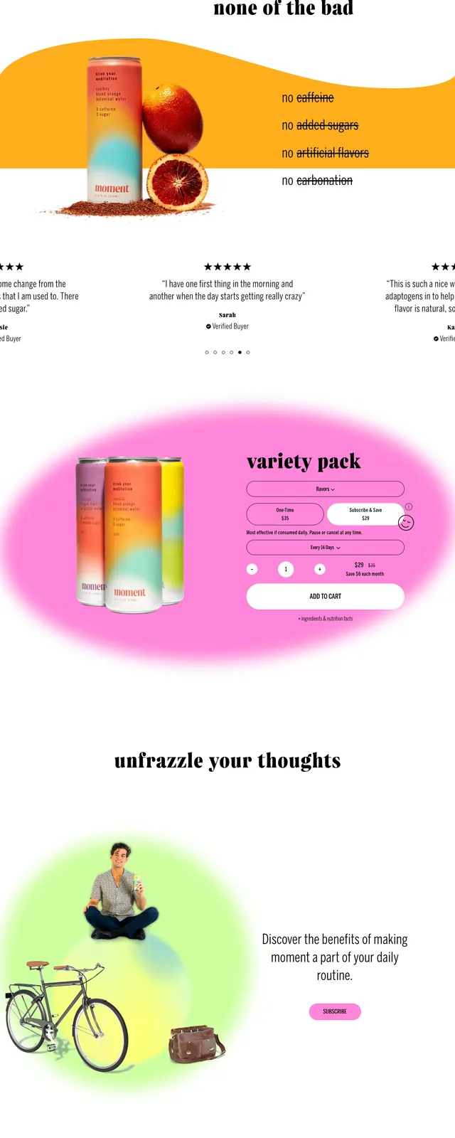
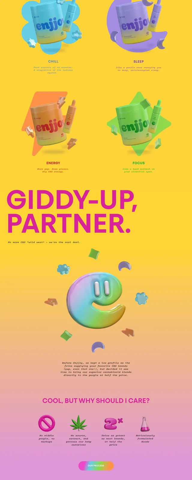
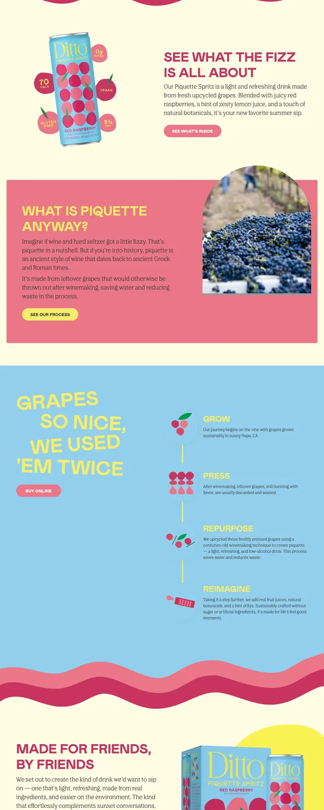
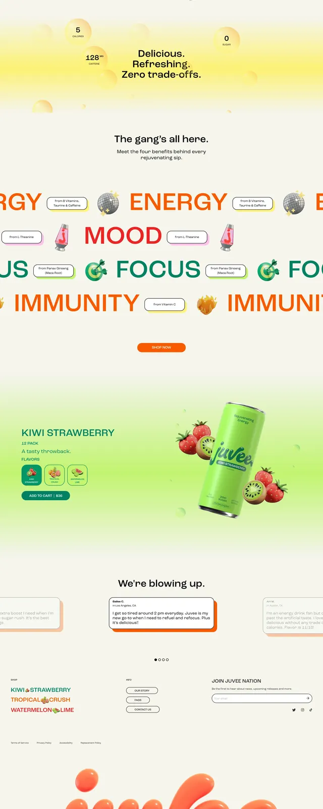
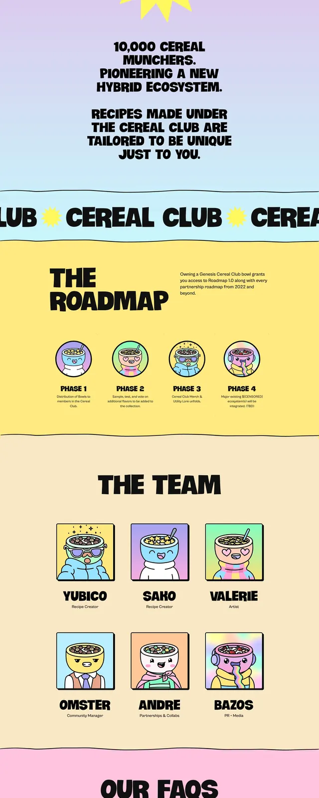
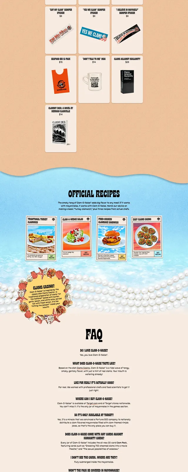
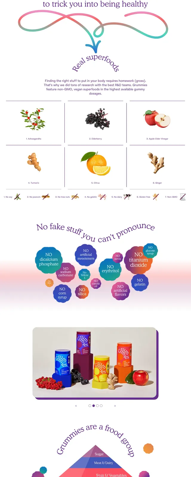
The page opens with a large hero area featuring a product jar on the right, oversized serif headline copy on the left, and soft orange-pink gradient blobs floating around the composition. Below, the page uses a looping ribbon graphic, ingredient tiles, and small trust badges to communicate product benefits and restrictions. A later section highlights a cluster of colorful bubble labels for things the product does not contain, followed by a simple Instagram image gallery and a deep purple footer with a wavy top edge.
Key takeaway
The design leans on whimsical gradients, playful typography, and product-first storytelling to make a health supplement feel friendly rather than clinical. It balances brand personality with functional trust signals like ingredient details, certifications, and exclusions.
Reuse notes
Use this pattern for DTC product pages that need a strong personality without losing clarity. The floating gradient forms, serif headline treatment, and trust-badge sections are especially reusable for wellness, food, or supplement brands.