Preview image. Unlock full-res
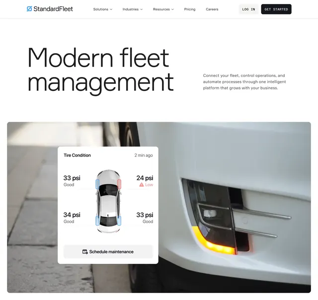
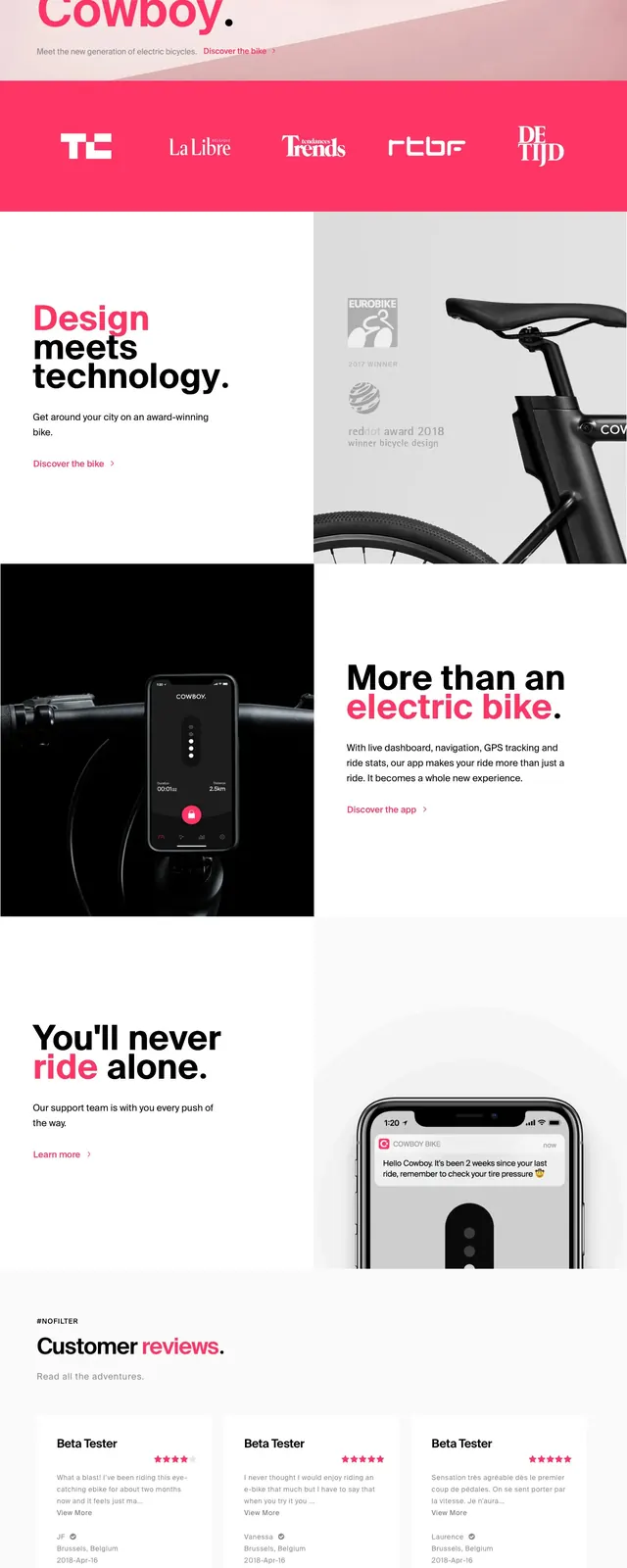
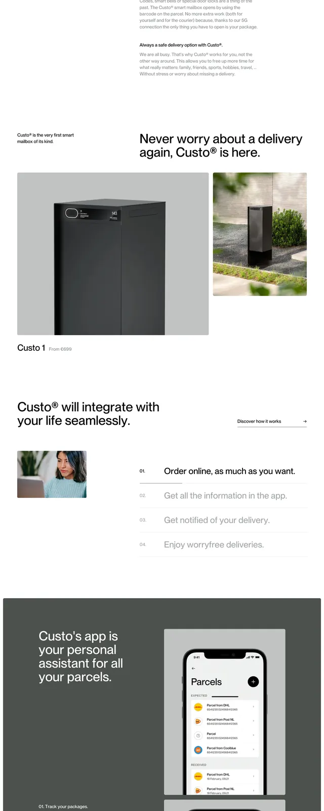
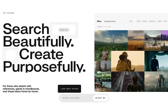
Minimal, white-first bicycle landing page hero with large product photography and sparse navigation.
Summary
Minimal, white-first bicycle landing page hero with large product photography and sparse navigation.
Visual description
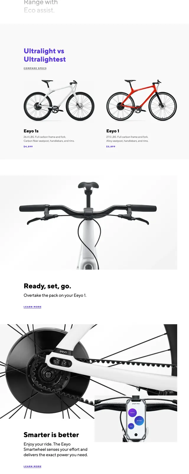
The page opens on a stark white background with a slim top navigation, the Gogoro eeyo logo at left, and small utility icons and subscribe text at the right. A large product photo of a white bicycle dominates the hero, cropped vertically so the frame, wheels, and brand wordmark overlap across the center of the page. Lower on the page, a second bike detail image shows the handlebars from the front, followed by a short marketing headline, a newsletter signup form, and a sparse footer with logo, legal links, and social icons.
Key takeaway
The layout uses extreme whitespace and oversized product imagery to make the bike feel premium and architectural. Small typography and restrained navigation keep attention on the object rather than the interface.
Reuse notes
Use this pattern for hardware or consumer product launches where the product itself should be the hero. It works best when you have strong studio photography and want a clean, editorial presentation with minimal copy.