Preview image. Unlock full-res
A bright, minimal agency homepage with a centered hero, light product imagery, and spaced-out credibility sections.
Summary
A bright, minimal agency homepage with a centered hero, light product imagery, and spaced-out credibility sections.
Visual description
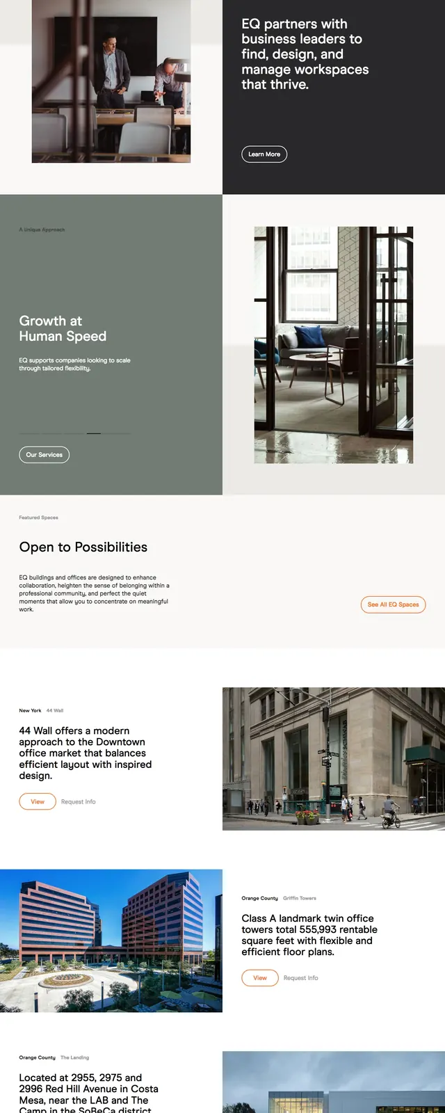
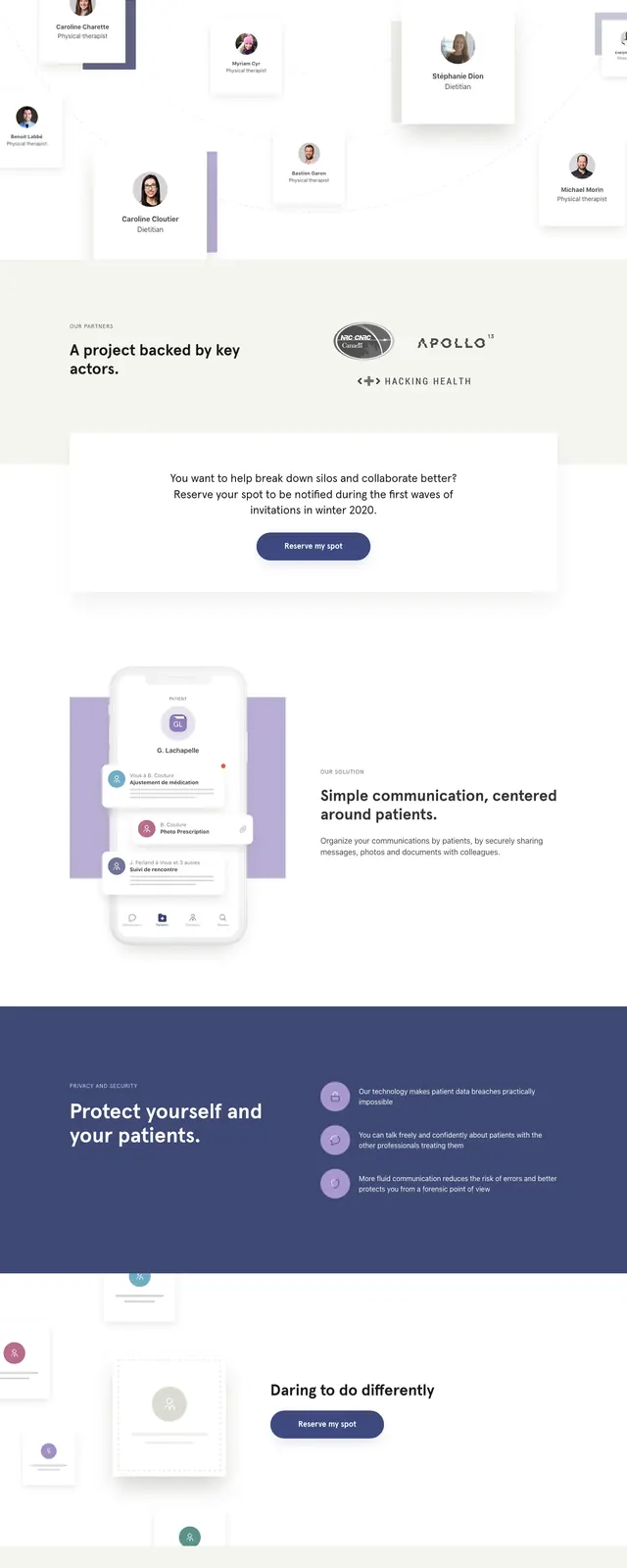
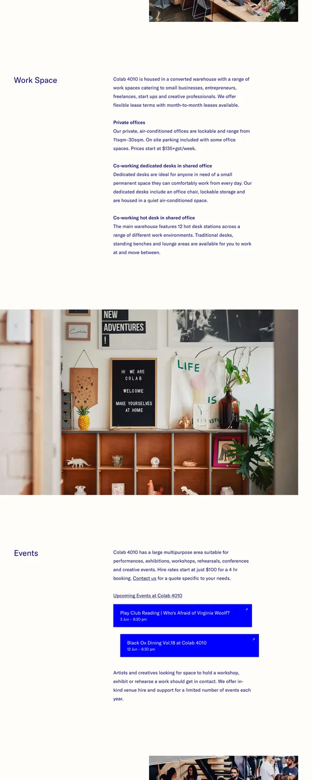
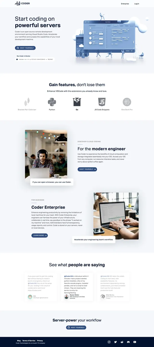
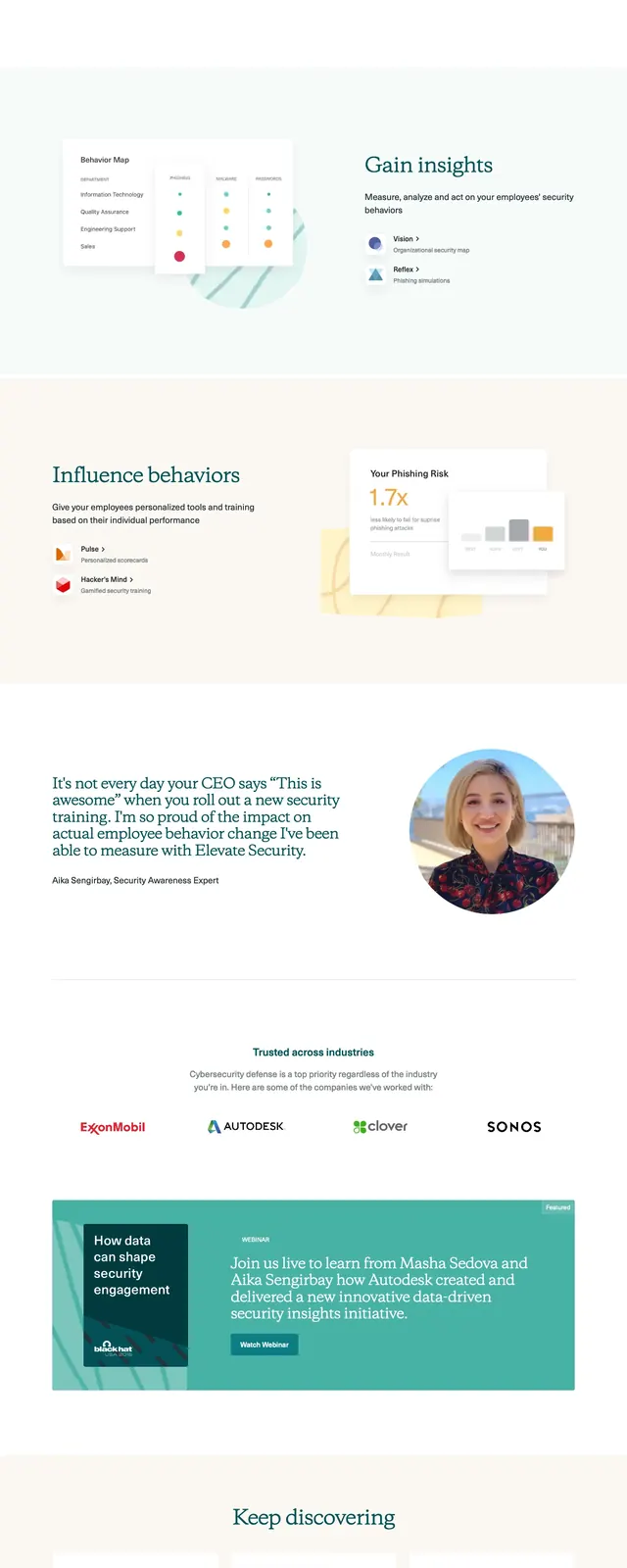
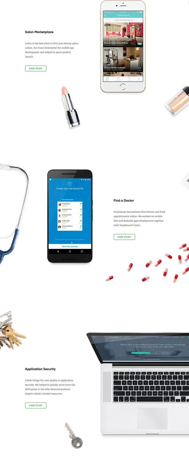
The page opens with a centered hero on a white background, framed by floating desk and device imagery around the edges. A compact top navigation sits above a bold headline and a single outlined call-to-action button. Below the fold, the layout shifts into a simple expertise section, a featured case study with a large mobile mockup, and a wide strip of client logos. The page ends with a minimal contact CTA and a small footer with links and social icons.
Key takeaway
This design relies on large whitespace, restrained color, and product-focused imagery to make an agency feel polished and credible. The reusable pattern is a centered pitch hero followed by proof sections that progressively build trust.
Reuse notes
Reuse the structure for a consulting, studio, or software services homepage where the goal is to look clean and established. The visual language works best when paired with one strong headline, one CTA, and selective case-study proof rather than dense copy.