Preview image. Unlock full-res
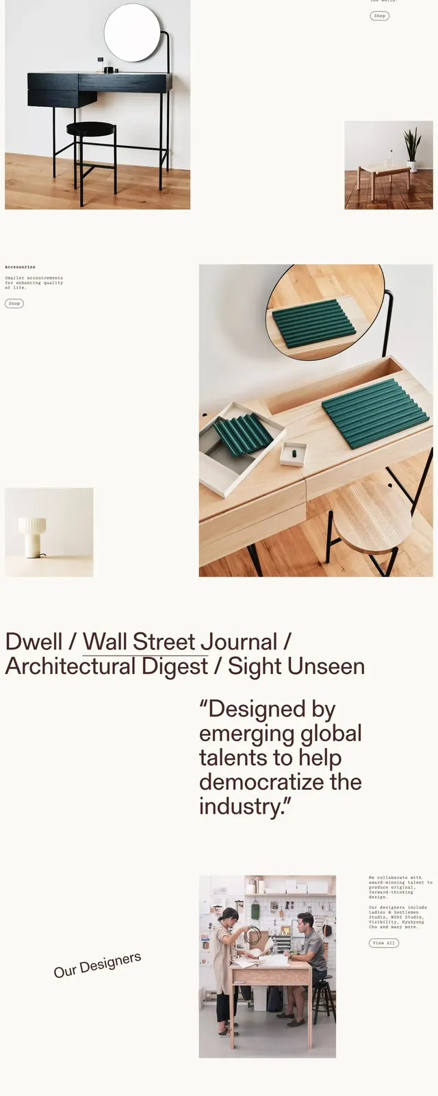
A minimal, editorial-style homepage for a collectible furniture and objects brand with large photography and sparse navigation.
Summary
A minimal, editorial-style homepage for a collectible furniture and objects brand with large photography and sparse navigation.
Visual description
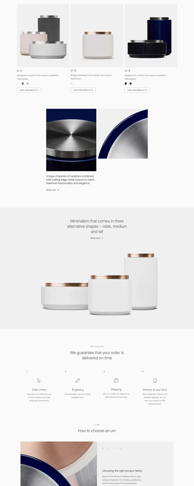
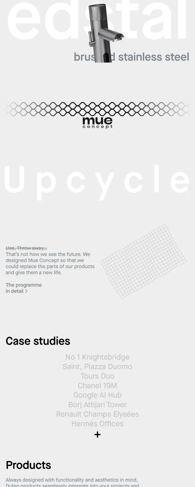
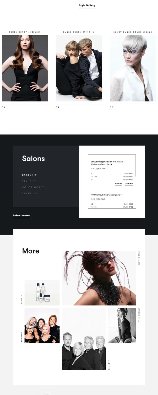
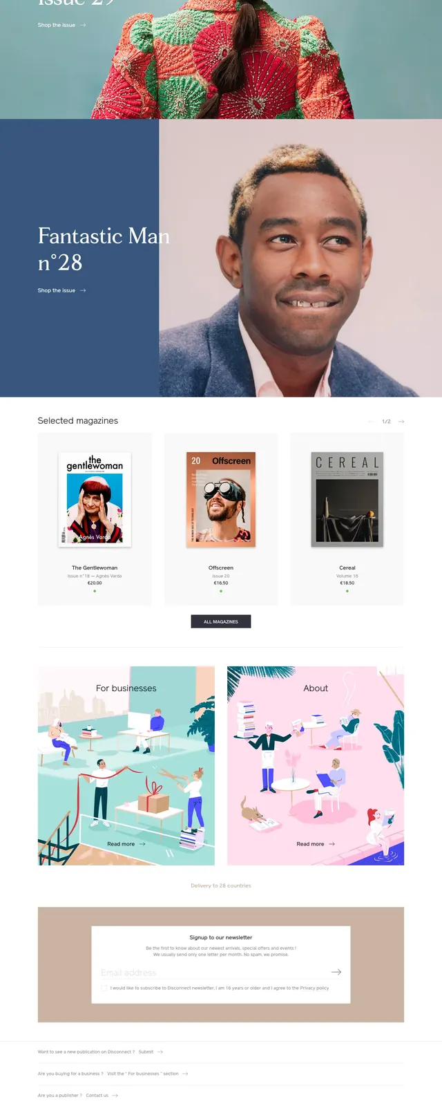
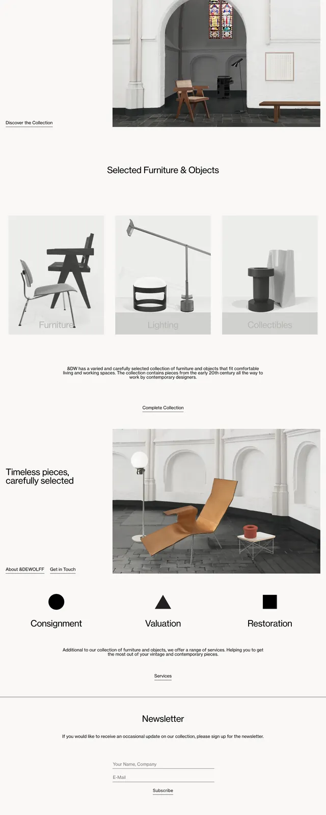
The page uses a bright white background with thin black typography and very large amounts of whitespace. A simple top navbar sits above a large hero image of an interior scene with furniture, followed by centered section headings and a three-column category block with muted image cards. Lower on the page there is a split section with text on the left and a large product image on the right, then a services row, a centered newsletter form, and an oversized wordmark in the footer.
Key takeaway
The strongest reusable idea is the gallery-like pacing: one large image, a short caption, then tightly curated category and service blocks. The design feels premium by staying understated and letting the imagery do most of the work.
Reuse notes
Use this pattern for design-forward retail, gallery, or collectible brands that want an editorial rather than commercial feel. It works best when product photography is strong and the site needs to feel calm, selective, and high-end.