Preview image. Unlock full-res
A minimalist luxury-watch landing page with a large editorial hero, search bar, brand carousel, comparison section, and embedded video feature block.
Summary
A minimalist luxury-watch landing page with a large editorial hero, search bar, brand carousel, comparison section, and embedded video feature block.
Visual description
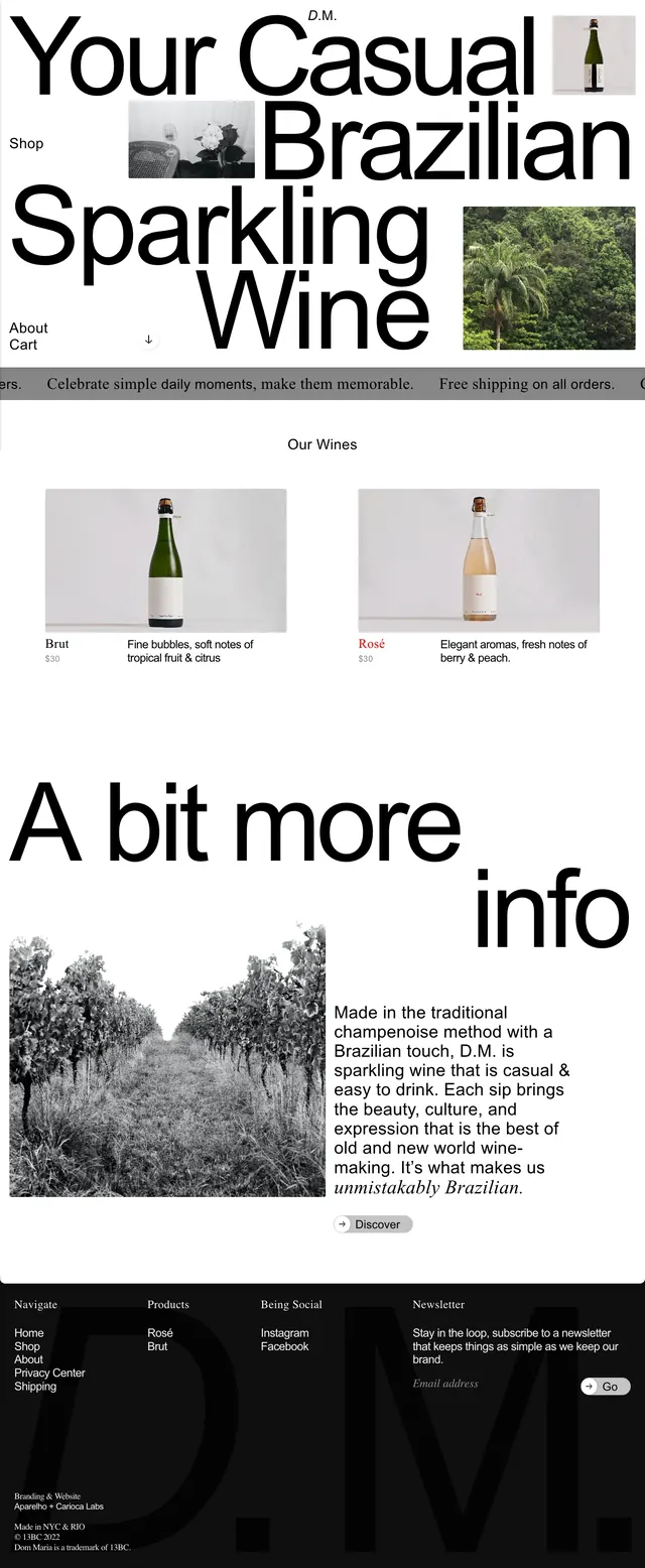
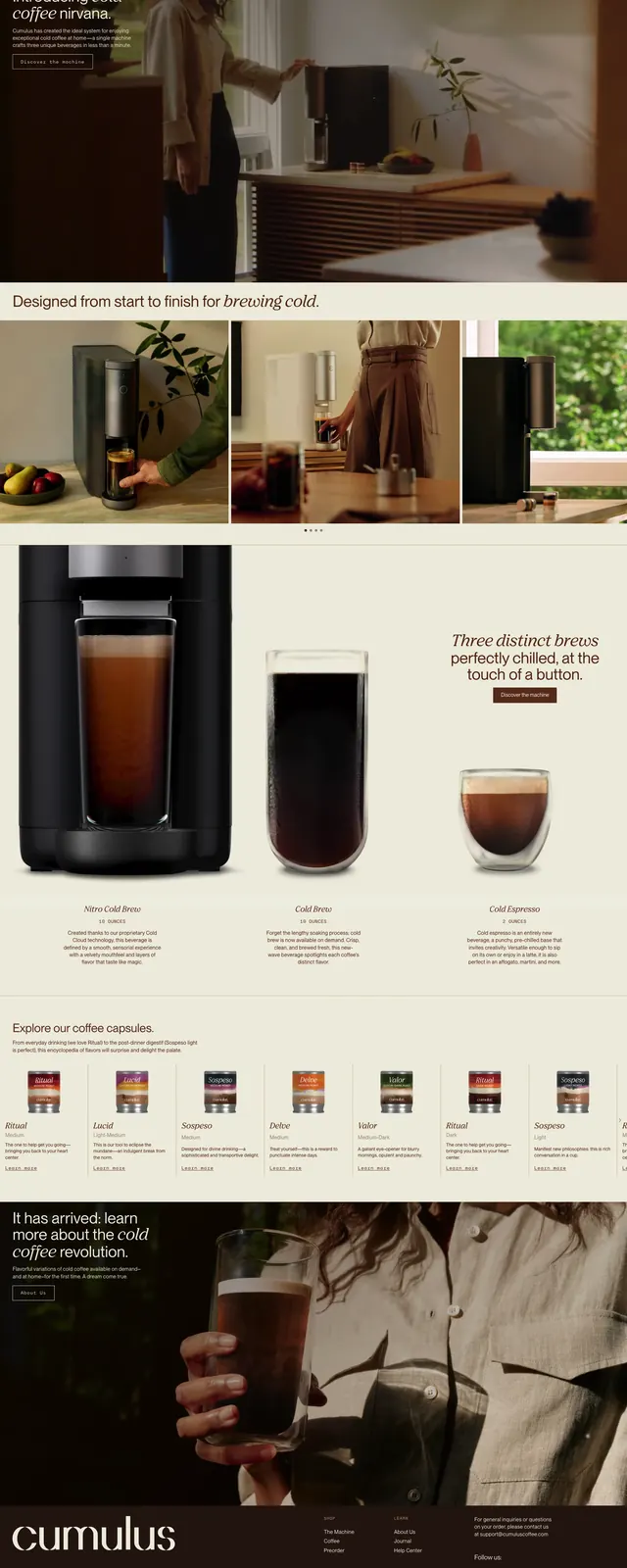
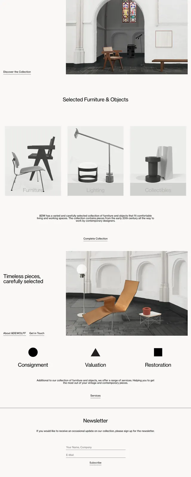
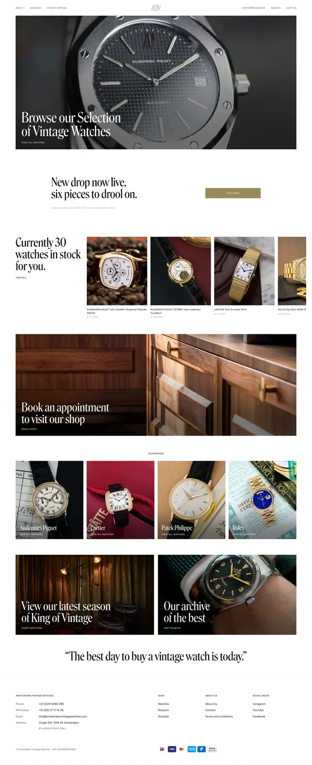
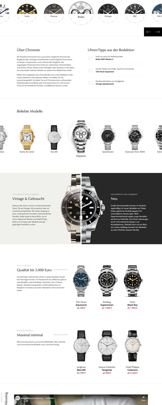
The page opens with a split hero: bold black headline and short supporting copy on the left, and a large grayscale watch product image on the right. A wide search field sits across the lower part of the hero with a dark search button, reinforcing the product-discovery focus. Below, there is a horizontal strip of popular brand logos and watch thumbnails, followed by a two-column comparison section that contrasts vintage and new watches with a central split watch image. Further down, an embedded video module appears with a dark caption panel overlaid on the lower left, and a simple footer closes the page.
Key takeaway
The strongest idea is the editorial luxury-commerce layout: oversized type, restrained monochrome imagery, and a search-first hero that makes the catalog feel curated rather than transactional. The split compositions and overlapping cards add depth without breaking the clean premium aesthetic.
Reuse notes
Use this pattern for high-end marketplaces or collection sites where discovery, brand credibility, and product storytelling matter. It works best with strong product photography and restrained branding; the layout depends on large imagery and generous whitespace.