Preview image. Unlock full-res
A playful illustrated DTC cookware homepage hero with a centered headline, a single primary CTA, and a whimsical kitchen scene built from cutout-style graphics.
Summary
A playful illustrated DTC cookware homepage hero with a centered headline, a single primary CTA, and a whimsical kitchen scene built from cutout-style graphics.
Visual description
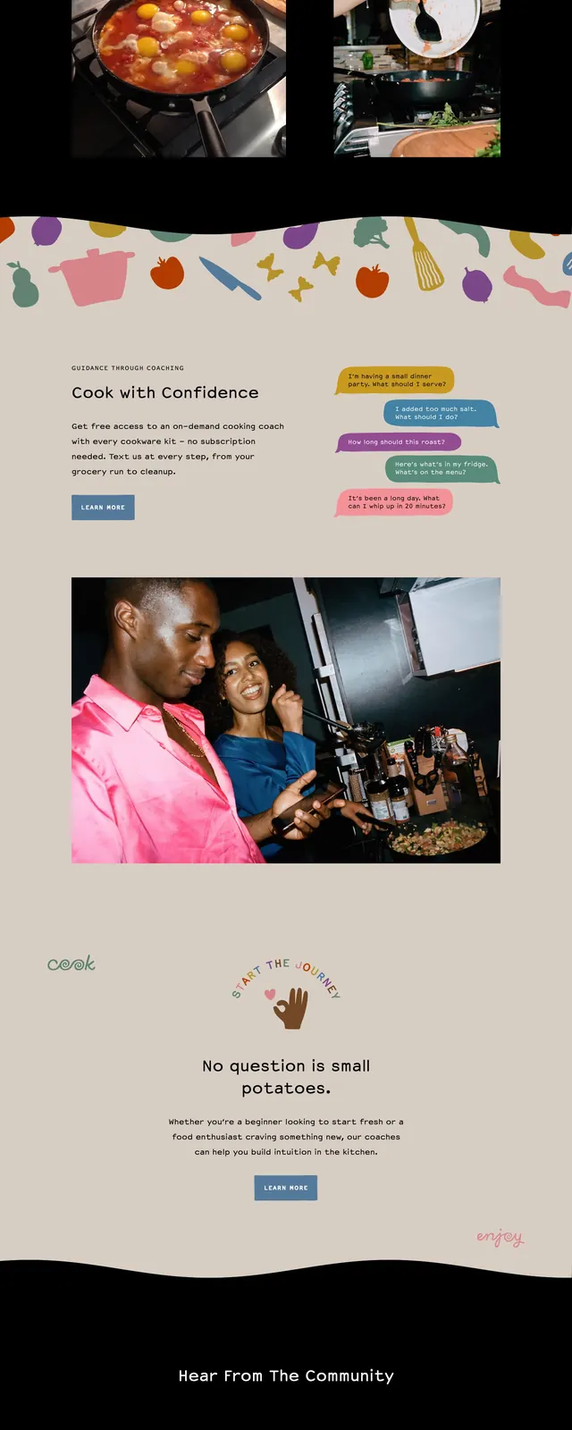
The top of the page shows a small logo and simple navigation on a warm beige background, followed by a centered headline reading "Hi, we’re Equal Parts." with a short supporting sentence and a blue shop button. The hero is surrounded by colorful kitchen-themed illustrations, including cookware, utensils, a plant, and countertop scenes arranged like a playful collage. Lower on the page, there is a section titled "Our Secret Recipe," a photographic lifestyle image, and a black footer filled with scattered abstract food-like shapes and multiple link columns.
Key takeaway
The site pairs a friendly brand voice with large-scale illustrated storytelling, making the product feel approachable and distinctive. The strongest reusable move is the collage-style hero that mixes utility, personality, and product category cues in one composition.
Reuse notes
This works well for consumer brands that want to feel warm, design-led, and memorable without relying on a standard product screenshot hero. Reuse the structure for lifestyle ecommerce pages, especially when the brand has a strong visual system or custom illustration language.