Preview image. Unlock full-res
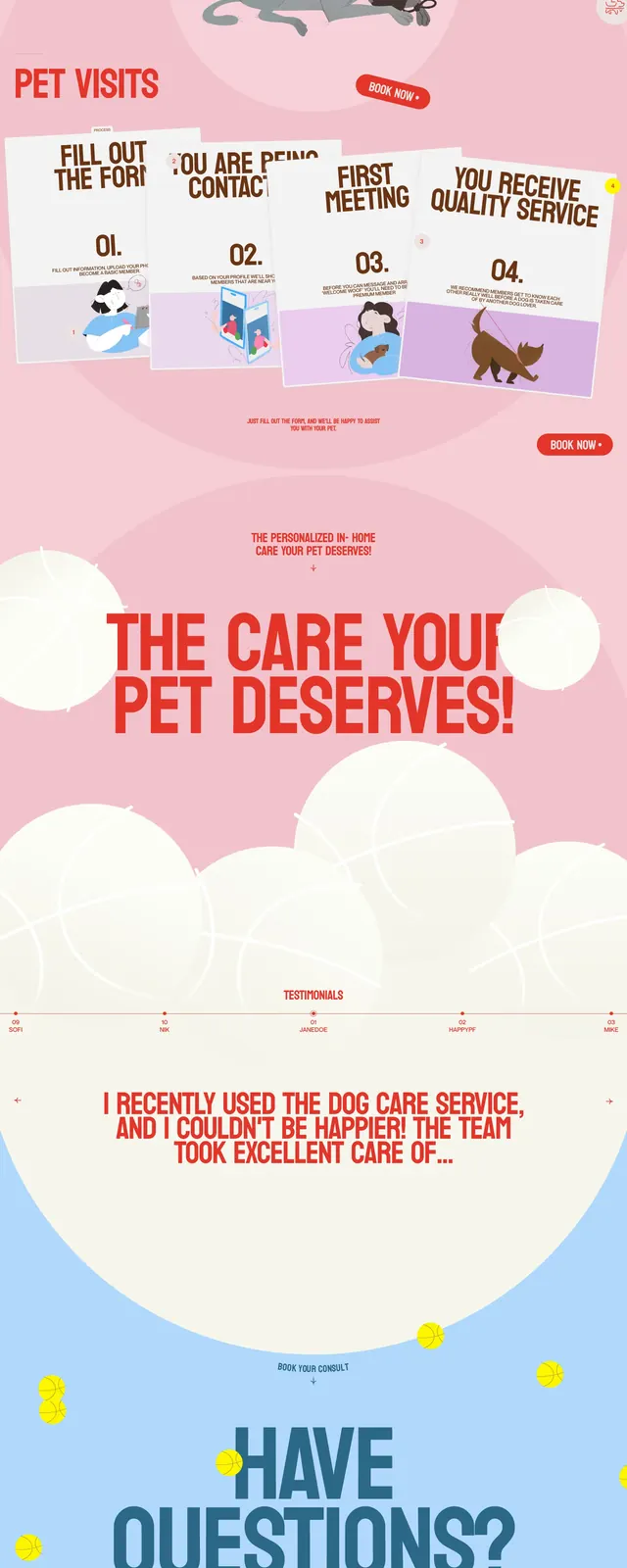
A hand-drawn pet-care landing page with oversized red headlines, a whimsical illustrated dog, and soft pastel sections.
Summary
A hand-drawn pet-care landing page with oversized red headlines, a whimsical illustrated dog, and soft pastel sections.
Visual description
The page opens with a large illustrated dog centered on an off-white background, framed by oversized red all-caps messaging and a minimal top navigation. Below, a pink value-proposition section uses giant typography and floating circular shapes to create a soft, playful visual rhythm. Further down, a testimonial strip and a collage-style gallery of pet photos continue the same airy, brand-heavy treatment. The footer is simple and structured, with logo, contact details, and utility links arranged in columns.
Key takeaway
The design relies on bold illustration, large condensed headlines, and pastel color blocking to make a friendly service feel distinctive and memorable. It is strongest as a reference for pet-care brands that want personality without losing clarity.
Reuse notes
Reuse the formula of one dominant central illustration, oversized message text, and soft decorative shapes to build an approachable hero. The layered photo gallery and sparse footer are also easy patterns to adapt for lifestyle or care-focused brands.