Preview image. Unlock full-res
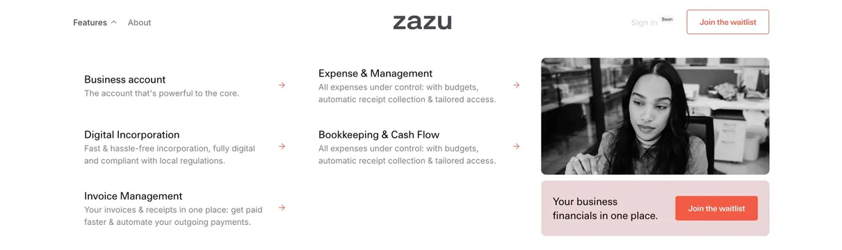
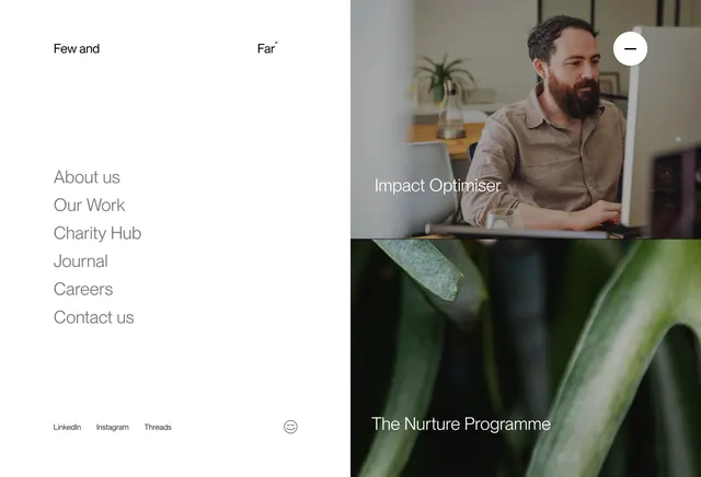
Open full-screen menu overlay with a white link column on the left and two stacked photographic feature panels on the right.
Summary
A full-viewport navigation overlay splitting a clean white link list from two stacked photo panels promoting key programs or services.
Visual description
Left half is white with the brand name split across the top (Few and on the left, Far with registered mark on the right). Six gray sans-serif nav links stack vertically: About us, Our Work, Charity Hub, Journal, Careers, Contact us. Footer row holds LinkedIn, Instagram, and Threads text links on the left and a small smiley icon on the right. Right half divides into two equal photo panels: top shows a bearded man at a desk with white Impact Optimiser label bottom-left and a white circular close button (minus icon) top-right; bottom panel is a macro green leaf photo with The Nurture Programme label bottom-left.
Key takeaway
Turning the open menu into a editorial moment by pairing primary links with two visual destinations instead of a blank overlay. The close control lives inside the imagery, keeping the link column uninterrupted.
Reuse notes
Works for studios or agencies that want navigation to surface flagship work or programs. Needs two strong thumbnail images and short program names. Light left panel contrasts with photographic right; less suited to dense mega-menu taxonomies.