Preview image. Unlock full-res
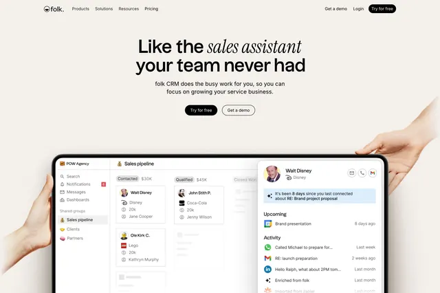
Light centered CRM hero with a serif headline that mixes upright and italic words, two CTAs, and a held tablet showing the product dashboard.
Summary
A light, centered CRM hero whose serif headline mixes upright and italic words for emphasis, anchored by a large held-tablet product screenshot below. The defining move is the italic phrase doing the highlighting inside an otherwise plain headline.
Visual description
A warm off-white section with a slim top navbar: "folk." wordmark at left, menu (Products, Solutions, Resources, Pricing) center, and "Get a demo", "Login", plus a dark "Try for free" pill at right. The centered serif headline reads "Like the sales assistant your team never had", with "sales assistant" set in italic to stand out. A muted one-line subhead follows, then two centered CTAs: a dark "Try for free" pill and a light bordered "Get a demo". Below, a large product screenshot of the folk CRM sits on a tablet held by faint hands at the lower corners; it shows a "Sales pipeline" board with contact cards (Walt Disney, Ole Kirk C., John Stith P.) and an overlaid contact detail panel with upcoming items and an activity feed.
Key takeaway
Using italics inside a serif headline to highlight the key phrase, replacing a color or weight change with a typographic one. The held-tablet screenshot with hands grounds the product in human use, and the overlaid contact panel previews a real workflow rather than a flat marketing shot.
Reuse notes
Good for a warm, approachable B2B SaaS or CRM that wants an editorial feel without going dark. Needs a clean, legible product screenshot since it carries the lower half. The mixed upright/italic headline works best with one short emphasized phrase; over-italicizing dilutes it.
More hero sections
See all











More like this


Keep what you find
A free account saves references to boards and can send you a weekly email of picks based on what you save.
To see every result, go Pro.