Preview image. Unlock full-res
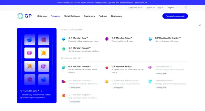
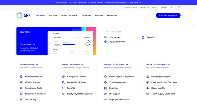
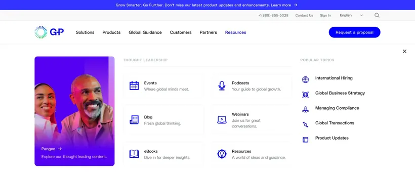
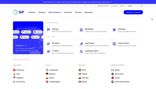
Expanded Global Guidance nav panel with Globalpedia promo, audience-segment link grid, and flag-labeled country shortcuts across regions.
Summary
The Global Guidance nav item opens a structured mega menu combining a Globalpedia promo tile, two audience grids, and a regional country directory with flags.
Visual description
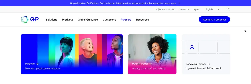
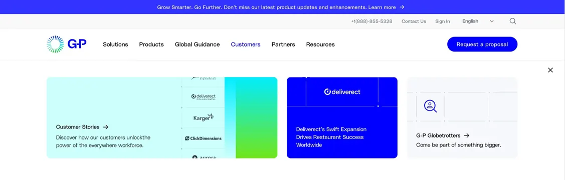
Standard G-P header with announcement bar, utility links, logo, and nav where Global Guidance is active in blue. White dropdown with close control. Left square promo card in solid blue shows a stylized globe graphic with country labels, "Globalpedia" title with arrow, and subtitle on trusted market guidance. Main area splits into two labeled rows: "FOR COMPANIES" with three items (Startups, Mid-Market, Enterprise) each with small line icon and one-line description, and "FOR TEAMS" with five role-based entries (HR, Legal, Finance, IT, Leadership) in the same icon-plus-copy pattern. Bottom band labeled "POPULAR LOCATIONS" lists countries grouped by region (Asia-Pacific, Europe, Americas, Middle East/Africa), each with a circular flag icon and country name in a multi-column layout.
Key takeaway
Layering audience segmentation and geo navigation in one dropdown without visual chaos: icons and short labels for teams, flags for countries, and one hero resource tile for depth content.
Reuse notes
Ideal for global HR, legal, or expansion platforms that must route both persona and geography from the nav. Flag icons need consistent sizing; dense country lists may need search on smaller locales.