Preview image. Unlock full-res
Two stacked feature rows, each pairing a gradient-backed product UI card on the left with headline, body copy, and a learn-more link on the right.
Summary
A pair of alternating product feature blocks showing real in-app UI mockups against lime and cyan gradients, each explained by a bold headline and short paragraph.
Visual description
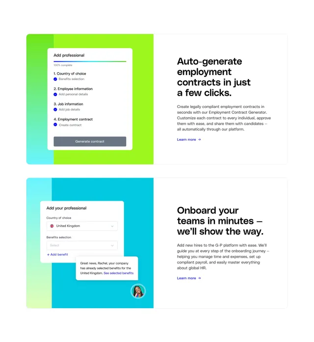
White page with two full-width rows stacked vertically. Top row: left half shows a white "Add professional" card on a lime-green to cyan gradient, with a 100% progress bar and four checked steps (country, employee info, job info, employment contract) ending in a dark "Generate contract" button; right half has bold headline "Auto-generate employment contracts in just a few clicks.", supporting paragraph, and blue "Learn more" link with arrow. Bottom row mirrors the layout: left shows an onboarding form card on a cyan-to-pale-green gradient with UK flag dropdown, benefits selector, and an overlapping notification bubble with a small avatar; right carries headline "Onboard your teams in minutes we'll show the way.", body copy, and matching learn-more link.
Key takeaway
Repeating the same split pattern twice so the page rhythm stays predictable while the UI stories change. Gradient backplates behind flat product cards make screenshots feel branded without heavy illustration.
Reuse notes
Strong template for global HR or payroll SaaS explaining multi-step workflows. Each row needs a credible product screenshot and a single sharp benefit headline. Both rows use UI-left copy-right; alternating sides would add variety on longer pages.