Preview image. Unlock full-res
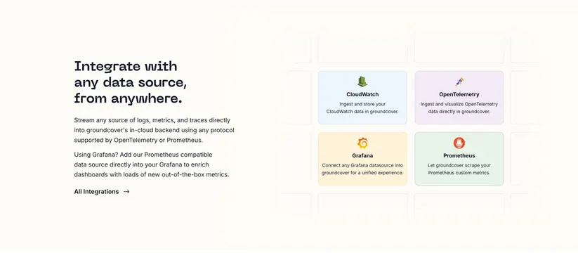
Split integrations section with a monospaced headline and copy on the left and a partially cropped grid of color-tinted integration cards on the right.
Summary
A split integrations section pairing left-aligned monospaced copy with a grid of pastel-tinted integration cards on the right, deliberately cropped at the edges to imply many more. The defining trait is the soft per-card color tint keyed to each tool's brand.
Visual description
On a cream background, the left column holds a three-line monospaced headline "Integrate with any data source, from anywhere.", two short grey paragraphs, and an "All Integrations" text link with an arrow. The right column is a grid of rounded cards; four are fully visible and colored (blue CloudWatch, lavender OpenTelemetry, amber Grafana, green Prometheus), each with the tool's icon, a bold name, and a one-line description. Surrounding the visible four is a ring of empty or partially cropped cards fading toward the edges, suggesting a larger catalog. Spacing is generous and the tints are pale and desaturated.
Key takeaway
Tinting each integration card with a faint version of that brand's color makes a logo grid colorful and scannable while staying cohesive. Cropping the outer ring of cards implies a deep integration library without listing everything.
Reuse notes
Use when you support many integrations and want to show variety without a full logo dump. The pastel tints should be muted and consistent in saturation or the grid looks gaudy. The cropped edge cards work best when at least three or four real cards anchor the center.
More integrations sections
See all




More like this
Keep what you find
A free account saves references to boards and can send you a weekly email of picks based on what you save.
To see every result, go Pro.