Preview image. Unlock full-res
Light features section pairing a heading and three icon blurbs with a large project-dashboard mockup and an overlapping email modal.
Summary
A features section that leads with a bold heading and three icon-and-text blurbs, then drops a large product-dashboard screenshot below with a Gmail "New email detected" modal overlapping it.
Visual description
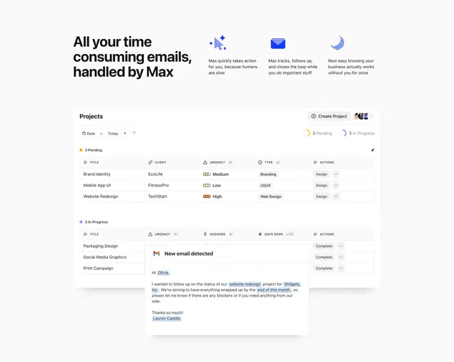
Top-left holds a heavy three-line black headline "All your time consuming emails, handled by Max." To its right, three compact feature blurbs each pair a small blue line icon with two lines of supporting copy. Below, a wide white application screenshot shows a "Projects" view with a Create Project button, avatar stack, and two grouped task tables, "3 Pending" and "3 In Progress," with columns for client, urgency (AI), type, assignee, and actions, using small pill badges and progress chips. A white card overlay floats over the lower table reading "New email detected" with highlighted entities inside a sample message. The palette is white and gray with a single electric-blue accent.
Key takeaway
Anchoring the section with a real, detailed product screenshot and then overlapping a contextual modal on top of it sells the workflow far better than static feature copy. The three terse icon blurbs at top carry the messaging while the screenshot carries the proof. Highlighting AI-extracted entities inside the email modal demonstrates the product live.
Reuse notes
Best for an AI or automation SaaS where the value is in the product doing work inside a familiar interface. Needs a genuinely polished dashboard mockup and a believable overlay to land. The overlapping modal can crowd the screenshot, so leave breathing room around it.