Preview image. Unlock full-res
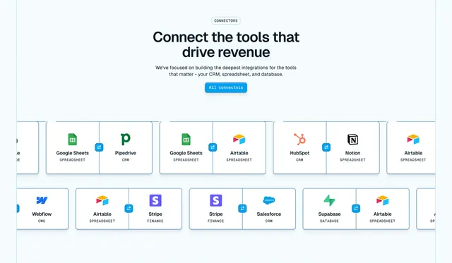
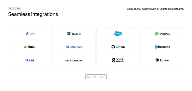
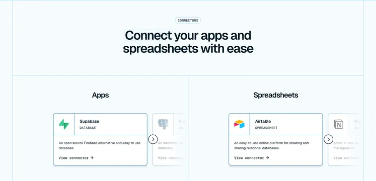
Light integrations section with a centered intro over rows of paired connector cards showing two app logos linked by a sync glyph.
Summary
A light integrations section that shows connectors as paired cards, each holding two app logos joined by a sync icon, beneath a centered headline. The two-logos-per-card pairing pattern is the defining idea.
Visual description
Centered at top: a small bordered "CONNECTORS" eyebrow pill, an oversized two-line black headline "Connect the tools that drive revenue", two lines of grey sub-copy, and a filled blue "All connectors" pill. Below, two horizontal rows of white bordered cards each contain two app logos with their type label beneath (Google Sheets / SPREADSHEET, Pipedrive / CRM, Airtable / SPREADSHEET, HubSpot / CRM, Notion / SPREADSHEET, Webflow / CMS, Stripe / FINANCE, Salesforce / CRM, Supabase / DATABASE) split by a small blue bidirectional sync badge in the middle. The logos are full color against the pale blue page, and the rows extend past both edges with cards peeked off-screen, implying horizontal scroll.
Key takeaway
Showing each integration as a pair of logos linked by a sync glyph, which communicates "this app connects to that app" far better than a single logo grid. The small uppercase type labels under each logo add context, and the peeked rows imply a long scrollable set.
Reuse notes
Ideal for a sync or data-integration product where the value is connecting two named tools, not just supporting one. The paired-card pattern needs colorful, recognizable logos to read well on a light background. Pairs naturally with an "All connectors" index page.
More integrations sections
See all





More like this
Keep what you find
A free account saves references to boards and can send you a weekly email of picks based on what you save.
To see every result, go Pro.