Preview image. Unlock full-res
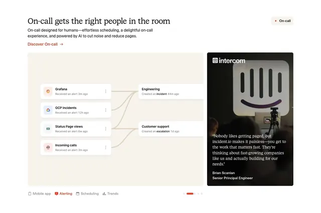
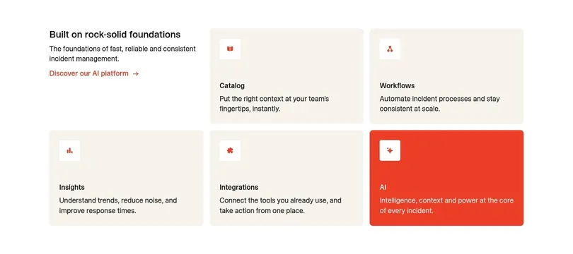
Light feature-detail block pairing a serif heading and a node flow diagram in a beige panel with a photographic testimonial card, navigated by a tab row with carousel dots.
Summary
A light feature-detail panel for an on-call product that places a serif heading and red "Discover" link over a beige diagram card showing alerts routing to teams, beside a dark photographic customer testimonial, with a tab row and carousel dots tying a set of features together.
Visual description
At the upper left, a serif heading, a two-line sans description with an em-width pill label, and a red "Discover On-call" link with an arrow. A small "On-call" pill sits at the upper right. The main area is a wide beige rounded card holding a flow diagram: four source cards on the left (Grafana, GCP incidents, Status Page views, Incoming calls, each with an app icon, label, and timestamp) connect by curved lines to two destination cards on the right (Engineering, Customer support). To its right is a dark image testimonial card branded "intercom" with a product photo backdrop, a multi-line quote in white, and an attributed name and title. Along the bottom: a horizontal tab row (Mobile app, Alerting, Scheduling, Trends) with the active item in red, and a row of carousel dots with one red bar active.
Key takeaway
Visualizing the product's value as a literal routing diagram (sources connect to the right people) instead of a flat screenshot, so the benefit is legible at a glance. Pairing that diagram with a co-branded photographic testimonial in the same row blends "how it works" and "who trusts it" in one feature card.
Reuse notes
Use for a workflow or routing product where the core idea is connections between systems and people. The visible tab row and carousel dots signal this is one of several swappable feature panels, so it suits a feature carousel. Needs real integration icons and a credible quote; the beige-and-red palette reads warm and editorial rather than technical-dark.
More feature detail sections
See all


More like this

Keep what you find
A free account saves references to boards and can send you a weekly email of picks based on what you save.
To see every result, go Pro.